Monthly Masters' Critique - Thomas Kinkade - Kitsch or Classic?
Jul 1, 2019 09:16:54 #

Introduction
Those of you who’ve followed the Masters posts from the beginning knew I’d get to Thomas Kinkade one of these days. His work is too well known to ignore. Whether you find his idealized scenes inspiring and heartwarming or kitschy and laughable, you know he is “iconic” in the literal sense: he has become iconic by his sheer popularity, is easily recognized and copied. He has produced a massive body of work comprised mostly of idealized, nostalgic scenes meant to tug on the heartstrings of the viewer. His biggest fan base is the baby boomer generation (the generation to which I and most of you belong), who tend to find triggers to memories in his paintings.
In my study of Kinkade, I came across questions about how to photoshop images to look like his paintings, and conversations about who might be the Thomas Kinkade of photography (Spoiler: most seem to think it’s Peter Lik.) So I hope in reviewing this offering you’ll consider Kinkade’s possible influence on landscape photography and offer your own thoughts. You may find especially interesting the pointers Kinkade himself offered to videographers attempting to translate his painting style to the camera, because most of it pertains to still photography too.
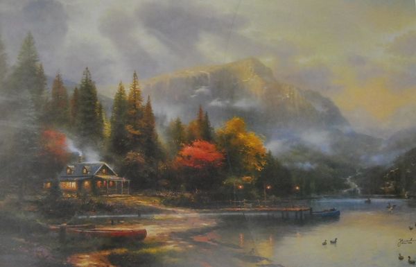
The item I’ve selected for you to critique is “The End of A Perfect Day”. I chose it because it is neither the most or least sugary sweet of his images, and it features a scene similar to some that we may have photographed: a rustic cottage alongside a mountain lake amid blazing fall foliage. Please review the links below for more detailed information about the man, his rather conflicted life and death, and respond to any of the prompts you find interesting.
Questions to Consider
1. What do you think of the painting? Composition? Subject matter? Lighting? Color? Level of detail? Mood? Would you want this on your wall? Why or why not?
2. What is your opinion of Kinkade’s body of work? Classic or kitsch? Why?
3. Do you see any indication of influence of the Kinkade style on modern landscape photography?
4. Some critics that cross the boundaries of painting and photography have ventured that HDR is the photographic expression of the Kinkade style. What are your thoughts on that “accusation”?
5. Any of us would probably have screeched to a stop if we passed such a scene as this on our travels, intent to capture it. Have you run across similar scenes? Share one if you will, and tell us about your experience and your editing. Then tell us if the Kincade approach might have influenced your choices. (Extra points if you create a new Kinkade-ish image using the suggestions he gave in the Vanity Fair article)
Links for Study
https://thomaskinkade.com
https://en.wikipedia.org/wiki/Thomas_Kinkade
https://www.theguardian.com/artanddesign/2012/may/09/thomas-kinkade-dark-death-painter
http://sfaq.us/2015/03/on-the-despised-art-of-thomas-kinkade/
https://www.artsy.net/article/artsy-editorial-thomas-kinkade-painter-art-critics-hated-america-loved
https://www.thedailybeast.com/the-drunken-downfall-of-evangelical-americas-favorite-painter
https://www.vanityfair.com/news/2008/11/thomas-kincades-16-guidelines-for-making-stuff-suck
https://latimesblogs.latimes.com/culturemonster/2012/04/why-was-thomas-kinkade-loathed-by-art-critics.html
Those of you who’ve followed the Masters posts from the beginning knew I’d get to Thomas Kinkade one of these days. His work is too well known to ignore. Whether you find his idealized scenes inspiring and heartwarming or kitschy and laughable, you know he is “iconic” in the literal sense: he has become iconic by his sheer popularity, is easily recognized and copied. He has produced a massive body of work comprised mostly of idealized, nostalgic scenes meant to tug on the heartstrings of the viewer. His biggest fan base is the baby boomer generation (the generation to which I and most of you belong), who tend to find triggers to memories in his paintings.
In my study of Kinkade, I came across questions about how to photoshop images to look like his paintings, and conversations about who might be the Thomas Kinkade of photography (Spoiler: most seem to think it’s Peter Lik.) So I hope in reviewing this offering you’ll consider Kinkade’s possible influence on landscape photography and offer your own thoughts. You may find especially interesting the pointers Kinkade himself offered to videographers attempting to translate his painting style to the camera, because most of it pertains to still photography too.
The item I’ve selected for you to critique is “The End of A Perfect Day”. I chose it because it is neither the most or least sugary sweet of his images, and it features a scene similar to some that we may have photographed: a rustic cottage alongside a mountain lake amid blazing fall foliage. Please review the links below for more detailed information about the man, his rather conflicted life and death, and respond to any of the prompts you find interesting.
Questions to Consider
1. What do you think of the painting? Composition? Subject matter? Lighting? Color? Level of detail? Mood? Would you want this on your wall? Why or why not?
2. What is your opinion of Kinkade’s body of work? Classic or kitsch? Why?
3. Do you see any indication of influence of the Kinkade style on modern landscape photography?
4. Some critics that cross the boundaries of painting and photography have ventured that HDR is the photographic expression of the Kinkade style. What are your thoughts on that “accusation”?
5. Any of us would probably have screeched to a stop if we passed such a scene as this on our travels, intent to capture it. Have you run across similar scenes? Share one if you will, and tell us about your experience and your editing. Then tell us if the Kincade approach might have influenced your choices. (Extra points if you create a new Kinkade-ish image using the suggestions he gave in the Vanity Fair article)
Links for Study
https://thomaskinkade.com
https://en.wikipedia.org/wiki/Thomas_Kinkade
https://www.theguardian.com/artanddesign/2012/may/09/thomas-kinkade-dark-death-painter
http://sfaq.us/2015/03/on-the-despised-art-of-thomas-kinkade/
https://www.artsy.net/article/artsy-editorial-thomas-kinkade-painter-art-critics-hated-america-loved
https://www.thedailybeast.com/the-drunken-downfall-of-evangelical-americas-favorite-painter
https://www.vanityfair.com/news/2008/11/thomas-kincades-16-guidelines-for-making-stuff-suck
https://latimesblogs.latimes.com/culturemonster/2012/04/why-was-thomas-kinkade-loathed-by-art-critics.html
Jul 1, 2019 16:00:13 #
I have things I need to do so am short of time now.
Besides, I really don't like doing reviews/critiques to someone else's script.
So one quick observation/idea.
Kinkade's work appeals to many - read not a stuffed shirt swollen headed Artiste! or member of the superior/elite class because:
a. it does remind us of Rockwell and others we saw in magazines in the 50s etc.*
b. the soft dreamy look with few really sharply defined lines and pastel colors in bright areas and dark moody colors in others allows our imagination to overlay some scene we have experienced or dreamed of. So his images are a doorway to our memories.
*They said the same kind of things about Rockwell - not a real artist, merely an illustrator and before him they said the same of Frederick Remington.
In reality it was probably fueled by the fact that Remington, Rockwell and Kinkade are in general better known and more successful than they will ever be, at least while they are alive. I mean, "Appealing to the masses, how low class."
Jul 1, 2019 16:18:07 #
robertjerl wrote:
I have things I need to do so am short of time now... (show quote)
Thanks for jumping in the water first! Yes, his stuff definitely reminds me of Rockwell - massive output, appeal to emotion, etc, but your phrase about "doorway to memories" is particularly apt.
And don't ever feel you have to follow the questions asked at the end of a Masters' offering, they are just there as prompts for those who care to use them. Run off on any road you choose to offer your own thoughts.
Jul 1, 2019 18:32:23 #
I took the time to skim those links while eating a late lunch.
A few added thoughts:
1. His life ended on the sad note of alcohol and drugs because he lost control and was overwhelmed by the sadness and depression that had always been there. His painting were a combination of the world he sometimes saw and feared and the world he dreamed of and wanted to be in.
2. The one mention of the movie in which his mentor tells him to "...paint the light!" One of the photo instructors at Cal State Los Angeles (I only needed an independent project to get another bachelor's in "Cinematography Animation") used to tell all the photo students to "Learn to see the light."
The other instructors all picked it up and used it also.
The long explanation was to learn to see the range of brightness and shadows, contrasts, the color casts, the reflections from and onto the subject and how the light molded itself around the shapes of the scene and subjects both hiding and bringing out the details in different places.
"Learn to see the light." and then learn how to record it with the camera (film back then).
I gave in to a whim and ordered a used copy of the movie from ebay for only $5.58 including shipping. Actually described as still sealed but the disk is loose inside the case so sold as used.
I have saved the instructions to make a photo look like his paintings. But I already make photos look like the old magazine illustrations, often ones that the focus is just a touch off and the illustration/painting look hides/negates the need for pin point sharp detail. Here is one.

Jul 1, 2019 20:44:00 #
kenievans
Loc: Dallas
I have never been a really big fan of Kinkades work. I dont dislike it and I think he is talented but I find it to be too Hallmark greeting cardish without a lot of substance. Its cotton candy art. It doesn't fill me up.
Jul 1, 2019 21:36:02 #
I like his work and have done so since the late 1990's
As far as having one the wall goes we tend to like images of palces we have we have been to, and my photographs will do for most of that.
HDR doesn't have to be over the top. It is an artistc decision to do so and most of mine are not over the top.
There are places, that are similar, we have visited whilst on vacation (some of them in North America) and while they are beautiful they have never been in the same light as he paints.
As far as post processing I tend not not to go over the top for most images. Except for those one I create myself (not photographs).
I also like Norman Rockwell and we have been lucky enough to visit his studio, and museum, in the Birkshires.
Jul 2, 2019 08:14:06 #

I enjoyed skimming the articles and reading the comments from Robert, Keni and Richard. I confess my initial interest was stimulated after reading Robert's "Learn to see the light" reference. Light and shadows were a huge part of the year of the black and white film photography class I took in 1990.
As for color landscapes, just a couple of days ago I read a comment in an older topic on UHH: "Outdoor light is outdoor light." OY VEY - could any statement be further from the reality
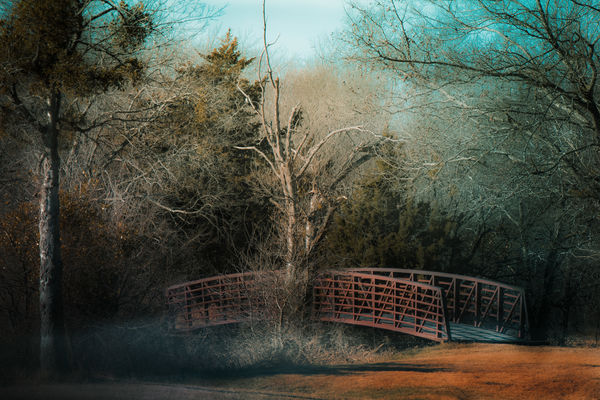
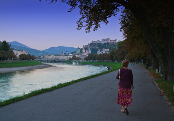
I was amused to discover that my below #1 image, originally edited with a heavy dose of Topaz Simplify, could be further adjusted to give a tiny nod to Kinkade's style. It doesn't have the strong directional source of light that #2 does (posted exactly as I had shared on UHH a few years ago) but #2 needs a fawn wandering into the scene.
I'm going to have to give more thought to why I dislike Kinkade's style even though some of my landscape photos have similar touches and influences. It could be as simple as I just like photographs better than paintings and that I'm strongly attracted to nature's beauty. Thanks so much for this stimulating topic, Minnie!
As for color landscapes, just a couple of days ago I read a comment in an older topic on UHH: "Outdoor light is outdoor light." OY VEY - could any statement be further from the reality
I was amused to discover that my below #1 image, originally edited with a heavy dose of Topaz Simplify, could be further adjusted to give a tiny nod to Kinkade's style. It doesn't have the strong directional source of light that #2 does (posted exactly as I had shared on UHH a few years ago) but #2 needs a fawn wandering into the scene.
I'm going to have to give more thought to why I dislike Kinkade's style even though some of my landscape photos have similar touches and influences. It could be as simple as I just like photographs better than paintings and that I'm strongly attracted to nature's beauty. Thanks so much for this stimulating topic, Minnie!
Jul 2, 2019 09:32:38 #
robertjerl wrote:
I took the time to skim those links while eating a... (show quote)
Thanks for coming back by with some really good information, a provocative summation of his life/death/work, and a cool image. Like you, I often edit images to get a painterly look that isn’t very different from the description he provides. I will post one of mine too. I hope you’ll come back and tell us about the movie when you’ve had a chance to review it.
Jul 2, 2019 09:35:29 #
kenievans wrote:
I have never been a really big fan of Kinkades work. I dont dislike it and I think he is talented but I find it to be too Hallmark greeting cardish without a lot of substance. Its cotton candy art. It doesn't fill me up.
Thanks for dropping by Kenzie. I confess that I have always had a “too-sweet-to-eat” feeling about his work, too. After spending some time on the subject to do this post, I am now willing to confess that I have indulged in some of the techniques he describes in my own work. Maybe it’s a matter of degree? Dunno, I’ll keep thinking about it.
Jul 2, 2019 09:37:43 #
RichardTaylor wrote:
I like his work and have done so since the late 19... (show quote)
Thanks Richard, for a thoughtful and honest response. One of the freedoms more accessible to traditional artists than to photographers is the license to depart from realism more readily. There is still that school of response to any photographic enhancement as “cheating”. I cheat all the time.
Jul 2, 2019 09:40:06 #
Linda From Maine wrote:
I enjoyed skimming the articles and reading the co... (show quote)
Thanks Linda for an in depth response. I love your posted images and I relate to your last paragraph. I am wondering the same: why my aversion to Kinkade, when I use the same techniques? I am still ruminating on that. Will get back to this topic later.
Jul 2, 2019 09:59:06 #

I was sitting in a discussion group of artists led by a gallery owner, and the mention of Kinkade brought out a flurry of negative comments. Most thought he was "cheesy" and not particularly good. The gallery owner then asked why he was so successful. Obviously, he had a really good marketing plan! But besides that, he developed a "look" that is his. Having a particular style that is somehow unique is a desirable thing, according to the gallery owner.
I admit to liking Kinkade's pictures, but not as paintings. His scenes are idyllic, which is nice, but a bit too busy for my taste. But I do love them when doing the jigsaw puzzles! I do like this particular painting - not so much for the quality of the painting, but for the scene it implies. I'd love to be there! And that, I think, is the attraction for most of his works: I'd really like to be there. And I really like how he handled the light. I wouldn't copy his style, as it's a bit too soft and dreamy for my taste. But I admire that he perfected it and stayed true to it. He found something that worked for him. I think we'd all be better at our craft if we did likewise.
I admit to liking Kinkade's pictures, but not as paintings. His scenes are idyllic, which is nice, but a bit too busy for my taste. But I do love them when doing the jigsaw puzzles! I do like this particular painting - not so much for the quality of the painting, but for the scene it implies. I'd love to be there! And that, I think, is the attraction for most of his works: I'd really like to be there. And I really like how he handled the light. I wouldn't copy his style, as it's a bit too soft and dreamy for my taste. But I admire that he perfected it and stayed true to it. He found something that worked for him. I think we'd all be better at our craft if we did likewise.
Jul 2, 2019 10:21:24 #
In a mind meld moment, I emailed Minnie that I had suddenly realized how often I use painterly pp at the same time she was writing that very thing to Robert.
Then I found four of Kinkade's I'd actually put on my wall! They are Maui Gardens, Eternal Springtime, A Walk Down Autumn Lane and Autumn Snow. These are not only free of the kitschy and fantasy elements (sooo many in some of his works), but are very similar to scenes I have experienced and photographed. AzPicLady mentions the paintings make her want to be there; that's a key point too.
I can see why his name would often be associated with "cheesy" as AzPicLady just wrote. Those kitschy works stick in your mind just like melting candy would stick to your fingers
Jul 2, 2019 10:51:19 #
kenievans
Loc: Dallas
minniev wrote:
Thanks for dropping by Kenzie. I confess that I have always had a “too-sweet-to-eat” feeling about his work, too. After spending some time on the subject to do this post, I am now willing to confess that I have indulged in some of the techniques he describes in my own work. Maybe it’s a matter of degree? Dunno, I’ll keep thinking about it.
Minnie I use some of his techniques as well. I learned it from Linda From Maine. It's all her fault!

I think there definitely is a place for it. I used it a lot more when I first started trying to be creative with my post processing but the more I learn and create I find that I am not as heavy handed with it. I still like a soft look, depending on the subject but I don't think it works with everything I do and I would get pretty bored doing the same thing over and over.
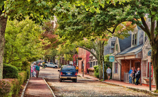
Here is one of my landscapes that I think comes the closest to his style.
Mostly his work just doesn't move me. On the other hand Rockwell speaks to me. His work brings a warmth in my chest and makes me smile. Probably because for me it brings back many childhood memories having grown up with a large, red headed, freckle faced, conservative, rural family.
Jul 2, 2019 11:12:16 #
minniev wrote:
Thanks Richard, for a thoughtful and honest response. One of the freedoms more accessible to traditional artists than to photographers is the license to depart from realism more readily. There is still that school of response to any photographic enhancement as “cheating”. I cheat all the time.
So do I.
How far away from 'realism" are B&W images, especially B&W landscapes?
Here are a couple of mine that are a nod to Thomas Kincade.
Mostly it is just PPing the original raw files, however the second one has a big dose of of Topaz Adjust (a HDR preset).
.
If you want to reply, then register here. Registration is free and your account is created instantly, so you can post right away.