Light And Shadow
May 13, 2019 09:39:48 #

kenievans wrote:
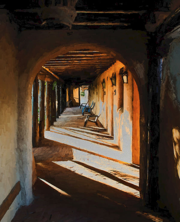
This is the Sage Brush Inn in Taos NM. We were returning to our room after dinner when I saw this scene. I hurried to my room to grab my camera. I was very happy with how it turned out. I think I captured the warmth of the light and the sense of peacefulness I saw. Your comments and thoughts are appreciated.
Kenie, You have a good eye sir!
I hope you don't mind my messing with your image. It has and old masters kind of look and I couldn't resist. As Linda said the bright areas of the walls needed to come down a bit and like Jim said the shadows needed to come up although this version doesn't bring them as far. The very bright area in the top right bothered me the most so it got filled to darken it while retaining some texture. Speaking of texture I like the choice of canvas. As a final step, I had my barber take a little off the top
May 13, 2019 11:53:50 #
IDguy
Loc: Idaho
Jim-Pops wrote:
I don't mind the white area after my edit. I lowered the Highlights that improved that area then opened up the shadows moving slider all the way. All of a sudden I saw so much of the texture on the walls them gave the picture additional impact.
I agree and like the edit. The white area no longer distracts because it isn’t surrounded by black.
May 13, 2019 12:06:04 #
May 13, 2019 12:07:31 #
kenievans
Loc: Dallas
dennis2146 wrote:
I really like the photo. Very well done.
Dennis
Dennis
Thank you Dennis. Sometimes the photo gods hand you a good one and other times they make you work for it.

May 13, 2019 12:15:52 #
kenievans
Loc: Dallas
Rich1939 wrote:
Kenie, You have a good eye sir! br I hope you don'... (show quote)
I am happy for anyone to take a shot at any of my images. I was looking through Topaz for a texture or something to give it that old master look as you called it. I went with a Edward Degas filter. While the subject matter is not a typical Degas, the style really fit. Both you and Jim brought out more of the style and I like both approaches. As Linda hinted I have been leaning toward being Elvira Mistress of the Dark here lately.

May 13, 2019 19:10:26 #

Unlike other views I like the contrast of the lighting. If it was mine I would not change a thing.
May 16, 2019 10:17:12 #

kenievans wrote:
This is the Sage Brush Inn in Taos NM. We were returning to our room after dinner when I saw this scene. I hurried to my room to grab my camera. I was very happy with how it turned out. I think I captured the warmth of the light and the sense of peacefulness I saw. Your comments and thoughts are appreciated.
What I love about this photo is that I can "feel" the heat (so I wouldn't clone out the white on the right side) and the adobe. Please don't take offense when I say that I think this is a bit over-saturated - in this case the pp really works. The chair adds just the right bit of extra color to the scene.
If the photo were mine, I'd cut out the extreme right side because it distracts my eye from looking through the doorway. Otherwise, I think it's one fine photo!
May 16, 2019 12:15:41 #
kenievans
Loc: Dallas
ediesaul wrote:
What I love about this photo is that I can "feel" the heat (so I wouldn't clone out the white on the right side) and the adobe. Please don't take offense when I say that I think this is a bit over-saturated - in this case the pp really works. The chair adds just the right bit of extra color to the scene.
If the photo were mine, I'd cut out the extreme right side because it distracts my eye from looking through the doorway. Otherwise, I think it's one fine photo!
If the photo were mine, I'd cut out the extreme right side because it distracts my eye from looking through the doorway. Otherwise, I think it's one fine photo!
Thank you Edie. I am glad you enjoyed it and I never take offense. We all have our own tastes and opinions about art. I agree that the chairs do make the scene. I don't think it would have worked without them.
May 17, 2019 12:21:25 #
kenievans wrote:
This is the Sage Brush Inn in Taos NM. We were returning to our room after dinner when I saw this scene. I hurried to my room to grab my camera. I was very happy with how it turned out. I think I captured the warmth of the light and the sense of peacefulness I saw. Your comments and thoughts are appreciated.
There are some bright spots that don't show much detail. This is contrasted with some areas of very deep shadow. I'd think that this scene ,with a very high dynamic range, would benefit from bracketing and then a merge of the exposures in LR. From your intro to the photo, though, I'm gathering that you did not have the time to set up a tripod for this shot. So, maybe some burning of the bright areas?
The composition is excellent. I love that we are standing in a dark area and peering out into the evening sun (considering the location this evening sun is still quite bright). The composition is the highlight of this photo. Well done.
Erich
If you want to reply, then register here. Registration is free and your account is created instantly, so you can post right away.