Cat in the Hat
Mar 9, 2019 09:14:48 #

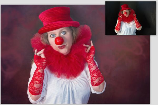
I have been a fan of Kelly Robitaille since I discovered her work years ago...this is my first time trying to put together my take on her style. I love her whimsical, dramatic, creative style. I thought about sharing the original and inviting others to try but I was so excited to try the edit that I couldnt wait. I plan to do a series...I have some other ideas in mind.
Please share your thoughts, especially if you see something I can improve. I tried the frequency separation method and I can never figure out the texture part. Also, dodging and burning pointers would be helpful for more of a painterly look.
Please share your thoughts, especially if you see something I can improve. I tried the frequency separation method and I can never figure out the texture part. Also, dodging and burning pointers would be helpful for more of a painterly look.
Mar 9, 2019 10:06:13 #
Mar 9, 2019 11:28:56 #

This is so much fun! Who is the model?
I'm not familiar with "frequency separation," so I'd like to hear more from you or others on that tool/technique.
Looking closely, there are just a couple of issues:
1. center below the collar, a few sharp lines - one in white, two in pink (from cloning?)
2. left and right side of hat needs better blending - is that the dodge/burn you mentioned? We had a share topic recently on dodge/burn, but I can't recall if it was mentioned as a way to paint in a different color. Let's talk
Mar 9, 2019 12:15:07 #
kenievans
Loc: Dallas
I like what you did with this and would appreciate hearing more about frequency separation as well.
Mar 9, 2019 22:26:25 #
AZNikon wrote:
Wow-those eyes make the shot! 
Thank you! I do think the focus in most if not all of her shots are the eyes and what I really like about her work, I spent a lot of time with the eyes.
Mar 9, 2019 22:41:27 #
Linda From Maine wrote:
This is so much fun! Who is the model? br br I'm ... (show quote)
Thank you, I had a lot of fun with the whole process. So I have a small collection of crazy hats and have had this series in my head for a while. Recently discovered Robitaille had put a video collection together walking you through her process and I could not resist. The two, my series idea with the hats and her training videos came together in the image you see here. Model = yours truly. I pre focused my camera set up on a tripod and snapped a dozen images, looking and tweaking until I got something I felt I could work with.
My image lacks proper frequency separation and dodge and burning. I really didnt pull off the painterly part very well. It is a two layer process that preserves details in the texture layer but allows blurring and color corrections on the blur layer? I hope that is correct. It never works for me the way it is supposed to. I also tried to dodge and burn but failed that process as well, it wasnt working the way it was supposed to.
Good eye on the catches! I saw the first spot you mentioned just after uploading. I will go back and see if I can repair. I took a piece of the red collar and blended it over the v-neck of the shirt and missed some clean up. Around the hat is where I brought in texture and changed the background. I think my brush was too soft and I should have used a harder one to allow me to get tight up against the hat.
I need to go back and watch the training videos a few more times to see if I can understand the painting process better. Frequency separation and dodge and burn techniques are covered quite well on youtube, etc.
Mar 9, 2019 23:15:14 #
A few good videos on Frequency Separation:
www.youtube.com/watch?v=Z8mnzVNaiD0
www.youtube.com/watch?v=kfiUuxjwq3Y
www.youtube.com/watch?v=MJFYTBsX9Q4&t=0s&list=PLWbPgB-WtnKFh5Jgk3gWhCmh-5ScC-Jxg&index=7
www.youtube.com/watch?v=Z8mnzVNaiD0
www.youtube.com/watch?v=kfiUuxjwq3Y
www.youtube.com/watch?v=MJFYTBsX9Q4&t=0s&list=PLWbPgB-WtnKFh5Jgk3gWhCmh-5ScC-Jxg&index=7
Mar 10, 2019 00:32:09 #
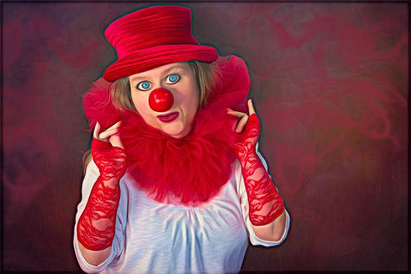
A little closer to the painterly whimsical dramatic fantasy I was going for.
Mar 10, 2019 08:37:08 #
EyeShootWideOpen wrote:
Thanks for the additional information, Diane. This newest version is very vibrant and eye-catching. Like the background a lot!A little closer to the painterly whimsical dramatic fantasy I was going for.
Mar 10, 2019 09:07:27 #
Linda From Maine wrote:
Thanks for the additional information, Diane. This newest version is very vibrant and eye-catching. Like the background a lot!
Thanks Linda. I created the background with 2 different texture overlays on the original black. Then, I added on smoke overlays, added a color overlay to the smoke, used color picker on the hat to bring it into color harmony with the photo.
Mar 10, 2019 16:46:36 #

What a great start to your series. Love the colours and the pose. And don’t forget, many of the great masters posed for themselves, so you’re in good company! I have tried frequency separation - it’s definitely the ‘in thing’ in high-end photo retouching (whatever ‘high-end’ means). Aaron Nace at Phlearn.com will give you a free app to save the laborious part. I liked the result when I tried it. D&B does seem to be variable for me - sometimes pleased with it sometimes not, and I think it depends on the resolution of the image in question.
Looking forward to seeing more in your series. Well done ESWO.
Looking forward to seeing more in your series. Well done ESWO.
Mar 10, 2019 18:38:06 #
magnetoman wrote:
What a great start to your series. Love the colour... (show quote)
Thank you. This was spur of the moment, I did not have any options for my subject other than myself. My main objective here was to try the editing technique, which I was not expecting success on the first try at all but I surprised myself. I do have several of the free apps that set up the FS layers and I have watched Aaron Nace on many videos. I was thinking about it today and something clicked for me so I may have figured out what I was doing wrong. I will do some experimenting and see. I agree on D&B...I am not a painter and I think that would be a benefit in the case of D&B. I should probably be writing the ideas down for the series...they come to me at random and I have had several good ideas after finishing this image.

Mar 10, 2019 18:48:38 #
EyeShootWideOpen wrote:
Thank you. This was spur of the moment, I did not ... (show quote)
Writing down ideas, or rough sketches, is essential for me or I forget a really good idea I’m sure I had yesterday! I keep a notebook for jotting just such things, together with notes on methods I’ve learned on the net. It proves very useful.
Mar 10, 2019 21:00:31 #
EyeShootWideOpen wrote:
I have been a fan of Kelly Robitaille since I disc... (show quote)
Could this technique be used to remove tattoos?
Mar 10, 2019 22:40:18 #
magnetoman wrote:
Writing down ideas, or rough sketches, is essential for me or I forget a really good idea I’m sure I had yesterday! I keep a notebook for jotting just such things, together with notes on methods I’ve learned on the net. It proves very useful.
I often do the same but I am not quite as organised as you are at keeping the notes all together. Good idea!
If you want to reply, then register here. Registration is free and your account is created instantly, so you can post right away.