My Image Your Look: Diabaig Pier.
Feb 19, 2019 11:16:02 #

Jim-Pops wrote:
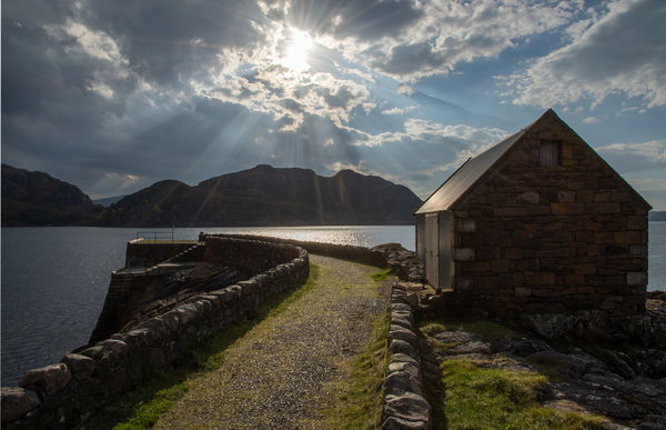
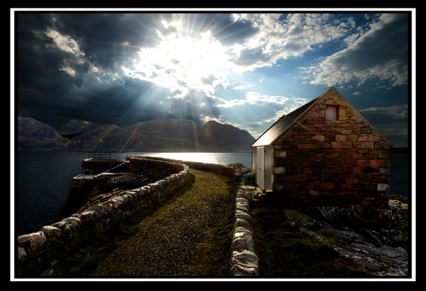
Beautiful serene picture, have not seen it before on your other post. Love it. Wanted to bring out the rock work on the building.
Thank you Jim-Pops. I knew some would go for bringing out the stonework and some would go for the silhouetted look.
Feb 19, 2019 11:19:57 #
AzPicLady wrote:
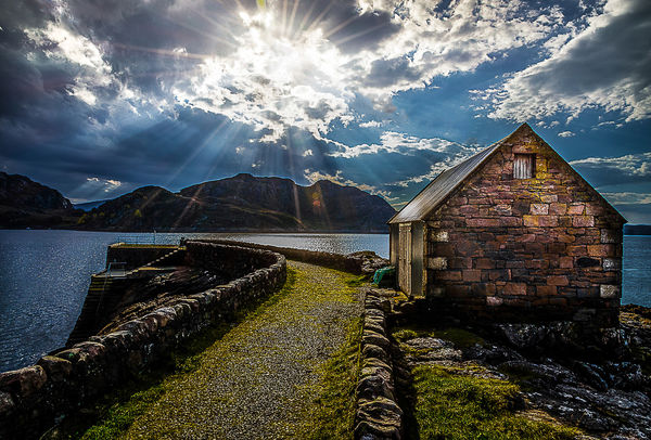
I wanted to save that rich detail in the sky and at least some of it in the shed. This was the best compromise I could get.
I knew some would find the stonework irresistible. You probably weren't the only one to find the sky un-tameable.
Feb 19, 2019 11:33:48 #
I should probably have included some technical details in the original post because it was the sort of situation that's going to push any camera's capabilities to its limits. I used exposure bracketing (+2, 0, -2) and exposure compensation set at -0.7. Since I was looking straight at a very bright sky and there were large shadowed areas in the foreground I suspected that the exposure bracketing on its own wouldn't be enough to save the highlights so I added the EC as a precaution.
I think I might eventually be getting a feel for my camera's capabilities because the final merge wasn't showing any blown highlights. The good thing about exposure bracketing is that it gives you a fair bit of wiggle room where exposure is concerned. I knew that if the final merge was under-exposed the file would take a fair bit of brightening (if that's what I wanted. In my own edit I left it quite dark). For normal exposures I usually add EC of 0.3 because I know that in more normal circumstances the bracketing will keep the highlights safe.
I think I might eventually be getting a feel for my camera's capabilities because the final merge wasn't showing any blown highlights. The good thing about exposure bracketing is that it gives you a fair bit of wiggle room where exposure is concerned. I knew that if the final merge was under-exposed the file would take a fair bit of brightening (if that's what I wanted. In my own edit I left it quite dark). For normal exposures I usually add EC of 0.3 because I know that in more normal circumstances the bracketing will keep the highlights safe.
Feb 19, 2019 16:43:05 #

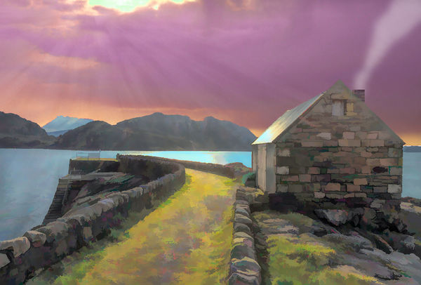
I thought about just removing the power line from your posted picture but then I started playing with the picture.
Feb 19, 2019 19:56:09 #

It appears we all have the same ideas. I just took out some distracting objects and played with the shades.
Feb 20, 2019 01:12:18 #
SoHillGuy wrote:
I thought about just removing the power line from your posted picture but then I started playing with the picture.
An interesting flight of the imagination, SHG. Nice painterly effect.
Feb 20, 2019 01:20:24 #
UTMike wrote:
It appears we all have the same ideas. I just took out some distracting objects and played with the shades.
It's all about bringing out the look that we think is most appropriate, and we all have our own ways of doing that. It looks like your subtle adjustments have got it where you wanted it to be.
Feb 20, 2019 16:20:50 #

Chose to lighten up a few areas very much like others, loved the stonework on the building!
R.G. wrote:
I posted my own edit of this one a while back and ... (show quote)
Feb 20, 2019 16:30:35 #

Feb 21, 2019 00:56:10 #
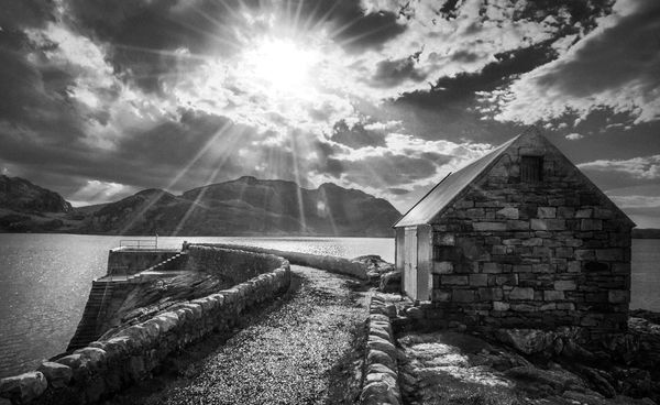
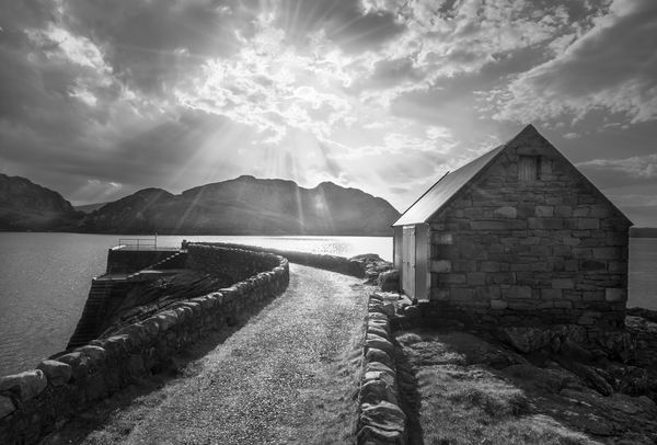
For me, this one begged for B&W since there wasn't a lot of color. I was interested in the tones and textures.
Feb 21, 2019 10:16:27 #

I am late to the party but not too late I too finally decided on B/W. It was a wonderful shot to work on.
Feb 21, 2019 10:36:46 #
deer2ker wrote:
Chose to lighten up a few areas very much like others, loved the stonework on the building!
Thanks for joining in, Fawn. I like the "printed on metal" look.
Feb 21, 2019 10:38:06 #
SalvageDiver wrote:
For me, this one begged for B&W since there wasn't a lot of color. I was interested in the tones and textures.
Nicely handled, SD.
Feb 21, 2019 10:39:08 #
NJFrank wrote:
I am late to the party but not too late I too finally decided on B/W. It was a wonderful shot to work on.
Thank you Frank. B&W has a way of bringing out any drama that's there.
Feb 21, 2019 12:00:40 #

If you want to reply, then register here. Registration is free and your account is created instantly, so you can post right away.