Portrait of a Racehorse (Color or B&W?)
Dec 11, 2018 11:31:40 #

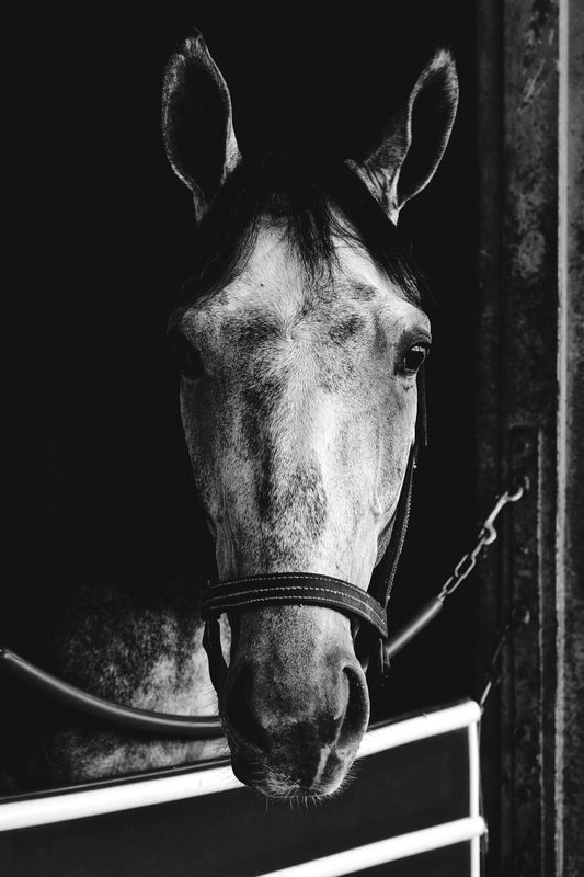
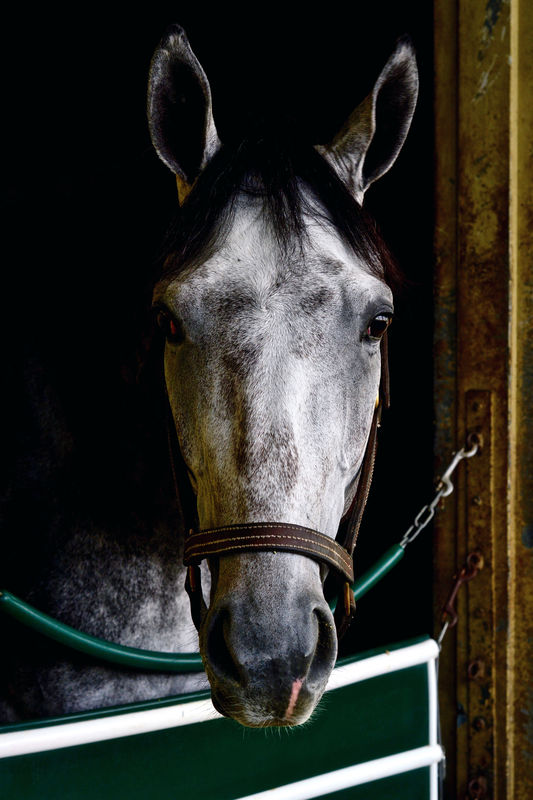
This photo was taken at Belmont Racetrack in trainer Gary Contessa’s stable. I was wondering which rendition you think is better?
ISO 500 - 50mm - f/7.1 - 1/160 sec.
Additional critique, comments and suggestions always welcomed. Thanks
Select download for additional resolution.
If you wish to read about Belmont Park it is here https://en.wikipedia.org/wiki/Belmont_Park
ISO 500 - 50mm - f/7.1 - 1/160 sec.
Additional critique, comments and suggestions always welcomed. Thanks
Select download for additional resolution.
If you wish to read about Belmont Park it is here https://en.wikipedia.org/wiki/Belmont_Park
Dec 11, 2018 11:36:14 #

Bmac wrote:
This photo was taken at Belmont Racetrack in trainer Gary Contessa’s stable. I was wondering which rendition you think is better?
ISO 500 - 50mm - f/7.1 - 1/160 sec.
Additional critique, comments and suggestions always welcomed. Thanks
Select download for additional resolution.
If you wish to read about Belmont Park it is here https://en.wikipedia.org/wiki/Belmont_Park
ISO 500 - 50mm - f/7.1 - 1/160 sec.
Additional critique, comments and suggestions always welcomed. Thanks
Select download for additional resolution.
If you wish to read about Belmont Park it is here https://en.wikipedia.org/wiki/Belmont_Park
I like them both nicely done.
Dec 11, 2018 11:42:31 #
RichardSM wrote:
I like them both nicely done.
Thank you for looking and commenting Richard.
Dec 11, 2018 11:52:21 #

I like the HORSE in both, but the white gate needs to be burnt down in either as my eye goes right to that brightest area and not stay on the horse. Also the green is distracting in the color image. I'd replace it with a neutral blue-gray or faint yellowish off-white.
Dec 11, 2018 11:53:29 #
WIZARDofJOZ
Loc: Midwest
For my taste, I like the color. Adds a bit of life to the photo.
The first seems to have too much black/dark - but like the "pose".
The first seems to have too much black/dark - but like the "pose".
Dec 11, 2018 12:04:52 #
lamiaceae wrote:
I like the HORSE in both, but the white gate needs to be burnt down in either as my eye goes right to that brightest area and not stay on the horse. Also the green is distracting in the color image. I'd replace it with a neutral blue-gray or faint yellowish off-white.
Thanks Mike, good suggestions.
Dec 11, 2018 12:06:37 #
WIZARDofJOZ wrote:
For my taste, I like the color. Adds a bit of life to the photo.
The first seems to have too much black/dark - but like the "pose".
The first seems to have too much black/dark - but like the "pose".
Thanks for viewing and commenting Wizard. One for the color.
Dec 11, 2018 12:29:36 #
Bmac wrote:
This photo was taken at Belmont Racetrack in trainer Gary Contessa’s stable. I was wondering which rendition you think is better?
ISO 500 - 50mm - f/7.1 - 1/160 sec.
Additional critique, comments and suggestions always welcomed. Thanks
Select download for additional resolution.
If you wish to read about Belmont Park it is here https://en.wikipedia.org/wiki/Belmont_Park
ISO 500 - 50mm - f/7.1 - 1/160 sec.
Additional critique, comments and suggestions always welcomed. Thanks
Select download for additional resolution.
If you wish to read about Belmont Park it is here https://en.wikipedia.org/wiki/Belmont_Park
The photo is very nice in both formats. My preference would lean towards the color, as the horse is already "black and white", and the color in the bridle and the stall highlight that. If the horse had been another color, I may have preferred the black and white. Beauty is in the eyes of the beholder, but both are very well done.
Dec 11, 2018 12:30:45 #

Dec 11, 2018 12:32:14 #
orrie smith wrote:
The photo is very nice in both formats. My preference would lean towards the color, as the horse is already "black and white", and the color in the bridle and the stall highlight that. If the horse had been another color, I may have preferred the black and white. Beauty is in the eyes of the beholder, but both are very well done.
Thank you for opining Orrie.
Dec 11, 2018 12:33:49 #
angler wrote:
Colour for me Bmac,lovely shot.
Looks like three color, zero black. Thanks for commenting Jim.
Dec 11, 2018 13:17:22 #
Another for the color, which helps to recognize the subtle horse coloring, etc.
Dec 11, 2018 13:47:09 #

I like the B&W..the color one doesn't have enough color to make a difference...I would do some selective dodging on the horses right side, and some burning on the white trim to tame it down..good shot!
Dec 11, 2018 16:54:54 #

Both, but I prefer the color. The earthy colors seem to bring the portrait to life. 
Dec 11, 2018 17:41:06 #
If you want to reply, then register here. Registration is free and your account is created instantly, so you can post right away.