The value (or distraction) of virtual mats and frames
Dec 11, 2018 16:12:53 #
Linda From Maine wrote:
You are obviously very passionate about what you wrote earlier (hopefully, you don't suggest someone is stupid every time a comment is made that you disagree with), but there's really no need to shout. We hear you just fine.
Wasn't shouting, merely emphasizing so that the forum police could catch the drift. I never suggested anyone was stupid. I said they were just short of stupid. Don't rewrite my posts. Around here, we leave that to Faux News.
Thank you and have a Christmas.
Dec 11, 2018 17:15:24 #
Tomcat5133
Loc: Gladwyne PA
Staight answer Linda photos here uploaded should just be the picture period. Display art
has all forms of presentation methods. I was at Art Basil Miami the other day and was surprised
How much I like images on aluminum. Photo exhibitions are mounted with a mat size varies.
I think it matters to the viewer. A white mat on a artistic B&W photo is the right choice.
Some very large color art works at Basil we’re borderless which looked right.
Dec 11, 2018 17:23:52 #

Tinwhistle and Tom, appreciate your taking the time to offer your viewpoints.
Dec 11, 2018 17:32:11 #

Tom Daniels wrote:
Staight answer Linda photos here uploaded should just be the picture period. Display art
has all forms of presentation methods. I was at Art Basil Miami the other day and was surprised
How much I like images on aluminum. Photo exhibitions are mounted with a mat size varies.
I think it matters to the viewer. A white mat on a artistic B&W photo is the right choice.
Some very large color art works at Basil we’re borderless which looked right.
has all forms of presentation methods. I was at Art Basil Miami the other day and was surprised
How much I like images on aluminum. Photo exhibitions are mounted with a mat size varies.
I think it matters to the viewer. A white mat on a artistic B&W photo is the right choice.
Some very large color art works at Basil we’re borderless which looked right.
I think its up to the uploader to make a choice to use a mat or not, However one word triptych. In this case some form of matting is necessary.
It really is an individual choice, otherwise and while opinions differ, it is up to the photographer to make that call.
Dec 11, 2018 19:18:32 #
artBob wrote:
Depends on the audience. "Serious" photo... (show quote)
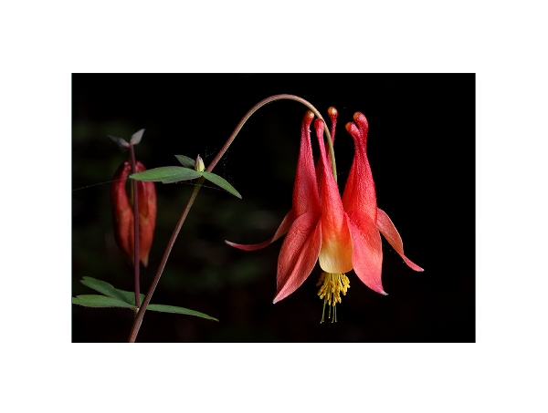
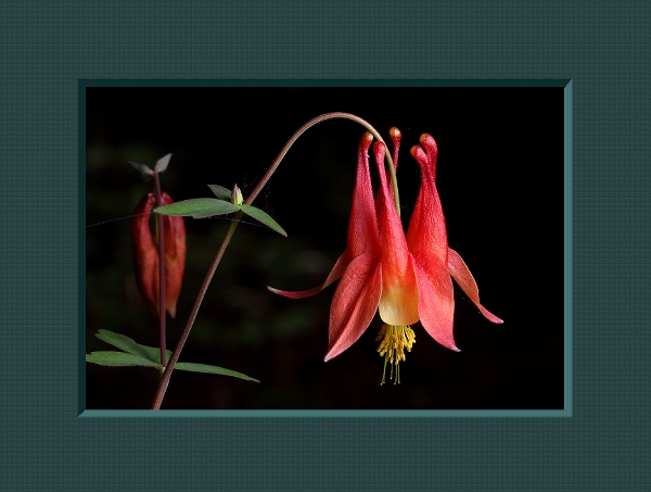
Here is an image with a couple of different digital mat treatments. Should I go back to work on the image, or are the mats distracting, or am I not serious? Or perhaps might this example be an exception to your rigid rules?
Mike
Dec 11, 2018 19:22:01 #
sbohne wrote:
Wasn't shouting, merely emphasizing so that the forum police could catch the drift. I never suggested anyone was stupid. I said they were just short of stupid. Don't rewrite my posts. Around here, we leave that to Faux News.
Thank you and have a Christmas.
Thank you and have a Christmas.
Welcome aboard, fellow Michigander. Using caps lock is generally interpreted as shouting online.
"Just short of stupid?" OK. I think you are being just short of obnoxious. No problem, right?

Again, welcome to UHH.
Mike
Dec 11, 2018 19:22:52 #

When the mat is very large, as in your two examples, the mat competes with the image, and in fact becomes a major part of the presentation. IMHO the purpose of the frame/mat should be to separate the image from a similar color background, or to direct the viewers's vision into the frame.
Linda From Maine wrote:
Recently in both For Your Consideration and Landsc... (show quote)
Dec 11, 2018 19:23:44 #
wham121736 wrote:
Thanks for your input!When the mat is very large, as in your two examples, the mat competes with the image, and in fact becomes a major part of the presentation. IMHO the purpose of the frame/mat should be to separate the image from a similar color background, or to direct the viewers's vision into the frame.
Dec 11, 2018 19:24:16 #

Blenheim Orange wrote:
Welcome aboard, fellow Michigander. Using caps lock is generally interpreted as shouting online.
"Just short of stupid?" OK. I think you are being just short of obnoxious. No problem, right?
Again, welcome to UHH.
Mike
"Just short of stupid?" OK. I think you are being just short of obnoxious. No problem, right?
Again, welcome to UHH.
Mike

Dec 11, 2018 19:27:26 #
In these examples the bright mat in #1, because of its visual weight and brightness, draws my eye away from what is clearly the subject. I would prefer #2 with just a very small frame to keep the viewers gaze only on the flower.
Blenheim Orange wrote:
Here is an image with a couple of different digital mat treatments. Should I go back to work on the image, or are the mats distracting, or am I not serious? Or perhaps might this example be an exception to your rigid rules?
Mike
Mike
Dec 11, 2018 19:55:36 #
wham121736 wrote:
I agree on all points. Obviously that doesn't mean that the photographer shouldn't do as he/she prefers, but it's good to remember that viewers may not see the presentation in the same way that the creator does. All part of the sharing experience!In these examples the bright mat in #1, because of its visual weight and brightness, draws my eye away from what is clearly the subject. I would prefer #2 with just a very small frame to keep the viewers gaze only on the flower.
Mike, the photo itself is exquisite.
Dec 11, 2018 20:34:13 #

Agree.
wham121736 wrote:
When the mat is very large, as in your two examples, the mat competes with the image, and in fact becomes a major part of the presentation. IMHO the purpose of the frame/mat should be to separate the image from a similar color background, or to direct the viewers's vision into the frame.
Dec 11, 2018 21:18:00 #

In the particular (beautiful, by the way) image just posted, the black mat works for me. The white one is jarring. Even narrower white wouldn't be my choice.
Dec 11, 2018 21:25:27 #

I don't think there needs to be a strict rule or protocol, on the forum, as to posting images with or withou mattes (virtual or physical) or frames unless the thread or section is dedicated to technical and aesthetic analysis or critiquing or some sort of competition. Perhaps the concept I alluded to in my previous post can be adopted whereby a virtual matte can be included but will be judged or critiqued as the matte is an intrinsic part of the composition.
Why discuss mattes, frames, display concepts adn such if the forum is ostensibly dedicated to "pure" photography" some might ask or argue. So here's my argument: I have nos statistics on the matter but I am guessing that most people, photography enthusiasts included, are viewing all their work and that of others on a monitor screen a laptop or a smartphone. Nothing terrible about that but there is a word of creative possibilities in some of the old fashioned concepts such as fine printmaking. When prints enter the equation then there are the concepts and craftsmanship of mounting, matting, framing, surface finishes, archival issues, specialized glazing and glass, signatures and watermarks, exhibition methods, display lighting, decorative aspects, plaque mounting and lamination and albums and books.
On this and many other online forumes and even in the photographic print media there are endless discussions about equipment, camera, lenses, high resolution, pixel counts post processing- fols are striving for super sharpness, extremely accurate color, ever maner of quality control and all of this for a computer screen image. I mean what are y'all gonna do with all theses superior images- store them on your hard drive, upload them to some kinda "cloud" or relegate them to a CD or DVD which will probably deteriorate in time- never again to be seen.
If you do decide to display prints, gift them to significant othere folks, create decor or sell them to clients or hang them in a gallery we should discuss all the elements that go into the finished final disposition of our images. Perhaps we shoud suggest YET another section dedicated to print making, finishing and presentation and display.
Signatures and watermarks. These issues have been controversial or at least debatable for a very long time- to sign or not to sign? What about so-called watermarks? What about credit lines?
Personally, I think artist shoud sign their work and I therefore had sign all of my portraits prints. Of course, the signature shoud not interfere with the composition, become a distraction and be careful place writer is not overly conspicuous bur readable from a reasonable viewing distance. The actual size of the signature shoud be proportionate to the size of the print. . I use india ink in tones or colors that are compatible with the key of the image and the colors or tones therein. For example, in a high key portrait the viewer's eye will go to the darkest tone in the image, which is usually the skin tone of the subject, there for a black signature would be distracting in that it would be darker than anythg in the composition. I oud use a very light gold or a pasted color that pick up in something in the image. In a low key portrait, the viewer's eye is attracted to the brightest tone in the imahe, therefore, a white, bright metallic, white or vivid color would draw the eye. I would then use a very dark antique gol, dark to medium gray or darker color ink that would coordinate with a subtle tone in the image. I have the same policy and methods for fine are work landscapes etc.
I usually avoid foil or gold stamping, although I have the equipment with several size slugs and various colors of foil. I reserve this for high quantity work- usually smaller prints. I prefer to do a hand signature.
Usually commercial work for publication or point of purchase displays, corporate and trade show displays (other than portraits) are not signed or watermarked. Some clients will permit a credit line.
Photographs enter into competition are usuan not signed or watermarked as per the rules. The judges are not supposed to know who the maker is until after the judging. The proints are identified on the back if the mount.
"Watermark" is a funny word- actually it is a kind of 'phantom" logo or trademark that is embedded on fine stationery that only can be seen when the paper is transilluminated or viewed at a certain angle to the light. In photography it is a trademark, credit line or copyright notice placed in the image, usually as notice of copyright (for protection) to purposely deface the image so it cannot be successfully copied or reproduced withou authorization. Photographer are certainly entitled to watermark there work for theses reasons.
Signing the matte? I don't know if there is any conventional, traditional or standard protocol for the question of whether to sign the print or the matte. I prefer to sign the print in that the matte is just a display component that can become separated from the photograph- it is tantamount to signing the picture frame.
I have ebb sining prints for many years and the only complaints I ever received from a client is whe I somehow forget to sign a print and it was returned to me for the signature.
Dec 11, 2018 21:34:51 #
E.L.. Shapiro wrote:
Much of interest to consider, Ed. Many thanks for your far-ranging information and for selflessly sharing your decades of experience, and most of all, for continuing to be a role model in how thoughtful adults should conduct themselves on a forum!I don't think there needs to be a strict rule or p... (show quote)
If you want to reply, then register here. Registration is free and your account is created instantly, so you can post right away.