B&W conversion
Nov 27, 2018 07:42:34 #
I like the color one best. It has more depth whereas the B&W flattens the scenery to ho-hum. IMO
Nov 27, 2018 07:50:00 #

CindyHouk wrote:
Good Morning Bill.....I have the NIK collection but didn't use it on this one...just used the various settings in LR. I will check out the high key presets and see what it looks like. Thanks for playing around with it and you should post the one you edited...I would like to see it!
This is just one of the high key presets.
Nov 27, 2018 08:49:43 #
They're both very nice although I'm always partial to B&W. Personally, I would decrease the shadows and lighten up the whole image just a bit to be able to better see details. Conversion from color to B&W is always fun to do. BYW - my old stomping grounds were the Gibsonia and Butler/Evans City areas.
Nov 27, 2018 09:48:32 #
Nov 27, 2018 10:36:08 #
Nov 27, 2018 10:39:06 #

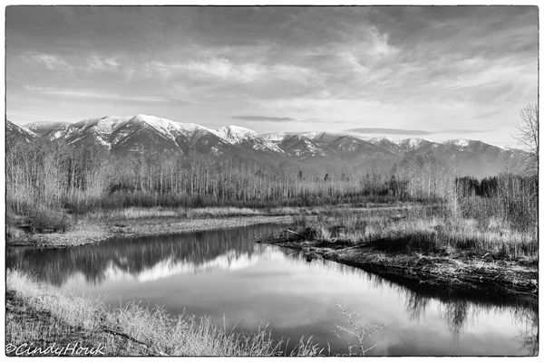
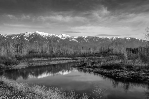
I hate to be the nay-sayer here, but I think this particular image isn't the greatest choice for conversion to B&W. The colours are great, and it's a really nice, inviting image. In colour. However, the particular colours here are of about the same density, so when translated to grey, they are about all the same shade. Consequently, the fact that there is a line of trees in front of the mountains is totally lost. As a B&W it lacks contrast and definition. Now perhaps that can be corrected, but as presented, I'd have to say the colour version is very nice but the B&W lacks interest.
Nov 27, 2018 10:41:24 #
First, let me say this is a beautiful scene, composed well. I love black and white photographs, and I applaud efforts to convert wonderful color scenes into equally wonderful black and white scenes. I have but one suggestion. Take a look at the area of the mountains below the snow, and above the trees. It forms a narrow band across the center of the photo. In the color version, that area has little tonal variation, but you can still see some. In the b&w conversion, that same area has a bit of a washed out, gray look to it. Even though our eyes are supposed to be attracted to the brighter areas of a photo, I could not help but look at that area, in the b&w version. The color version does not have the same effect on me.
Maybe you've tried this, already, and found that it didn't work, but I'll suggest this, anyway. The dehaze control, in LR, can sometimes help with areas like this. You do not have to dehaze the entire shot. That might not prove fruitful. You might try the adjustment brush, in that area, increasing the dehaze, just for that band. A little bit just might bring out some more detail in the color shot, which should do something for the b&w conversion.
Maybe you've tried this, already, and found that it didn't work, but I'll suggest this, anyway. The dehaze control, in LR, can sometimes help with areas like this. You do not have to dehaze the entire shot. That might not prove fruitful. You might try the adjustment brush, in that area, increasing the dehaze, just for that band. A little bit just might bring out some more detail in the color shot, which should do something for the b&w conversion.
Nov 27, 2018 11:08:53 #

Nov 27, 2018 11:19:38 #

Black and white images have been part of my photography for many years. I learned in the optical darkroom using b&w film and printing paper for that purpose and I was lucky to have two great tutors, one of them died a few years ago.
Today software makes possible what we could not even dream of when we were in the optical darkroom working with negatives.
I was taught about the importance of dodging and burning in, technics I still use with my conversions. In the "digital darkroom" we can do selective manipulations and that has contributed significantly to the improvement of our photography.
Your image is a very good one. I like to put some more contrast in my images and I understand that each one of us has his or her own taste. My definition of contrast easily could be totally different to what someone else calls contrast.
Modern conversion software are of excellent quality. I use Topaz B&W Effects II and I have enough parameters in the software to manipulate the image to my taste. Other conversion softwares are similar in quality. I am not familiar with Lightroom.
If indeed you are interested in converting images buy a book on b&w digital photography that will prove to be a great investment. The book could teach you more than we can here with our opinions.
Nov 27, 2018 11:23:47 #

CindyHouk wrote:
Been practicing converting color to b&w....which do you like better - the color or the b&w? And what can I do to make the b&w better? Edited in Lightroom. Along the Flathead River with the Columbia Mountain range, Kalispell MT
Cindy,
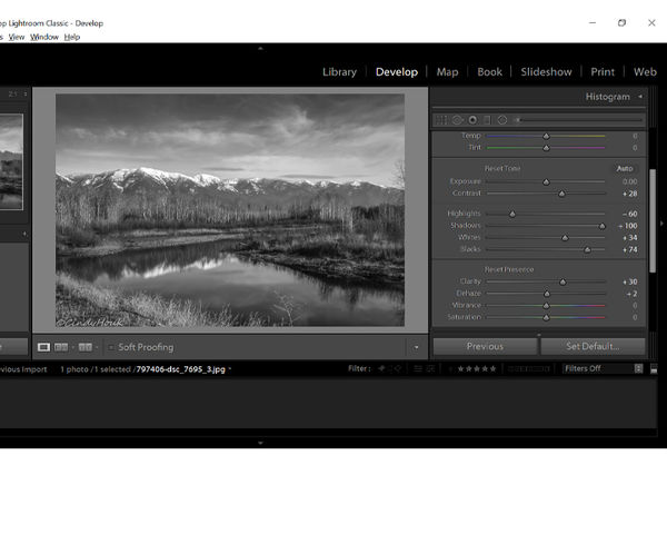
I really like your shot. I think if you open up the shadows you would like it a lot more. Since you asked what you could do here is a suggestion. I opened the shadows, and increased the contrast a little. I will post the results below and a screen shot of the changes. I also tilted it slightly to the left to straighten up the trees. I to did all the adjustments in Lightroom.
Dave
Nov 27, 2018 11:57:54 #

Nov 27, 2018 12:25:40 #

Anvil wrote:
First, let me say this is a beautiful scene, compo... (show quote)
Thanks Anvil! and no I didn't try the dehaze but I will! I really appreciate the suggestions...good and bad...it all helps me get better! I have only been at this photography game for about 3 years so there is still so much to learn.
Nov 27, 2018 12:26:40 #
Dave.Largent wrote:
Cindy,
I really like your shot. I think if you open up the shadows you would like it a lot more. Since you asked what you could do here is a suggestion. I opened the shadows, and increased the contrast a little. I will post the results below and a screen shot of the changes. I also tilted it slightly to the left to straighten up the trees. I to did all the adjustments in Lightroom.
Dave
Thanks Dave....I really like how you edited it and so glad you posted a shot of the changes...now I will go back and play some more!
Nov 27, 2018 12:27:42 #
Bill_de wrote:
This is just one of the high key presets.
Thanks for posting the edit Bill....that one really brought up the shadows....I will definitely be playing later tonight with the image to see what else I can do!
Nov 27, 2018 12:28:42 #
SueScott wrote:
They're both very nice although I'm always partial to B&W. Personally, I would decrease the shadows and lighten up the whole image just a bit to be able to better see details. Conversion from color to B&W is always fun to do. BYW - my old stomping grounds were the Gibsonia and Butler/Evans City areas.
Thanks SueScott for the suggestions and I know your old stomping grounds well!!
If you want to reply, then register here. Registration is free and your account is created instantly, so you can post right away.