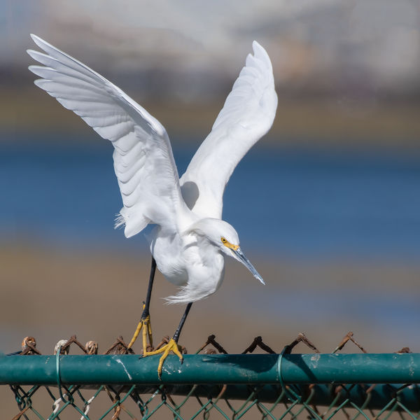
#1 or #2...l like them both
Nov 14, 2018 16:39:38 #
Edie,
I know. It's a problem...do I want a picture that's unbalanced or that has an ugly fence in the foreground. Unbalanced photos drive me crazy, and the fence was there in reality. Since you weren't there, you don't have that image in your mind...I guess I do and so maybe I'm more forgiving in my previsualized image having a fence in it. I don't have a good solution except to comp in some other foreground, and I really don't like that idea. I guess the solution would be to take a better picture in the first place. I enjoy this conversation and appreciate your thoughts. Thanks.
jak
Nov 14, 2018 19:54:55 #

jak86094 wrote:
Which do you prefer? This is the same bird as par... (show quote)
Beautiful clear shots. My choice would be #1 -- I don't like the juxtaposition of the beak and the fence in the second shot.
Nov 14, 2018 20:27:04 #

I guess I don't find the picture unbalanced. Rather, the horizontal bar anchors the bird. My own taste chooses not to have the ugly fence. But, in the end, the image is yours and your vision must prevail because you alone must be happy with it.
Nov 14, 2018 21:01:59 #
ediesaul wrote:
I guess I don't find the picture unbalanced. Rather, the horizontal bar anchors the bird. My own taste chooses not to have the ugly fence. But, in the end, the image is yours and your vision must prevail because you alone must be happy with it.
That's part of the fun of photography...having different visions and being able to realize them...or not. I took a shot at PP of #1, applying many of your suggestions, but including my preferences. See below.
jak
Nov 15, 2018 09:12:22 #
jak86094 wrote:
That's part of the fun of photography...having different visions and being able to realize them...or not. I took a shot at PP of #1, applying many of your suggestions, but including my preferences. See below.
jak
jak
Wow! I like it!!!
Nov 15, 2018 11:13:33 #
ediesaul wrote:
Wow! I like it!!!
Thanks, that’s high praise. I appreciate your thoughts and suggestions, but even more, I appreciate the chance to compare our ideas and, hopefully, create a better photo. It was fun and productive. Thanks again.
jak
Nov 16, 2018 10:03:49 #
allanj wrote:
I prefer #1 if most of the fence is cropped out.
To expand the sky above #1 first expand the canvas size above the image. Then edit, fill , content aware. To avoid a sharp line where the old and new regions meet expand the added area 1 or 2 pixels before filling. This is an abbreviated explanation but should give you enough info to search for instructions on using comtent aware full.
Nov 17, 2018 10:17:53 #
Nov 18, 2018 20:14:56 #

Nov 18, 2018 20:24:37 #

I like Edie's edit. That's what I was going to suggest. She took out all the unnecessary fence which brings the focus to the bird, which is correct. I'm not sure if the rules in this section have changed but it's not considered good form to edit someone else's photo without getting permission first. That aside, I like the picture a lot better the way Edie did it.
If you want to reply, then register here. Registration is free and your account is created instantly, so you can post right away.