#1 or #2...l like them both
Nov 13, 2018 19:03:39 #
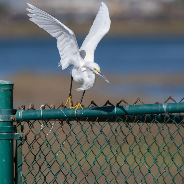
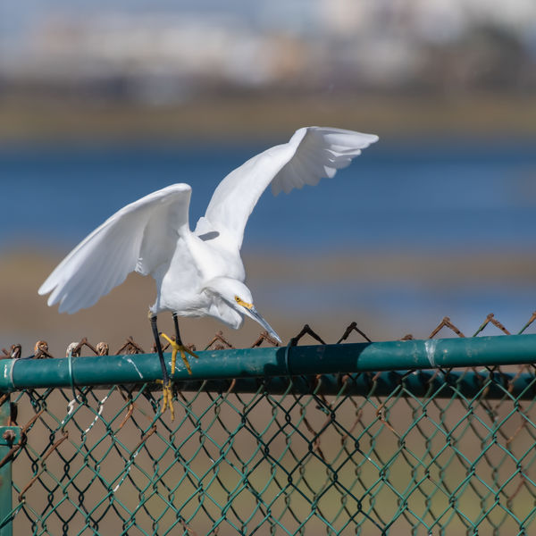
Which do you prefer? This is the same bird as part of a sequence as it flew from its fencetop perch. I love the position of the bird (wings, head, body and legs) in #1, but the wings are crowded at the top. Still, most of the subject, especially the point of focus on the face and eyes, is well within the frame so maybe this isn't too bad. I think the positioning of the wings, head, body and legs is also very elegant in #2, but not as nice as #1. There is more room around the subject, especially at the top. In both, there is room for the bird to fly into, so that's OK. So which do you think is best and why? Would you crop either differently or otherwise change the composition, post processing, etc.? I look forward to your comments and suggestions.
jak
_
jak
_
Nov 14, 2018 06:50:53 #

They're both pretty dynamic - My preference is 2, for that little bit extra.
Nov 14, 2018 08:05:36 #

I like #1 better.
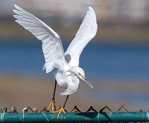
I cut out most of the areas around the bird in order to focus our eyes on the bird. I added some contrast and sharpened the photo a bit. I also straightened the bottom line (which one could do better). What I forgot to do, but still could be done in pp, is sharpen just the eye a bit more.
If this were my image, this is what I would have done.
Nov 14, 2018 08:36:19 #
They are both good. I like what ediesaul did with the crop, and if you choose #2, I would have the tendency to crop most of the white at the top off.
Nov 14, 2018 08:40:23 #

Nov 14, 2018 09:37:48 #
Nov 14, 2018 11:03:49 #
Edie,
Thanks for the input. The posted photo was SOOC, so it definitely needed some sharpening, etc. I like your edited version but think I would like a bit more space at the bottom...not all of the original, but space for the bird to drop/fly into.
I note that you expanded the area above the wingtips at the top of the frame. I assume you used content aware fill in PS to do that. I know you can expand the size of the frame and fill with content aware fill, but haven’t actually done it myself. How did you do it, or can you point me to a tutorial?
Too bad it has to be the chain link fencing and not something more photogenic. Thanks again.
Jak
Nov 14, 2018 11:08:37 #
magnetoman wrote:
They're both pretty dynamic - My preference is 2, for that little bit extra.
Magnetoman,
Thanks. #2 definitely is framed better. Take a look at Edie’s edit and comments re #1. I think most of them would apply to #2 also, though like I commented to her version, I think the bird needs some space to drop/fly into at the bottom, though it would have been better without the chain link fencing.
jak
Nov 14, 2018 11:14:53 #
plessner wrote:
I like the way the beak is more visible in #1
I think that is a good point. Edie made a very nice edit though I’d leave a bit more of the bottom for the bird to fly into. She also extended the frame above the bird, which I think was needed. If I’m not mistaken, she used content fill to expand the frame above the tips of the wings. That really helped. By the way, I’ve enjoyed your posts from your Iceland trip. Must have been a great voyage.
jak
Nov 14, 2018 11:19:20 #
Nov 14, 2018 11:23:00 #
Wanda Krack wrote:
They are both good. I like what ediesaul did with the crop, and if you choose #2, I would have the tendency to crop most of the white at the top off.
Wanda,
Good point. I have commented back to Edie about her edits, most of which I agree with, though I would leave a bit more at the bottom of the frame. She added some much needed space at the top of the frame. Thanks for taking the time to look and comment.
jak
Nov 14, 2018 13:35:14 #
I think NO. 1 is the better of the two shots because NO. 2 looks like the bird is beginning to slip off his fence rail perch. It takes me uncomfortable. Except for that #2 is IMHO a better composition. Other's opinions may vary
Nov 14, 2018 14:39:31 #
When I straightened the horizontal part of the top of the fence, there was not enough room for the photo, and the program left "blank" space there. I deleted the blank space with the spot healing brush, and the program picked up pixels of the sky, and voila! the extra space on the top was created.
Nov 14, 2018 14:49:27 #
Nov 14, 2018 15:18:23 #
You're welcome.
I read that you wanted more space at the bottom for the bird to fly "into." But there's nothing in the foreground; all that's there is ugly fence. At least, that's my opinion.
I read that you wanted more space at the bottom for the bird to fly "into." But there's nothing in the foreground; all that's there is ugly fence. At least, that's my opinion.
If you want to reply, then register here. Registration is free and your account is created instantly, so you can post right away.