More Moon Play
Oct 21, 2018 10:16:48 #

Linda From Maine wrote:
#1 - the moon last evening. I'm still shooting it ... (show quote)
 Clouds added from another photo, trees & birds are brush stamps I made from other pics of mine.
I never know which is #1 and #2, so I always write "top" or "bottom"!
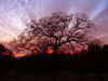
Top photo: I think that the darkness at the bottom balances the darkness at the top, and that you have captured/created a really good mood - an ominous setting apropos to a Shakespearean foreboding, a Wizard of Oz or Disney evil castle, and a Poe background. I like that the moon is not full.
If it were my image, I'd cut from the left so that we would have 3 birds and another 3 - the moon + 2 bushes, or looking at it differently, the moon, bird, and bush on the left and bush + 2 birds on the right.
Bottom Photo: Love this image! There is a delicacy to the way the birds are situated and balanced with the moon. The background enhances the feel that there's a big universe out there. The simplicity of the design is lovely.
Oct 21, 2018 12:55:30 #

ediesaul wrote:
Thanks so much for your detailed impressions, Edie. Greatly appreciated!I never know which is #1 and #2, so I always write... (show quote)
Oct 22, 2018 07:08:01 #
I love that first image best Linda! Frame it and make a halloween card! Beautiful work! 

Oct 22, 2018 07:58:03 #
Snap Shot wrote:
Thanks so much for your visit, Bill!I love that first image best Linda! Frame it and make a halloween card! Beautiful work!
Oct 22, 2018 11:47:28 #

Linda, as you know I would never do this myself, but I can appreciate how much you love playing with these. I think the first one is really nice. My instant reaction was that the center bird was a touch too large for the image. But if he's in the same image as the other two, I guess not. I do like the silhouette look to them. There's a lot of grain in the clouds, and when combined with the clarity of the actual moon, it looks funky.
#2 doesn't move me with that texture. It seems out of place, as it's clearly a wood grain and yet there's not enough actual wood in the picture to make the connection. I think the image is a good idea, and I like the birds in the bush and the moon. (Yes, I DO like the not full moon! There are enough full moon shot in the world.) I think you culd crop some off the left side, drop the background texture and have a nice shot.
The third one you added is really nice. I'd love to be able to say, "that's a really nice catch," but since it's a composite, I have to say, that's a really nice combo. It's very well done.
Oct 22, 2018 11:53:53 #
AzPicLady wrote:
Thank you for your comments, Kathy. I always look forward to your take on my play specifically because you're not into doing composites Linda, as you know I would never do this myself, b... (show quote)

The larger bird was added separately. Good point about smooth moon vs. grainy clouds. A funny thing about the "clearly wood grain" texture of #2: It is blurred clouds with a "film grain" filter added. I have no idea how it came to look like wood, lol. I do need to find a better use for it, though.
Thank you again for your excellent feedback!
If you want to reply, then register here. Registration is free and your account is created instantly, so you can post right away.