More Moon Play
Oct 20, 2018 17:29:19 #

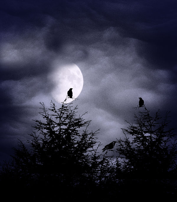
#1 - the moon last evening. I'm still shooting it in its awkward phases  Clouds added from another photo, trees & birds are brush stamps I made from other pics of mine.
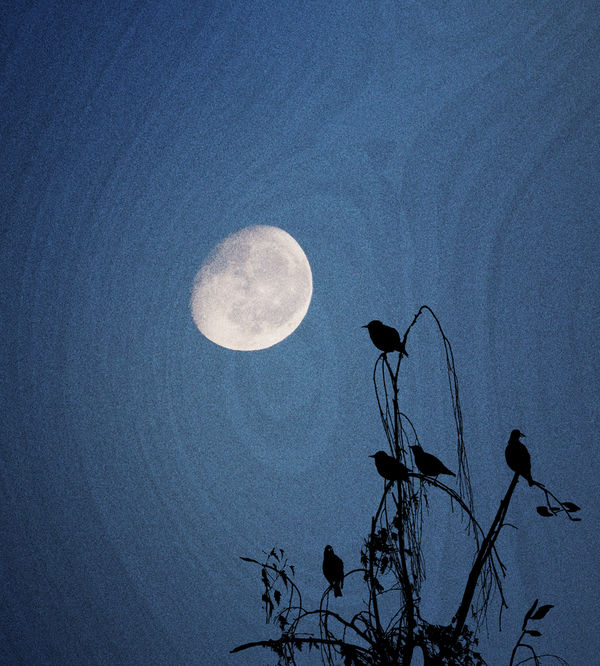
#2 - the same moon from my Sept 28 topic, but flipped orientation out of curiosity (a comment magnetoman made). The texture came from playing around with yet another image. I've been looking at this one for awhile and still haven't decided if I like it or not.
Your impressions and suggestions are welcomed! Many thanks for your time.
Clouds added from another photo, trees & birds are brush stamps I made from other pics of mine.#2 - the same moon from my Sept 28 topic, but flipped orientation out of curiosity (a comment magnetoman made). The texture came from playing around with yet another image. I've been looking at this one for awhile and still haven't decided if I like it or not.
Your impressions and suggestions are welcomed! Many thanks for your time.
Oct 20, 2018 21:03:21 #

First image is hauntingly beautiful! Frame-worthy, perfect for the time of year.
Second image is nice, similar theme as the first, but not sure the texture overlay works to best effect here. Did you try a vertical crop with this one? I wonder if cropping out some of the empty space on the left might give you a stronger image? Depends on what you’re going for, of course. But you might try that and see if it works to your satisfaction.
Second image is nice, similar theme as the first, but not sure the texture overlay works to best effect here. Did you try a vertical crop with this one? I wonder if cropping out some of the empty space on the left might give you a stronger image? Depends on what you’re going for, of course. But you might try that and see if it works to your satisfaction.
Oct 20, 2018 21:37:50 #
Linda From Maine wrote:
#1 - the moon last evening. I'm still shooting it ... (show quote)
I like them both. Now for the hard part. Why do I like them and what works or just misses? Both of these photos fit in my category of artistic impressions. The first one is very much in keeping with the season. It has a spooky vibe to it that I like. The one aspect of the photo I am not totally enthusiastic about is the bottom. There is no detail there and it adds a lot of black to the bottom of the frame. I thought that a crop would fix that; but then it feels like the trees are disconnected. So I think I would leave it as it is. I also think that the graininess in both images is very appealing in this application. I'm not sure if I like the lines in the sky of the second shot. You are on to something really good with this technique. I don't mind the "less than full" moon. The moon is cool almost all the time and does not, in my opinion, have to be full before you grab your camera. I think both of these are very impressive.
Erich
Oct 21, 2018 05:44:30 #

#1 has direct appeal for me wheres #2 leaves me thinking "Hmmm...". A giant Milky Way in the background would look more appropriate than wood grain to my mind, but perhaps I just need to let the idea grow on me. Perhaps it needs to look more like cosmic swirls or wayward weather patterns.
Oct 21, 2018 07:51:54 #

I think #1 is brilliantly pieced together. On looking at it, one could only think that you landed a very lucky shot, not built from pieces. Stories instantly come to mind when i see this shot. Number 2 . . . i'm not a fan of the wood grain background, and oddly enough, my eye was instantly drawn to one small dark spot that looks like a sensor dust issue. I know it's not, but for me, it just detracts. I do like the wilted shape of the branches in that one probably even more than the first.
Oct 21, 2018 07:57:58 #
Treepusher wrote:
I had problems finding a vertical crop of #2 because the way the lines swirl. I might have to find a more suitable home for that particular texture. Thanks so much for your feedback, Randy, So glad you enjoyed #1!First image is hauntingly beautiful! Frame-worthy, perfect for the time of year.
Second image is nice, similar theme as the first, but not sure the texture overlay works to best effect here. Did you try a vertical crop with this one? I wonder if cropping out some of the empty space on the left might give you a stronger image? Depends on what you’re going for, of course. But you might try that and see if it works to your satisfaction.
Second image is nice, similar theme as the first, but not sure the texture overlay works to best effect here. Did you try a vertical crop with this one? I wonder if cropping out some of the empty space on the left might give you a stronger image? Depends on what you’re going for, of course. But you might try that and see if it works to your satisfaction.
Oct 21, 2018 08:00:07 #
ebrunner wrote:
You are so right about the trees, Erich. I was swayed by the crow in it to take the photo and convert; the rest was blocked by a rooftop. Silly 'cause it's not like I can't make or find plenty of bird brushes and trees with more height I like them both. Now for the hard part. Why do I ... (show quote)
Thanks so much for your interest!Oct 21, 2018 08:01:34 #
R.G. wrote:
Thanks for commenting, R.G. "Cosmic swirls" could be something to look into #1 has direct appeal for me wheres #2 leaves me thinking "Hmmm...". A giant Milky Way in the background would look more appropriate than wood grain to my mind, but perhaps I just need to let the idea grow on me. Perhaps it needs to look more like cosmic swirls or wayward weather patterns.
 Glad you enjoyed #1. The clouds are a shot that Keni sent me!
Oct 21, 2018 08:05:43 #
melueth wrote:
Thanks for your time, Marylea! I see the spot you mentioned, and now I won't ever un-see it, so that will have to disappear I think #1 is brilliantly pieced together. On looking at it, one could only think that you landed a very lucky shot, not built from pieces. Stories instantly come to mind when i see this shot. Number 2 . . . i'm not a fan of the wood grain background, and oddly enough, my eye was instantly drawn to one small dark spot that looks like a sensor dust issue. I know it's not, but for me, it just detracts. I do like the wilted shape of the branches in that one probably even more than the first.
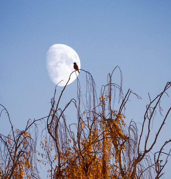
Glad you enjoyed #1. Those are fun to do! The "wilted" branches of #2 are the top of a weeping willow next door. A rather tame daytime composite is below (wrong lens; otherwise I'd have done more vertical orientation). Appreciate your visit!
Oct 21, 2018 08:07:17 #

Oct 21, 2018 08:11:56 #
yssirk123 wrote:
Thank you! It's a lot of fun to put together different elements, and then try changing blend modes to see what results Both shots are beautiful, but #1 is spectacular.

Oct 21, 2018 08:22:51 #
I have to agree with Treeprusher "First image is hauntingly beautiful! Frame-worthy, perfect for the time of year."
No 2 just has no long lasting impression with or without the swirls. Your third version is much better than #2.
Back to your first image. You did a beautiful composite without you sharing that information not many would notice. You deserve a 4 star rating. ****
No 2 just has no long lasting impression with or without the swirls. Your third version is much better than #2.
Back to your first image. You did a beautiful composite without you sharing that information not many would notice. You deserve a 4 star rating. ****
Oct 21, 2018 08:30:58 #
Jim-Pops wrote:
Thanks so much for your terrific comments, Jim! I'm delighted you enjoyed the first. I forgot to mention that after I flattened layers I did a "pinhole" b&w treatment via Nik Silver Efex, but at lowered opacity.I have to agree with Treeprusher "First image is hauntingly beautiful! Frame-worthy, perfect for the time of year."
No 2 just has no long lasting impression with or without the swirls. Your third version is much better than #2.
Back to your first image. You did a beautiful composite without you sharing that information not many would notice. You deserve a 4 star rating. ****
No 2 just has no long lasting impression with or without the swirls. Your third version is much better than #2.
Back to your first image. You did a beautiful composite without you sharing that information not many would notice. You deserve a 4 star rating. ****
Re providing "information" that it's a composite: hard to know when or when not. I don't want people to feel "fooled," and in FYC it's often as much about sharing techniques and ideas for others to try, and getting suggestions to make better.
But presenting a finished product with no opening explanation is OK too
Greatly appreciated.
Oct 21, 2018 08:58:30 #
Before Shakey passed and was involved in the "Post Processing Digital Images" section there were a lot of people sharing different techniques with simular outcomes, but all that has seemed to stop. I tried to start something again in that section but without much interest. Maybe I gave up to quickly. 
[quote=Linda From Maine]
Re providing "information" that it's a composite: hard to know when or when not. I don't want people to feel "fooled," and in FYC it's often as much about sharing techniques and ideas for others to try, and getting suggestions to make better.
[quote=Linda From Maine]
Re providing "information" that it's a composite: hard to know when or when not. I don't want people to feel "fooled," and in FYC it's often as much about sharing techniques and ideas for others to try, and getting suggestions to make better.
Oct 21, 2018 09:11:58 #
Jim-Pops wrote:
I don't believe I realized that user Shakey had died. Sorry to hear; I do remember his frequent topics in pp forum. FYC's My Image/Your View is popular, but it can be time consuming to keep track of how one achieved a certain look, not to mention the difficulties of explaining coherently Before Shakey passed and was involved in the "Post Processing Digital Images" section there were a lot of people sharing different techniques with simular outcomes, but all that has seemed to stop. I tried to start something again in that section but without much interest. Maybe I gave up to quickly.
Maybe you can start compiling a list of UHH users who appear to be interested in pp and then alert them by pm when you've posted a topic. Most new users probably aren't even subscribed to PP Forum (or FYC for that matter).
If you want to reply, then register here. Registration is free and your account is created instantly, so you can post right away.