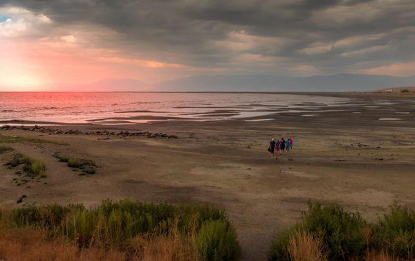
Salt Lake Sunset with Storm rolling in
Sep 11, 2018 08:34:33 #

I've never posted here before, but I'm thinking I might be on to something with this image. I've cropped and tweaked exposure and brought out a bit of the colors I saw on the water. Your feedback appreciated.
Sep 11, 2018 08:48:40 #
I like this a lot. I like the vast open space. Intriguing seeing the four people walking as a group and WHY is the question. I think if you tweak the exposure, brightness and contrast a bit you could have an award winner.
Everyone has an opinion and this is mine.
Everyone has an opinion and this is mine.
Sep 11, 2018 10:43:46 #
FreddB
Loc: PA - Delaware County
Jim-Pops wrote:
I like this a lot. I like the vast open space. Intriguing seeing the four people walking as a group and WHY is the question. I think if you tweak the exposure, brightness and contrast a bit you could have an award winner.
Everyone has an opinion and this is mine.
Everyone has an opinion and this is mine.
5 people and a dog - walking toward the camera - maybe they came out of the water? ☺
Sep 11, 2018 11:03:43 #
Jim-Pops wrote:
Thank you! Are you suggesting a bit brighter on the beach?I like this a lot. I like the vast open space. Intriguing seeing the four people walking as a group and WHY is the question. I think if you tweak the exposure, brightness and contrast a bit you could have an award winner.
Everyone has an opinion and this is mine.
Everyone has an opinion and this is mine.
Sep 11, 2018 11:05:18 #
FreddB wrote:
LOL! But someone giving pause to think is what I want. Are they leaving because of the clouds, hunbry kids, getting darker from sunset? maybe just taking a shortcut?5 people and a dog - walking toward the camera - maybe they came out of the water? ☺
Sep 11, 2018 12:49:40 #

You've managed to capture a great sense of space. To my eye the red looks a bit unconvincing - perhaps it's a bit too saturated and/or needs to be tint-shifted towards orange a bit. Or perhaps it's a bit too localised. Usually when you get that colour it's part of the overall ambient light.
Sep 11, 2018 19:28:28 #
R.G. wrote:
You've managed to capture a great sense of space. To my eye the red looks a bit unconvincing - perhaps it's a bit too saturated and/or needs to be tint-shifted towards orange a bit. Or perhaps it's a bit too localised. Usually when you get that colour it's part of the overall ambient light.
Good thought, I'll see what I can do to dial it back a bit.
Sep 11, 2018 23:46:55 #
R.G. wrote:
You've managed to capture a great sense of space. To my eye the red looks a bit unconvincing - perhaps it's a bit too saturated and/or needs to be tint-shifted towards orange a bit. Or perhaps it's a bit too localised. Usually when you get that colour it's part of the overall ambient light.
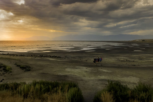
How about this version. I used graduated filter to shift WB from red and another to lighten the beach just a third to a half stop. Best to view in download.
Sep 12, 2018 01:29:01 #
mikeroetex wrote:
How about this version. I used graduated filter to shift WB from red and another to lighten the beach just a third to a half stop. Best to view in download.
Definitely more convincing.
Sep 12, 2018 10:49:06 #
allanj
Loc: New York City
mikeroetex wrote:
How about this version. I used graduated filter to shift WB from red and another to lighten the beach just a third to a half stop. Best to view in download.
The red in initial image bothered me also. Prefer this one. In any event a really nice shot.
Sep 12, 2018 15:27:11 #

Version 1 is very saturated, especially the figures, making them look ‘planted’. RG has mentioned the sky already and to me the colour looks added rather than ‘brought out’.
Version two is definitely easier on the eye but that sky colour still looks a bit ‘added’.
Everything else - space, composition, sky - is very nice.
Version two is definitely easier on the eye but that sky colour still looks a bit ‘added’.
Everything else - space, composition, sky - is very nice.
Sep 12, 2018 19:22:08 #
Sep 12, 2018 19:22:57 #
jimjjc
Loc: Wisconsin
I know what everyone is saying about the red in the first image, BUT, in reality, the red image is many times what is reality. Do you want to capture the real image....or the "preferred accepted image' by your peers????
Sep 12, 2018 20:06:46 #
clickety wrote:
Actually six humans, can't find a dog, beware some critics. LOL
Yeah, did not want to point that out to someone trying to be helpful!
Sep 13, 2018 00:08:18 #

Mike, this is a great image for a start. It had intrigue, nature, spaces. There is a lot that can be done with this image in the way of tonality, subtle changes of shading, etc. This definitely has potential.
--Bob
--Bob
mikeroetex wrote:
I've never posted here before, but I'm thinking I might be on to something with this image. I've cropped and tweaked exposure and brought out a bit of the colors I saw on the water. Your feedback appreciated.
If you want to reply, then register here. Registration is free and your account is created instantly, so you can post right away.