This is
Sep 2, 2017 18:33:45 #

Apaflo wrote:
Not the ideal BW conversion. Reduce the brightness and increase contrast to give it some pop. Then adjust the gamma curve to get the best tone mapping.
Victim of UHH posting again. Was not this bright and it had more contrast on my monitor before posting.
Don
Sep 2, 2017 18:38:43 #
Voss wrote:
Hi, Don,
Hope you don't mind, but I'm adding one more for comparison. It has increased contrast and a blue filter to highlight the character. Not saying B&W is better, just throwing out a different view. Oh, and also put a vignette around it to help add contrast to the edges.
Hope you don't mind, but I'm adding one more for comparison. It has increased contrast and a blue filter to highlight the character. Not saying B&W is better, just throwing out a different view. Oh, and also put a vignette around it to help add contrast to the edges.
This version is not my cup of tea Voss. Way to much contrast for me.
Really didn't mind other members expressing their view on what might make an image better but would like to grant permission first.
Thanks for your views!
Don
Sep 2, 2017 20:16:00 #
PAR4DCR wrote:
This version is not my cup of tea Voss. Way to much contrast for me.
Really didn't mind other members expressing their view on what might make an image better but would like to grant permission first.
Thanks for your views!
Don
Really didn't mind other members expressing their view on what might make an image better but would like to grant permission first.
Thanks for your views!
Don
Got it. Sorry about that.
Sep 2, 2017 20:55:13 #

PAR4DCR wrote:
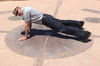
normal for the Big Easy!!
Another image that, I think, would loose some impact in B&W.
Don
Another image that, I think, would loose some impact in B&W.
Don
Great shot in color. Was he part of a fashion show?

Sep 3, 2017 00:23:09 #

Sep 3, 2017 04:32:12 #
Sep 3, 2017 17:46:06 #
Voss wrote:
Got it. Sorry about that.
No big deal, don't worry about it.
Don
Sep 3, 2017 17:47:15 #
LarryN wrote:
Great shot in color. Was he part of a fashion show?
No Larry, he was attending this year's French Quarter Fest. Don't think he would make it
as a fashion model!!
Don
Sep 3, 2017 17:47:38 #
Sep 3, 2017 17:48:41 #
Sep 3, 2017 17:50:02 #
bobbennett wrote:
Oddly enough, I prefer the b&w. Nice Shot!
Yes, Bob, color vs B&W was a split vote. I think most liked the color version better.
Don
If you want to reply, then register here. Registration is free and your account is created instantly, so you can post right away.