Mini Theme: Arches of Umbria (B&W)
May 12, 2017 04:42:15 #

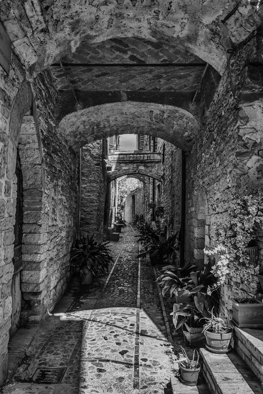
Some shots from recent trip to Umbria and Tuscany. I am hoping to do a triptych for my livingroom wall out of these. Which one would you delete? Comments and suggestions appreciated.


May 12, 2017 05:41:21 #
Bricol
Loc: LOWESTOFT, ENGLAND
Good morning Repleo,
Love your monochrome pictures.
I would think your No4 would be good on the right,
your No3 on the left and your No1 in the centre.
This should make a well balanced Triptych.
Hope this helps.
Regards,
Brian.
Love your monochrome pictures.
I would think your No4 would be good on the right,
your No3 on the left and your No1 in the centre.
This should make a well balanced Triptych.
Hope this helps.
Regards,
Brian.
May 12, 2017 05:42:22 #
PN_man
Loc: Western New York
I'm a fan of off-center compositions, so I prefer 2, 3 and 4 over 1. But it's a nice set in any case. I would put 2 in the middle.
May 12, 2017 06:25:14 #
May 12, 2017 07:22:31 #

I agree with PN_man. For a triptych, 2, 3 and 4 make the perfect composition.
May 12, 2017 09:20:31 #
Tom G
Loc: Atlanta, GA
repleo wrote:
Some shots from recent trip to Umbria and Tuscany. I am hoping to do a triptych for my livingroom wall out of these. Which one would you delete? Comments and suggestions appreciated.
YES, to all of 'em.

May 13, 2017 05:47:34 #

Super work. I'd use 2,3, and 4 as they are about the same degree of "close-upness." The first shows sky. Great photo but it might interrupt the more enclosed and intimate feeling of the other three. The one might look good with the other three if it were printed larger and placed above them.
May 13, 2017 07:06:38 #
Thanks folks for the great feedback and flattering comments. The placement suggestions are great too - I hadn't even thought about that.
Phil
Phil
May 13, 2017 07:50:17 #

After playing with them, I settled on 4 left, 2 center and 1 right for over all composition. I finally arrived there because 2 and 3 have an almost identical vanishing point making either 1 or 4 seem the odd one out. 3 doesn't lend balance to the set.
May 13, 2017 07:55:28 #

Hi Phil, I am not good at this type of thing.:) But if they were my pictures I would have them all over the walls.:) Great shots!!!!!
May 13, 2017 08:04:22 #
Actually 3 may be better on the right. the lighter values improve the set. Very much like 1 though
May 13, 2017 08:50:56 #

I like them all, but if I had to delete one, I believe it would be the third one.
May 13, 2017 09:32:12 #

PN_man wrote:
I'm a fan of off-center compositions, so I prefer 2, 3 and 4 over 1. But it's a nice set in any case. I would put 2 in the middle.
Agreed. Also, Great shots!
May 13, 2017 09:40:46 #

May 13, 2017 09:54:13 #

All of them are lovely. I don't know that I would settle on three.
If you want to reply, then register here. Registration is free and your account is created instantly, so you can post right away.