Which logo?
Feb 26, 2017 14:02:42 #

Tom Daniels wrote:
Wow. That swoosh version is killed by the black bkgd. And Lake is screaming for a blue of some kind.
I think you can do better then this. Try some more options that make sense. Good luck logos are not easy.
I think you can do better then this. Try some more options that make sense. Good luck logos are not easy.
I know. This is hard. The clothing we retail is athletic and has the Lakers logo on it. That is the high school's logo though and we don't want to limit ourselves to printing for the high school since we do much more than that. However, the reason we are the Laker Locker is because we sell fan wear to kids, parents, teachers etc ... We've had a really hard time coming up with something simple that encompasses it all. We just want a simple little trademark to use on the website we are building. Something that will be recognizable, but it really doesn't need to say it all. Does that make sense?
Feb 26, 2017 14:07:36 #
Peterff wrote:
The second logo is clean and doesn't seem to have conflicts as others have suggested. It this your business? http://www.google.com/search?q=Laker+Locker&ie=utf-8&oe=utf-8
You certainly want to avoid any Nike type similarities and also the Los Angeles Lakers.
You certainly want to avoid any Nike type similarities and also the Los Angeles Lakers.
Yes it is. I personally like the blue logo. It's simple, compact and clean. My husband wants to have a little sports figure. The colors aren't necessarily the colors we will use. We will get them in vector format and will be able to do anything we want with them. There have been other logos .. about 10 so far. Some of them are not compact enough for me. One is really sharp, but it looks like it belongs on the hood of a car. One looks like the guy was on drugs. He didn't even spell Laker right. It's a challenge. We did do a bio for them and we have just begun to see logos streaming in. I will share more if anyone is interested in seeing them.
Feb 26, 2017 14:10:17 #

Peterff wrote:
The second logo is clean and doesn't seem to have ... (show quote)
I was going to say the same thing! The LA Lakers immediately came to my mind when I read the first post of this thread. You could possably find yourself with a cease and desist order by surprise!
________________________________
Jerry in NC
Feb 26, 2017 14:15:48 #
Nightski wrote:
Yes it is. I personally like the blue logo. It's s... (show quote)
One approach could be to take the second which is quite striking, clearly represents your locality and any season. No reason why you couldn't adopt the sports figure with some modification to eliminate any brand conflict. The white background is better than black, and the figure would work well in blues as well. Color is an important part of logo design, so you don't want to keep changing it. Blue tones work well on many backgrounds. One consideration is that the sports figure could represent a product line for your business - Laker Locker Sports Apparel - and you could have similar design concept logos for other product lines - hiking gear - or whatever, all under the dominant Laker Locker brand logo.
Feb 26, 2017 14:19:29 #

Feb 26, 2017 14:20:41 #

Nightski wrote:
We are trying to choose a new logo for our business. We have a company creating logos for us and these are a couple that we liked. I'd love to have some feedback on which one a general audience likes. If there are any suggestions as to how to make one of these better, I am open to that as well. Thanks so much in advance for you input. 
Sandra, all I can do is echo others - the swoosh is too close to Nike's for your own good - you could get a cease-and-desist after you've spent a lot of money rolling out the logo. The other one is colorful, but doesn't address what your business does.
Feb 26, 2017 14:21:56 #

I think the style of the first one is over done. So, unless you have more choices number two it is.
--
--
Feb 26, 2017 14:25:54 #
Nightski wrote:
Screen printing, embroidery and a small retail store.
I would incorporate an example. Or in an embroidery style. I first thought you were selling meat or it was a gym. Maybe the word locker in embroidery design.
Feb 26, 2017 14:27:43 #
Rongnongno wrote:
I just hope you are not paying an arm and a leg for this.
Me too, Ron. LOL .. I asked my husband if he had paid them yet and I didn't get an answer.
Feb 26, 2017 14:30:19 #
Thanks so much for all the feedback. You all really helped me out. You have voiced all the concerns I had about the first one. The second one has potential, but more will be coming in and I will share.
Feb 26, 2017 14:51:39 #


Feb 26, 2017 15:03:08 #

Nightski wrote:
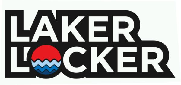
Three more ... that third one ..  .. and does that second one remind anybody of Home Depot?
.. and does that second one remind anybody of Home Depot?So far I like the second in this set best. (I did not think Home Depot.)
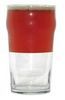
-Trying to figure the circular logo in the first and its relationship,
and the water in the second. (I realize "lake", but...)
It seems that you may need two logos? One for the school store, and one for the screening/embroidery?
Feb 26, 2017 15:04:26 #

Nightski wrote:
We are trying to choose a new logo for our business. We have a company creating logos for us and these are a couple that we liked. I'd love to have some feedback on which one a general audience likes. If there are any suggestions as to how to make one of these better, I am open to that as well. Thanks so much in advance for you input.
Whatever you do...make sure it works first in Black and White. Personally I'm a fan of the simpler the better...but that's perhaps what I've just learned over the 17+ years of graphic design. Just for the heck of it (a slow sunday afternoon at home), I put something together for you to consider.
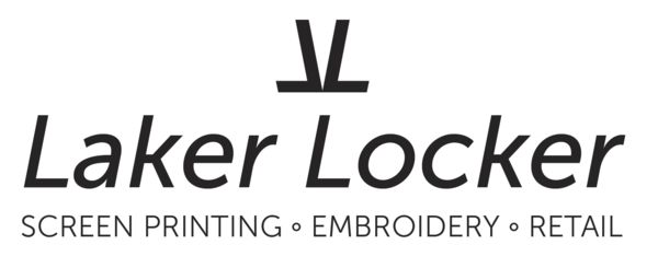
Feb 26, 2017 15:05:58 #
Cdouthitt wrote:
Whatever you do...make sure it works first in Black and White. Personally I'm a fan of the simpler the better...but that's perhaps what I've just learned over the 17+ years of graphic design. Just for the heck of it (a slow sunday afternoon at home), I put something together for you to consider.
I like it!
Feb 26, 2017 15:09:36 #
Nightski wrote:
We are trying to choose a new logo for our business. We have a company creating logos for us and these are a couple that we liked. I'd love to have some feedback on which one a general audience likes. If there are any suggestions as to how to make one of these better, I am open to that as well. Thanks so much in advance for you input.
The second one would be my choice (with that little info to start), as it is far more pleasing to the eye, simpler and more to the point! The first just does not feel right, "design-wise" I do not like it!
If you want to reply, then register here. Registration is free and your account is created instantly, so you can post right away.