I cannot decide.
Feb 5, 2017 18:07:26 #
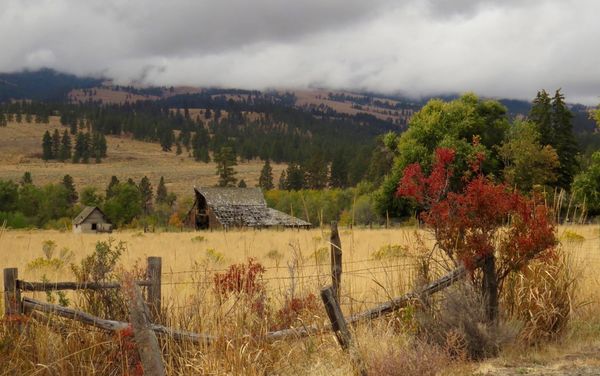
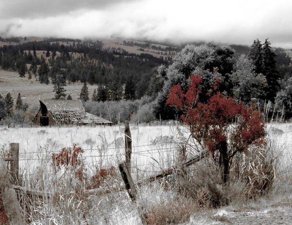
I would really like your opinions on these two. Does the 2nd one have any appeal or not. Maybe it is time to make cookies and get away from the computer!!!
Feb 5, 2017 18:40:14 #
Linda2, #2 looks like maybe a winter scene, I prefer #1
Linda2 wrote:
I would really like your opinions on these two. Does the 2nd one have any appeal or not. Maybe it is time to make cookies and get away from the computer!!!
Feb 5, 2017 19:20:31 #
Feb 5, 2017 22:03:05 #
"does number 2 have any appeal or not"?
I like the wintery feel # 2 gives. I like the small red bush that leads my eye to the barn.
I wonder how it would look with the big red bush and the tree behind it removed.

I like the wintery feel # 2 gives. I like the small red bush that leads my eye to the barn.
I wonder how it would look with the big red bush and the tree behind it removed.
Feb 5, 2017 22:34:35 #
Lens Cap wrote:
Linda2, #2 looks like maybe a winter scene, I prefer #1
Yes, #1 was the real scene. #2 was played with. I like the first one but I love winter scenes too. Thank you for commenting.
Feb 5, 2017 22:36:49 #

Feb 5, 2017 22:38:41 #
zesty wrote:
"does number 2 have any appeal or not"?
I like the wintery feel # 2 gives. I like the small red bush that leads my eye to the barn.
I wonder how it would look with the big red bush and the tree behind it removed.
I like the wintery feel # 2 gives. I like the small red bush that leads my eye to the barn.
I wonder how it would look with the big red bush and the tree behind it removed.
I see what you are saying. I like the idea too! Thank you.
Feb 6, 2017 09:01:40 #

I'm trying to get past my distaste for the white stuff of our never-ending winter and view this more objectively
There are some interesting elements to work with: the fence and barn in disrepair, the sweep of the foothills.
I'm feeling that the pp is only partly done in that there should be snow on the hills, and perhaps on the largest tree. I like the idea of de-saturating the reds, just to compare.
If you're not bored with the project yet, post a few more variations and let's see how it develops.
Feb 6, 2017 09:12:59 #

I like the B&W with the touch of colour. But I think you're right about there needing to be snow on the hills also to make it believable. There's too much of the bright white for my eyes. I wonder if you darkened the yellow before you converted to B&W if that would help. But then, you know I'm not big on PP! (By the way, I also like the colour version.)
Feb 6, 2017 13:09:38 #
Feb 6, 2017 15:03:43 #

Linda2 wrote:
I would really like your opinions on these two. Does the 2nd one have any appeal or not. Maybe it is time to make cookies and get away from the computer!!!
Hi, Linda,
The problem I see with both images is that the reddish foreground tree is against an almost identical value of tree behind it, and it is of equal decreased discernibility in both images. If you would brighten the red channel, it maight make a significant difference. I would do it, but my desktop is down again.
Dave
Feb 6, 2017 15:51:26 #
Thank you for you comments Linda. Even after all this white stuff I still love winter scenes. I guess that is intrigued me about the 2nd one.I may play with it some more!
Linda From Maine wrote:
I'm trying to get past my distaste for the white s... (show quote)
Feb 6, 2017 15:57:31 #
You know, I don't go into a lot of PP either. This was actually played with using Macphun filters and it was just for fun. The one tree was a brighter red but I did tone it down a bit. I think I was just having a bit of fun and not thinking about making it believable. January and February have to be good for something! Thank you for your comments.
AzPicLady wrote:
I like the B&W with the touch of colour. But I think you're right about there needing to be snow on the hills also to make it believable. There's too much of the bright white for my eyes. I wonder if you darkened the yellow before you converted to B&W if that would help. But then, you know I'm not big on PP! (By the way, I also like the colour version.)
Feb 6, 2017 15:57:54 #
Feb 6, 2017 16:01:42 #
I see what you are saying Dave. The red tree was brighter but I thought it detracted then. I will play with it some more. Thank You for commenting!
Uuglypher wrote:
Hi, Linda,
The problem I see with both images is that the reddish foreground tree is against an almost identical value of tree behind it, and it is of equal decreased discernibility in both images. If you would brighten the red channel, it maight make a significant difference. I would do it, but my desktop is down again.
Dave
If you want to reply, then register here. Registration is free and your account is created instantly, so you can post right away.