A Strange One - Niagara PaintBox for consideration & advice
Oct 18, 2016 12:03:38 #
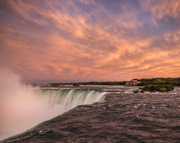
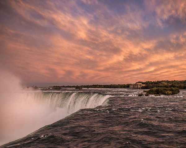
The night I arrived at Niagara featured as crazy a sunset as I've ever seen, one of those that colors the very air, so all the people look orange, the concrete is orange - and the water open to the sunset was tinged orange. Mixed with the deep aqua color of this water, the orange turned the water a strange and awkward purple. I do not know what to do with these images, so I hope others will suggest, or try their hand. The more true color of the water can be seen in the areas that the angle protected from the orange. But the sky was amazing. What do I do now?
Oct 18, 2016 12:39:24 #
There's so much colour aplenty that it could probably take a bit of desaturating to give it a slightly more believable look. The green of the falls looks a bit artificial with all that orange and purple in the air, which may not bother you, but if it did you could tint-shift Aqua towards blue a bit in the HSL section. That should get it to blend in a bit better.
It's one of those shots that people are going to say "Far too over-processed", despite the fact that that's how it looked in real life. Since you were there you may find that acceptable, but if you want it to be more realistic for others, a bit of un-processing is what's needed.
It's one of those shots that people are going to say "Far too over-processed", despite the fact that that's how it looked in real life. Since you were there you may find that acceptable, but if you want it to be more realistic for others, a bit of un-processing is what's needed.
Oct 18, 2016 13:21:49 #
R.G. wrote:
There's so much colour aplenty that it could proba... (show quote)
I'll try that.
I did very little to the file here, because I wasn't sure what TO do. I don't think I have ever un-processed Mother Nature! This is a new venture! I am truly lost in this set. The sky was so dramatic, and what it did to everything else was so surreal, people were just wandering about in awe at what the light was doing to the environment. I didn't think much about the camera, in terms of trying to compensate in shooting for what the sky was doing, but even if I had, I wouldn't have known what to do. Correcting WB in raw does not help anything here, so I'm just groping along, not in the dark but in the orange.
Oct 18, 2016 13:30:19 #
How ironic to be talking about "dumbing down" - as it were - the reality of the scene.
Not to mention, I bet many people are seeing different colors on their monitors than the OP. Not to mention, surely there are some folks out there who have been fortunate enough to witness similar - as with the brilliant deep blue skies I find here at times that seem fake to those who live in humidity or haze.
Minnie, I love your composition. The sharp line of the falls starting in the lower left corner is wonderful. The softness of the clouds is so appealing against the powerful dark water. Also love the mist rising and the bit of green water coming over the falls. The colors look totally natural to me! A wonderful photo. Sorry for being no help in your "dilemma."

Oct 18, 2016 13:34:41 #
R.G. wrote:
Depends on what you're used to seeing in real life ...It's one of those shots that people are going to say "Far too over-processed", despite the fact that that's how it looked in real life...

Oct 18, 2016 13:54:34 #
I think one of the reasons why the green/aqua of the falls got my attention is because it's the main reason why the purple tint of the flat water looks "awkward" as you say. Purple and green usually make unusual bed-fellows. I suspect that if you do something about the green, the purple tint of the river won't look so out of place.
Normally when a scene gets an overall tint it doesn't look odd because everything is affected, and our eyes are used to dealing with that. But what's happened with the water of the falls is that it was in shadow and therefore not affected by the orange/purple sky. If you tint-shifted it either towards purple or orange it would probably blend in a bit better and not make the river look odd, as it is doing.
Normally when a scene gets an overall tint it doesn't look odd because everything is affected, and our eyes are used to dealing with that. But what's happened with the water of the falls is that it was in shadow and therefore not affected by the orange/purple sky. If you tint-shifted it either towards purple or orange it would probably blend in a bit better and not make the river look odd, as it is doing.
Oct 18, 2016 14:24:59 #
Linda From Maine wrote:
How ironic to be talking about "dumbing down&... (show quote)
Thank you! The falls can be challenging on either side because you get sort of "backside" views from either, and have to work around the throngs of tourists with their selfie sticks to get any open spot.
I'm still in a quandary about the color dilemma, it is one of those rare times when real doesn't quite look right. I'm waiting for more folks to hopefully chime in, I'm willing to experiment, even if I end up going back to "how it was"!
Oct 18, 2016 14:30:22 #
R.G. wrote:
I think one of the reasons why the green/aqua of t... (show quote)
You are exactly right. The angle of the shadow protected the overflow from the orange light which was coming from behind the falls, on the right hand side of the image. I've spent a few minutes since reading your ideas trying to subdue the green in the overflow and take the reds in the river so the blues become more dominant in both. That may be more pleasing. I'll work some more on it this afternoon after laundry gets out of the way!
Oct 18, 2016 15:27:11 #
I thought I was getting good results from shifting green towards yellow (all the way) and desaturating, and shifting red towards orange a bit. Then I tried using the Adjustments brush to add the colour of the sky to the overspill area, keeping its saturation low. The overall saturation levels are a matter of taste. I desaturated a little but wasn't persuaded that it was much of an improvement.
-
-
Oct 18, 2016 16:34:14 #
Thanks RG, I do think it's more believable with these edits.
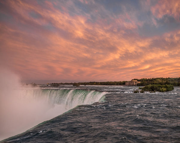
Here is another effort at mitigation and proof that you can't fix just one thing.
I lowered the purples, moved the purple hues to blue, reduced the reds, and painted with this combination on the flat water. I lowered the greens and yellows and raised the blues and painted with this combination on the over-spill water - all of this on a layer, which I masked and painted in at reduced opacity so that I didn't get rid of all the orange on the reflections on top of the water.
Here's the problem that created: the mist, which was tinted by the orange from the sky, looked totally out of place. So I had to reduce its saturation. Then it looked worse so I masked it and allowed some orange to show gradually from top down.
I dunno if it's better or worse, I have been looking at it too long so will leave it a while before tinkering and see if there's more brainstorms.
Oct 18, 2016 22:17:42 #
min if that's what you saw and that's what you pointed Oly at and you think that Oly did a good job of recording what nature provided then what's the problem? If you say you did no processing to bring out color and I believe that to be true then publish and be damned. What help do you expect to get from us folks who were not there did not witness it and are likely to have preconceived ideas of what it should look like? Consider yourself lucky to have seen such a wonderful scene first hand.
Sorry but their aint an awful lot to talk about its just beautiful as you and mother nature between you presented it.
Sorry but their aint an awful lot to talk about its just beautiful as you and mother nature between you presented it.
Oct 18, 2016 22:27:37 #
Billyspad wrote:
min if that's what you saw and that's what you poi... (show quote)
Thanks for dropping by, Billy. I honestly was flummoxed about what if anything to do with it and there's a half dozen more of different angles with the same problem. And I did get some help from RG, who has one of our best eyes for color work, and have a promise of help from another of our experts. I appreciate our folks more than I can say.
Oct 18, 2016 22:58:15 #
Dear Minnie, Leave it alone! I see nothing in this picture that looks over cooked or unrealistic. Of course I am a Canadian and I am used to clear skies and bright sunsets. To my eye every colour and tint is completely believable and totally true to nature. The green at the top edge of the waterfall is the perfectly normal effect when the water starts to aerate as it goes over the edge - just before it fills with air bubbles and turns white. The purple tint to the water is the reflection of the red/orange sky on the dark blue water and is perfectly normal. I love the hint of peach in the mist in the lower left corner. I would hate to see you take the edge off of this to meet the expectations of viewers who were not there. In your response to Billy you said that you had other shots with the same problem - what problem? I would like to know why the unusual format. Did you cut off one side or the other due to distractions?
Cheers, Don
P.S. If you like I can post a sunset from the Galapagos which will blow R.G.'s socks off.
Cheers, Don
P.S. If you like I can post a sunset from the Galapagos which will blow R.G.'s socks off.
Oct 18, 2016 23:08:56 #
Frank2013
Loc: San Antonio, TX. & Milwaukee, WI.
I find the original completely acceptable. If I did anything it would be cropping minniev. One way to get the water where you want it.....Ps go to image, adjustments, selective color, I tried reducing magenta with red selected and thought it did well....add mask, invert and paint back in where you want, adjust opacity to taste.
Oct 19, 2016 05:35:54 #
No changes needed in my opinion. Looks great to me - wish I could have seen it live but your photo offers a lot of compensation for not being there.
If you want to reply, then register here. Registration is free and your account is created instantly, so you can post right away.


