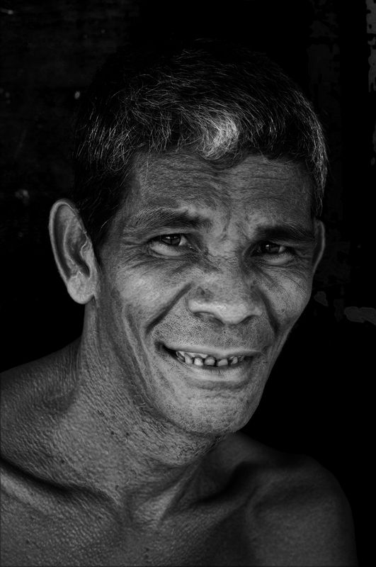
Man in Black and white
Mar 2, 2016 17:55:37 #

Mar 2, 2016 19:11:08 #
Some words come immediately to mind:
Strong
Warm
Kind
Friendly
Direct
Tough
I'll stop. Billy'll get a swelled head. :mrgreen: I don't see a thing wrong but I bet somebody will point out the lack of separation between hair and background. It does not bother me. I like that the first thing I see is his smiling eyes. :thumbup: :thumbup:
Strong
Warm
Kind
Friendly
Direct
Tough
I'll stop. Billy'll get a swelled head. :mrgreen: I don't see a thing wrong but I bet somebody will point out the lack of separation between hair and background. It does not bother me. I like that the first thing I see is his smiling eyes. :thumbup: :thumbup:
Mar 2, 2016 22:03:05 #
Frank2013
Loc: San Antonio, TX. & Milwaukee, WI.
Billyspad wrote:
Congratulations are of course in order Mr. Spad for your work voted into the Gallery. If this is the look you are seeking to achieve then you have succeeded. This image in my opinion, while good needs more of your attention with blending of your brush work. The cheeks, ear, brows, lower eyelids, and such are just overpowering. I am having to look hard to see those eyes that should be glaring at me instead. I might be the lone dissenter, but I feel this image is missing the mark somehow.For your consideration
Mar 2, 2016 23:51:27 #

Billyspad wrote:
For your consideration
A strong image with great impact.
Only possible improvement I can suggest is that his eyes ...eyes alone...not lids...could use a touch of brightening and crisp iris detail. IMO would help ramp this up several notches from its already laudable state.
Dave
edit: didn't mean to "pile on" after Frank's comment, but I certainly agree.
You captured what I see as an intelligent, openly thoughtful, and searching expression.
Mar 3, 2016 01:07:29 #
Frank2013 wrote:
Congratulations are of course in order Mr. Spad for your work voted into the Gallery. If this is the look you are seeking to achieve then you have succeeded. This image in my opinion, while good needs more of your attention with blending of your brush work. The cheeks, ear, brows, lower eyelids, and such are just overpowering. I am having to look hard to see those eyes that should be glaring at me instead. I might be the lone dissenter, but I feel this image is missing the mark somehow.
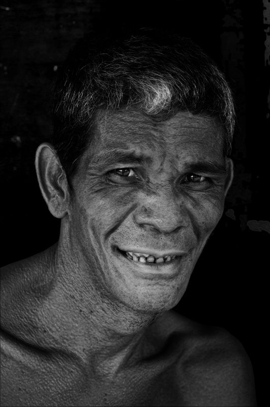
Do you prefer this young Frank. It misses the guy emerging into the light thing I liked but my happiness can only be complete if you are satisfied!
Mar 3, 2016 06:09:46 #
Frank2013
Loc: San Antonio, TX. & Milwaukee, WI.
I am pleased to hear my pleasure is of your utmost concern Mr. Spad. See with just a bit of explaining the denseness between my ears can be overcome.
Take a good look at where you have introduced light to for him to be walking into. Where exactly is this light coming from, Is it the right back side of his head or the left lower ear. If it is coming straight down and catches his bit of forehead grey then I might see it above his brow and on his cheeks and nose, the top of his nose not the front and bottom of it, and not really back up under his eye sockets on his lower lids where it would be shaded from his protruding brow. Sorry Mr. Spad but I see nothing but a splotched face and dont get the walking into the sun feel. I have considered your image as you asked and these are my thoughts. The second image is better but thats not the image you have said you are trying to portray. If it is worth it to you give this image more thought and time .if not simply move on.
Take a good look at where you have introduced light to for him to be walking into. Where exactly is this light coming from, Is it the right back side of his head or the left lower ear. If it is coming straight down and catches his bit of forehead grey then I might see it above his brow and on his cheeks and nose, the top of his nose not the front and bottom of it, and not really back up under his eye sockets on his lower lids where it would be shaded from his protruding brow. Sorry Mr. Spad but I see nothing but a splotched face and dont get the walking into the sun feel. I have considered your image as you asked and these are my thoughts. The second image is better but thats not the image you have said you are trying to portray. If it is worth it to you give this image more thought and time .if not simply move on.
Mar 3, 2016 06:16:29 #

Billy, I like both images, but the eyes in the second one improves the image just a bit. Nice work.
Mar 3, 2016 06:22:30 #
Chuck_893 wrote:
Some words come immediately to mind:
Strong
Warm
Kind
Friendly
Direct
Tough
I'll stop. Billy'll get a swelled head. :mrgreen: I don't see a thing wrong but I bet somebody will point out the lack of separation between hair and background. It does not bother me. I like that the first thing I see is his smiling eyes. :thumbup: :thumbup:
Strong
Warm
Kind
Friendly
Direct
Tough
I'll stop. Billy'll get a swelled head. :mrgreen: I don't see a thing wrong but I bet somebody will point out the lack of separation between hair and background. It does not bother me. I like that the first thing I see is his smiling eyes. :thumbup: :thumbup:
Appreciate you calling by Chuck and thank you for commenting
Mar 3, 2016 06:25:31 #
Billy,
Decent photo and has potential for sure. It does have impact, however, you might consider brightening up his eyes and the deep setting of his eyes. I believe the light flow is off (not there) from his eyes to his forehead to the hair towards his forehead. It just strikes me that his cheeks show more brightness and the front of his nose - I feel there is not proper flow of the lighting of the facial skin?
The one thing that just jumps right out at me is that spot of white hair right above his forehead as though that is the main object/area of the image. It needs toned down or the light flow needs to emanate down from that if you understand what I am saying. Also, as mentioned by another viewer, there should be more separation of his hair/head from the background that would give more impact to the image. It does have an attention getting punch to it, but some more work would draw out more detail and more impact. The image is just a little on the dark side and needs to have better light flow on the facial areas. Perhaps I am being too critical, but that is what I would consider for improvement?
Best Regards,
Tom
P.S. Billy, it just dawned on me what it reminds me of . . . his eyes look like there is a mask around them and reminds me of what Zorro looks like with his mask covering his face around his eyes. Honestly, it reminds me of Zorro's eyes without his physical mask, especially when looking at the download on my computer!
The second image is much better than the first, but not quite there, yet, IMHO.
Mar 3, 2016 06:36:30 #
Frank2013 wrote:
I am pleased to hear my pleasure is of your utmost... (show quote)
No light was introduced Frank. I was walking along as one does and he appeared through a canvas flap that must have been a door to where he was living maybe. Just time to catch his eye and smile before "click I got him". The light was just tropical daylight hitting his face . Hence from the dark to the light but of course it helps if one was there lol.
This will get no more attention Frank my next image is the important one. Very rarely do I rework anything this was just for you. Tend to learn and move on the world is full of shots to be taken.
Mar 3, 2016 06:39:14 #

It looks to me like just another routine top-notch Billyspad photo. Sorry I'm of no help in your quest for improvement, but I'll be darned if I can see any room for it.
Mar 3, 2016 06:44:26 #
Uuglypher wrote:
A strong image with great impact.
Only possible improvement I can suggest is that his eyes ...eyes alone...not lids...could use a touch of brightening and crisp iris detail. IMO would help ramp this up several notches from its already laudable state.
Dave
edit: didn't mean to "pile on" after Frank's comment, but I certainly agree.
You captured what I see as an intelligent, openly thoughtful, and searching expression.
Dave never worry about piling on. I post here to receive comment and critique with a view to getting work consistently in the excellent range so someone with your knowledge and skill is more than welcome to tell it like it is. I have broad shoulders and this is the big boys club. I wanted meaningless praise for below par work i would post in the gallery or join a post and share thread lol. No my friend just give me honesty always.
Mar 3, 2016 06:56:25 #
trc wrote:
Billy, br br Decent photo and has potential for s... (show quote)
Hya Tom I hear what you say and agree with some. The light is tropical sun at about 11am. Think arc light and double it and you'll get the idea.
Probably should have taken a more mainstream approach to the PP but sometimes that's just too easy so a play is in order.
The white on his hair I would never touch. This is snap shot taken on the street. No time to compose or think. That bit of white hair is part of him and no way would I alter it. If a woman has a large wart on her nose then in street photography that's how she is shown. The event has to be shown as close as possible to what it was when the shutter was pressed.
Thank you my friend for taking the time to comment so thoroughly it is greatly appreciated I assure you.
Mar 3, 2016 06:59:36 #
neilds37 wrote:
It looks to me like just another routine top-notch Billyspad photo. Sorry I'm of no help in your quest for improvement, but I'll be darned if I can see any room for it.
You are too kind my friend. I more critical of myself than I am of others would you believe and I have a long ways to go to reach the consistent level I hope to attain.
Thank you once again you are a true gentleman
Mar 3, 2016 07:02:18 #
Frank2013
Loc: San Antonio, TX. & Milwaukee, WI.
Billyspad wrote:
I was referring to your pp treatment...highlights, shadows, ect. to enhance the walking into the light thing you said you liked. Don't go out of your way for me...you are the one who needs to be happy wth it.No light was introduced Frank.
If you want to reply, then register here. Registration is free and your account is created instantly, so you can post right away.