A For My Mom ...
Dec 6, 2015 10:12:58 #

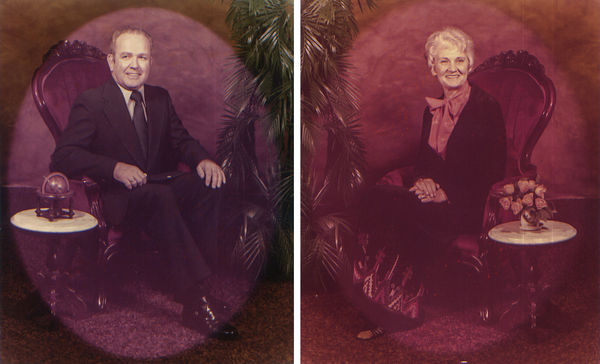
So here's the deal ... last month my mom sent me two photos of my grandparents and asked if I could fix them. She wanted me to do what I do with my other photos (composting, post and digital painting work, for those who aren't familiar with my work).
The two photos in question were taken in either 1987 or 88. They've been hanging on the same wall, with the same sunlight hitting it every day for nearly 25 years. They both had a vignette matte which has made for an interesting challenge and the sun has washed out quite a bit of detail in certain areas.
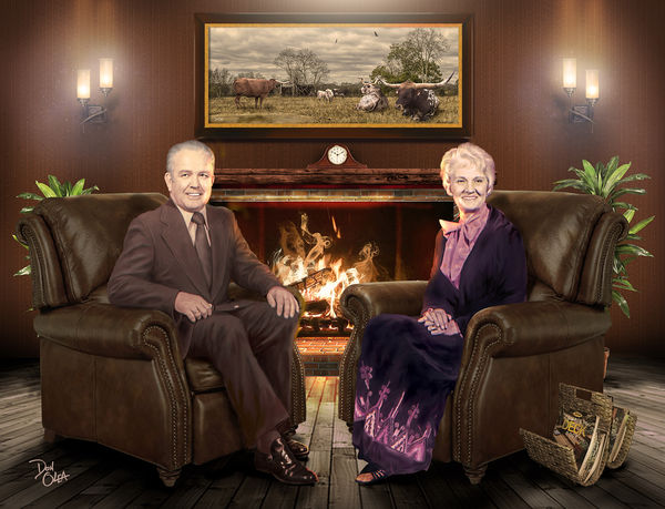
I have posted the two originals of Virgil and Vida so you can see what I started with. I'm not sure who shot the originals, but I did shoot the chair, the clock, the magazine holder, and the plant for the composite. The sconces I borrowed from Home Depot's website. Some UHHers may recognize the art above the fireplace, it is also one of my pieces. Everything else was built in PS 2015 and consists of 67 different layers.
My mom doesn't know it yet, but I plan on giving this to her printed and finished on canvas for Christmas. So my question is: am I missing anything and do you think will she like this? This is my marketing survey before I send it out to print. ;-)
The two photos in question were taken in either 1987 or 88. They've been hanging on the same wall, with the same sunlight hitting it every day for nearly 25 years. They both had a vignette matte which has made for an interesting challenge and the sun has washed out quite a bit of detail in certain areas.
I have posted the two originals of Virgil and Vida so you can see what I started with. I'm not sure who shot the originals, but I did shoot the chair, the clock, the magazine holder, and the plant for the composite. The sconces I borrowed from Home Depot's website. Some UHHers may recognize the art above the fireplace, it is also one of my pieces. Everything else was built in PS 2015 and consists of 67 different layers.
My mom doesn't know it yet, but I plan on giving this to her printed and finished on canvas for Christmas. So my question is: am I missing anything and do you think will she like this? This is my marketing survey before I send it out to print. ;-)
Dec 6, 2015 10:55:47 #

donolea wrote:
So here's the deal ... last month my mom sent me two photos of my grandparents and asked if I could fix them. ... am I missing anything ...
curiosity is killing me; why t do you have the old man reversed left for right?
You could remove the jacket buttons and put the ring on his other hand, most people wouldn't see the remaining problems.
Dec 6, 2015 11:34:11 #
Frank2013
Loc: San Antonio, TX. & Milwaukee, WI.
While this is truly fabulous work Don there are a few personal things that I will share with you, which you can ignore or give thought. I totally understand there are no mistakes with your work
.everything purposefully executed.
The glow of the lights I feel should be softer.
The light glow above the painting I feel may or may not be necessary, but if left should almost be more directed toward the center of the piece and reduced. As you might suspect I feel the light glow is too strong and I find it distracting from the subjects which might be an intent.
Lastly the fireplace fire is well done but, I feel the smoke right and the smoke ring center distracting and a bit unreal with such a rip roaring flame. Smoke is usually not as calm with such an intense flame.
Dec 6, 2015 12:51:39 #

Concur on the bright spots in background, sconces, lighting and the clock. The fire needs considerable taming down to
a few comfortable coals. This is a double portrait, and while I can admire your PP work, it is about 2 people. They shouldn't compete with those bright areas. As for the comment about the ring on the man's finger, it is not a wedding ring so doesn't matter which hand it's on. Some details therefore matter and some don't. Good job!
a few comfortable coals. This is a double portrait, and while I can admire your PP work, it is about 2 people. They shouldn't compete with those bright areas. As for the comment about the ring on the man's finger, it is not a wedding ring so doesn't matter which hand it's on. Some details therefore matter and some don't. Good job!
Dec 6, 2015 13:03:41 #
jenny wrote:
...As for the comment about the ring on the man's finger, it is not a wedding ring so doesn't matter which hand it's on. Some details therefore matter and some don't. Good job!
the direction he buttons his jacket does matter.
Dec 6, 2015 14:40:20 #
oldtigger wrote:
the direction he buttons his jacket does matter.
* * *
It's the same as the original. Most people aren't going to notice, but if it is a big deal, buttons can be removed.
:)
Dec 6, 2015 14:49:30 #

Being the perfectionist you are and we know you to be then you will spot any changes you feel need to be made.
The important question has been missed by my fellow Hogs in a headlong dash to pixel peep. Your mother my man will adore it.
As for the rest my honest and straight talking view on this is if you could achieve 1% of what this fella has done be critical if not stand back be amazed and keep shtum.
Just look at what he started with and result achieved.
I assumed as this will be printed on canvas the bright areas will be mellowed down naturally by the printing process?
Not sure the ladies left eyebrow is quite correct could you go back and pluck it a little lol.
Dec 6, 2015 14:52:40 #
jenny wrote:
* * *
It's the same as the original. Most people aren't going to notice, but if it is a big deal, buttons can be removed.
:)
It's the same as the original. Most people aren't going to notice, but if it is a big deal, buttons can be removed.
:)
It is the same as the original, but the original is wrong!
Here's the deal ... the original photographer screwed us all up. He actually flipped the original negative so the print would be facing my grandmother when they were framed separately/ I just took a look at the original prints I scanned and I was so confused, I had to go and check one of my coat jackets to make sure I wasn't crazy(er). So for 27-28 years, this has been hanging backwards on their wall and we never noticed! ;-)
Dec 6, 2015 14:54:56 #
Billyspad wrote:
Being the perfectionist you are and we know you to... (show quote)
Thanks for the kind words Billy, I'll have to check Grammie's eyebrow. BTW, look at my most recent comment, the original photographer pulled a fast one on us all!
Dec 6, 2015 14:57:37 #
jenny wrote:
Concur on the bright spots in background, sconces, lighting and the clock. The fire needs considerable taming down to
a few comfortable coals. This is a double portrait, and while I can admire your PP work, it is about 2 people. They shouldn't compete with those bright areas. As for the comment about the ring on the man's finger, it is not a wedding ring so doesn't matter which hand it's on. Some details therefore matter and some don't. Good job!
a few comfortable coals. This is a double portrait, and while I can admire your PP work, it is about 2 people. They shouldn't compete with those bright areas. As for the comment about the ring on the man's finger, it is not a wedding ring so doesn't matter which hand it's on. Some details therefore matter and some don't. Good job!
I may tame the glow down just a tad, but they were never the comfortable coals type. ;-) Besides I do need the brights to remain bright as I will lose some of that in the printing process. I do retouch with oils after it is printed, but the less of it I have to do the better.
BTW, it is his wedding ring. Read my latest comment below. It would seem the original photographer fooled us all.
Dec 6, 2015 15:22:12 #
How things look printed makes all the difference in the world, I realize that, so maybe shouldn't have commented about the highlights. Of course not everyone on this forum prints at all but I realize you do. It's another bit of adjustment we have to make and depending on what the print's
base will be. This should satisfy any perfectionist!
base will be. This should satisfy any perfectionist!
Dec 6, 2015 21:58:53 #
jenny wrote:
How things look printed makes all the difference in the world, I realize that, so maybe shouldn't have commented about the highlights. Of course not everyone on this forum prints at all but I realize you do. It's another bit of adjustment we have to make and depending on what the print's
base will be. This should satisfy any perfectionist!
base will be. This should satisfy any perfectionist!
I'm satisfied. 😜 I'm not really a perfectionist, that's why I asked for others opinions. It never dawned on me that the original print was flipped. I would have ended up sending it that way.
I do appreciate your input and thank you.
Dec 7, 2015 05:24:25 #

Well, I'm seriously impressed! I can see what some are saying and, as it's intended as a critique section, the comments are valid and hopwfully helpful. Personally I would love to be at your level of compositing skill - I'm currently wading through a tutorial to achieve some degree of proficiency, but really don't expect to catch you! In particular, the feet to floor are amazing.
Dec 7, 2015 06:56:30 #

I will not comment on anything that may or may not be wrong with your final version. Your ability is miles in from of mine. It only took 28 years for a stranger to pick up on the ring and buttons. Cudos to them My only question is why you decided to combine the two shots and how long did it take to get the final product?
Dec 7, 2015 07:18:00 #
magnetoman wrote:
Well, I'm seriously impressed!... In particular, the feet to floor are amazing.
Thanks for mentioning the feet.
Something had been bothering since i first saw the image but couldn't put my finger on it.
Its the floor.
That weathered rustic plank flooring doesn't belong in that otherwise finished 1990's room.
If you want to reply, then register here. Registration is free and your account is created instantly, so you can post right away.