Critiques, please
Jul 19, 2015 19:44:30 #

Blenheim Orange wrote:
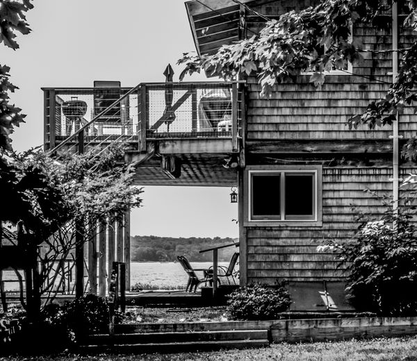
I see what you are after, and I think the image is very good. You are capturing the almost universal appeal of the vacation cottage or lakeside getaway. We see the lake and the woods through the porch, framed by the various items associated with cottage life.
Mike
Mike
Thanks for looking and your comments, Blenheim Orange. Next summer, perhaps my photo of the house will be even better! :D
Jul 19, 2015 23:15:27 #
Frank2013
Loc: San Antonio, TX. & Milwaukee, WI.
ediesaul wrote:
Thanks for looking and your comments, Blenheim Orange. Next summer, perhaps my photo of the house will be even better! :D
ediesaul I cannot come close to describing what so many have already said especially Apaflow but can show you my vision of your photo. Besides a little Lightroom work the crop up from the bottom I feel is the most important improvement.
Jul 20, 2015 00:20:19 #

Frank2013 wrote:
the crop up from the bottom I feel is the most important improvement.
That is another really interesting crop (goodness what a versatile image this is). I hadn't noticed before how special that particular crop is. It retains the pipe going up the wall on the right that balances the framing of the branches on the left. That is something I really missed in my other crops. But what I didn't see is that it emphases a diagonal "line" from the lower left, running just under the branches, through board on the deck and just above branches on the right side. The positioning of the various "squares", in particular the bright square in the center that attracts most of the attention also contributes to this diagonal. I like all of that.
Jul 20, 2015 09:10:53 #
Frank2013
Loc: San Antonio, TX. & Milwaukee, WI.
Apaflo wrote:
That is another really interesting crop (goodness ... (show quote)
I think ediesaul has a fine shot here it just needs a little work. I could not describe all the things you see so thought just the visual would help her, but with your description of the same Im sure she will be delighted.
Jul 20, 2015 09:57:48 #
ediesaul wrote:
Critiques appreciated, and thanked in advance.
Re: Frank's edits:
One aspect of your version that I like, and Apaflow's also, is that you made the photo lighter and enhanced texture. My version, which may hint at what may come, is darker, and we associate darkness with the sinister. I think 2 things: I am still inept with the sliders in RAW, and I was between-and-betwixt showing the "architecture" of the building in silhouette while still capturing textures. This issue was brought up early in the thread. I had wishy-washy ideas that, as Apaflow said, I could not bring to fruition. Also, my memory of the weather intruded into the final version. I know that art is in the artist's control and I'm not a fan of "Well, the garbage can was behind the bride and that's the way it was" philosophy of art and photography. As this photo was taken last week, I should allow more time to discern the photograph more objectively.
I am still not comfortable with cutting the bottom of the photo, which brings us closer to the house. The perspective of the "invisible eye" has changed. The person is no longer approaching and observing, but about to step into the picture. The latter person has already decided to engage. The lighter photos certainly make joining the fun easier. This use of light is very intriguing for me to think about in future photos. Does light make us more vulnerable to the unknown? We might more readily walk down a lit alley than a dark one.
My eye is still uncomfortable with the proportions of the photo. I will have to keep looking at it, perhaps from farther away, to see if I get used to this ratio. I don't have a solid footing to defend this position; it's just instinct.
I very much like what I perceive as increased clarity. I don't know how you accomplished the latter. I tried to make the photo as clear as I could in RAW. When one goes from RAW to Elements, should one sharpen a photo again?
Next time, I will set my camera on a tripod. Perhaps the photo would be better with friends sitting on the upper deck;perhaps filing out to swim. Maybe I'll catch a sailboat on the bay. What a different photo that one would be!
Thanks again, everyone, for making me THINK!!!!!
Jul 20, 2015 10:14:11 #

ediesaul wrote:
...
Thanks again, everyone, for making me THINK!!!!!
Thanks again, everyone, for making me THINK!!!!!
It's been a fascinating thread, Edie, and I have learned much, as well. Thank you!
Aug 7, 2015 18:15:42 #
ediesaul wrote:
Critiques appreciated, and thanked in advance.
I think there is a nice subject here. You wanted to show the structure and how it relates to the chair in the opening. Nice. I think, however, that the photo is a bit too dark. B&W was a good choice. I would lighten the photo and maybe add some contrast....sparingly.
If you want to reply, then register here. Registration is free and your account is created instantly, so you can post right away.