Critiques, please
Jul 19, 2015 16:05:04 #

ediesaul wrote:
...I took this photo on a bright, gray day. The l... (show quote)
It should always be first, and foremost, what you like, Edie. I think critique works best when someone isn't madly in love with something they shot, and aren't sure why. Or feel they have the potential to improve a shot, or the whole enchilada, and are open to suggestions.
I'm glad Treepusher asked about your reasons for the b&w. I'd had a passing thought about color, too, and then forgot to mention :)
Jul 19, 2015 16:13:38 #

ediesaul wrote:
... I don't understand how someone can say that the photo had no subject ...
Of course it has a subject - it's the entire place. The composition is fine.
The problem with the image is that, despite the +1.7 step exposure bias, it is still seems underexposed based on the blocked up shadows. Did that happen in post processing, or did it come out of the camera that way?
As for B&W vs. color, I'm with you on this since I shoot more B&W film than color anything. Color is often a great idea when the colors are pleasant or bright. But old wood and brick is often better in B&W.
Jul 19, 2015 16:58:49 #

Edie this was a fantastic response! It demonstrates exactly why significant commentary by the photographer is useful to a critic. That may be less true of photography by masters, who have already done a superb job of communicating through the visual symbolism in the image, but for the rest of us it is important for a critic to know what is supposed to communicated!
Ahhhhh... you are not photographing a physical object. It isn't just the photograph that is (necessarily) an abstraction, but the subject itself is an abstraction. Lets be even more focused... your subject here is "life". It's the relationship between people and their environment, except you have chosen to display that without even having a human in the image, just the effects of previous human presence.
This might come as a surprise, but what you were after is Street Photography. Not the classic style of Street, which is an urban sidewalk in NYC, but a rather sophisticated and unusual style.
The question of why BW is answered by the above. Color can work, but in this case it is virtually superfluous because "pretty" is not the point, and neither is "drama".
Fabulous concept. The presentation is not organized as well as it could be. It's like a rambling paragraph of text with all the right ideas expressed well in good sentences, but in the wrong order and without continuity. That's what "composition" fixes... It lowers the entropy, by reducing the conflicts and "the clash of uncoordinated orders" (see the works of Wolfgang Köhler on Gestalt Theory).
So editing should be toward coordinating all of those separate symbols in a cohesive way.
Exactly! And the framing or cropping has to be carefully done to preserve what you've captured. The biggest problem for my effort is starting with a JPEG that is already cropped. So I can only show a concept, not a product. I am going to "suggest" ideas, but I can't actually produce them in the way I'd want them to be in a final product. So... don't take my example image too seriously!
A little bit of Cubism creeping in! Not just symbols representing specific things, but "Universal Symbols". Not a specific "eye" located in the appropriate place on the face... but perhaps an eye symbol on the shoulder, where it gets noticed and where it's essence is mentally converted to whatever specific eye the viewer needs at the time. (Or, instead of an eye, how about a bird to represent tranquility and a rotisserie to represent to joys of taking advantage of that tranquility. Neither can have much detail, which would define them too specifically. A barely recognized shape, with specifics left to the viewer's imagination.)
I agree with the objectives of all of that, though in some cases not the method or the results. But the point is you have exactly the right idea for what you are doing and how you think about it!
Attached is a slightly different crop than what I previously described. Rather than centering the middle square of brightness, I did a bit of work on exactly what that square looks like, mostly adding contrast, and the result looked (to me) better with the framing closer to being based on thirds than on juxtaposition layers. So the inner square is centered horizontally, but dropped down closer to the bottom vertically. Still, it is as you say framed within the frame. Balance is important here too, and the brightness of various small objects affect the overall balance.
That would be a very different expression... not the same subject.
Either works, but with complex subjects, and in particular of an abstract subject that is not physically pictured, the most important aspect of composition is to lead the viewers eyes, in a very ordered fashion, from one symbol to another. With text we just put the sentences in the right order, to be read top to bottom and left to right. Each has it's place and has to have continuity to the next. With an image we have "sentences" too, but there is no predetermined order for viewing. We have to somehow, with framing and composition and by adjusting relative brightness, contrast and sharpness, encourage the viewer to use the most productive order of viewing. That just isn't easy either, and not only is it an opinion that varies from person to person, each person may vary too from one time to another.
Here is an expression of the concepts I'm thinking about. Lots of rough edges, so critic the concepts and not the specifics of how well it was implemented.
ediesaul wrote:
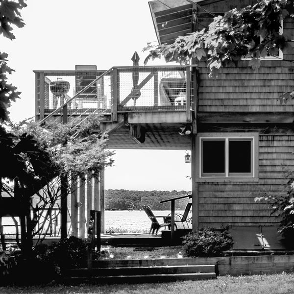
Subject: I wanted to depict the potential. In this case, the potential of a good time, a restful time, a fun time, by the shore.
Ahhhhh... you are not photographing a physical object. It isn't just the photograph that is (necessarily) an abstraction, but the subject itself is an abstraction. Lets be even more focused... your subject here is "life". It's the relationship between people and their environment, except you have chosen to display that without even having a human in the image, just the effects of previous human presence.
This might come as a surprise, but what you were after is Street Photography. Not the classic style of Street, which is an urban sidewalk in NYC, but a rather sophisticated and unusual style.
The question of why BW is answered by the above. Color can work, but in this case it is virtually superfluous because "pretty" is not the point, and neither is "drama".
ediesaul wrote:
To that end, this photo shows the water, the beach chairs, the outdoor furniture, the rotisserie. Nobody is there yet. A single bird is flying toward the open water - harbinger of good times.
Fabulous concept. The presentation is not organized as well as it could be. It's like a rambling paragraph of text with all the right ideas expressed well in good sentences, but in the wrong order and without continuity. That's what "composition" fixes... It lowers the entropy, by reducing the conflicts and "the clash of uncoordinated orders" (see the works of Wolfgang Köhler on Gestalt Theory).
So editing should be toward coordinating all of those separate symbols in a cohesive way.
ediesaul wrote:
Perspective: I like the frame within the total frame of the photo - a picture within a picture. Because the inner frame does not show all the potential, one still needs to peruse the entire photo to get "the complete picture." This kind of framing would not having been accomplished with a different perspective, a side-view, for example. Perhaps a side-view might make for a good photo, but it would be a different photo for sure.
Exactly! And the framing or cropping has to be carefully done to preserve what you've captured. The biggest problem for my effort is starting with a JPEG that is already cropped. So I can only show a concept, not a product. I am going to "suggest" ideas, but I can't actually produce them in the way I'd want them to be in a final product. So... don't take my example image too seriously!
ediesaul wrote:
Focus: This photo is from the eyes of someone who has just arrived. I remember seeing a Wyeth painting from the perspective of a bird just above and behind a bird in formation as the flock was flying over agricultural lands. Yes, the birds and landscape were very well depicted, but the perspective was the subject, I think.
A little bit of Cubism creeping in! Not just symbols representing specific things, but "Universal Symbols". Not a specific "eye" located in the appropriate place on the face... but perhaps an eye symbol on the shoulder, where it gets noticed and where it's essence is mentally converted to whatever specific eye the viewer needs at the time. (Or, instead of an eye, how about a bird to represent tranquility and a rotisserie to represent to joys of taking advantage of that tranquility. Neither can have much detail, which would define them too specifically. A barely recognized shape, with specifics left to the viewer's imagination.)
ediesaul wrote:
Black-and-white/no high contrast: While I like th... (show quote)
I agree with the objectives of all of that, though in some cases not the method or the results. But the point is you have exactly the right idea for what you are doing and how you think about it!
ediesaul wrote:
Cropping: I tried to crop as Apalflo suggested, and could not find a way that I liked. I would not mind Apalflo, if amenable, doing a crop so we can see how the image could be improved.
Attached is a slightly different crop than what I previously described. Rather than centering the middle square of brightness, I did a bit of work on exactly what that square looks like, mostly adding contrast, and the result looked (to me) better with the framing closer to being based on thirds than on juxtaposition layers. So the inner square is centered horizontally, but dropped down closer to the bottom vertically. Still, it is as you say framed within the frame. Balance is important here too, and the brightness of various small objects affect the overall balance.
ediesaul wrote:
Re: cropping to see the water. I don't think that just the view would make an interesting photo; what do others think?
That would be a very different expression... not the same subject.
ediesaul wrote:
A good subject for discussion might be: is a photograph successful when viewers have to look all over it to "get it" vs. a simple subject; can ambiance itself be a subject or only part of the subject?
Either works, but with complex subjects, and in particular of an abstract subject that is not physically pictured, the most important aspect of composition is to lead the viewers eyes, in a very ordered fashion, from one symbol to another. With text we just put the sentences in the right order, to be read top to bottom and left to right. Each has it's place and has to have continuity to the next. With an image we have "sentences" too, but there is no predetermined order for viewing. We have to somehow, with framing and composition and by adjusting relative brightness, contrast and sharpness, encourage the viewer to use the most productive order of viewing. That just isn't easy either, and not only is it an opinion that varies from person to person, each person may vary too from one time to another.
Here is an expression of the concepts I'm thinking about. Lots of rough edges, so critic the concepts and not the specifics of how well it was implemented.
Jul 19, 2015 17:16:26 #

selmslie wrote:
Of course it has a subject - it's the entire place... (show quote)
I'm sorry, selmslie, but the thread became confusing. When I wrote that "it had a subject," I was referring to Linda's photo on another UH site.
As for the underexposed parts, you are right that I perhaps darkened them too much.
Jul 19, 2015 17:19:44 #
Apaflo wrote:
Edie this was a fantastic response! It demonstrates exactly why significant commentary by the photographer is useful to a critic....
Apaflo, your responses to Edie were inspiring and fascinating and great teaching tools for many of us. Thank you, thank you!
Jul 19, 2015 17:39:13 #
ediesaul wrote:
... As for the underexposed parts, you are right that I perhaps darkened them too much.
I hope you still have a copy of the image from before you darkened it. There is little you can do starting from this JPEG to restore the shadows.
Jul 19, 2015 17:43:49 #

This is why I really enjoy FYC. Everyone in here has "opinions" on what works or doesn't. For the most part people back up their thoughts with sound reasoning why they suggest what to do with a photograph. Not simply a thumbs up or down. I couldn't help myself so i tried "playing" around with Edie's shot. Nothing that would win any awards but a learning process for me.
Thanks everyone for getting my brain to function
Thanks everyone for getting my brain to function
Jul 19, 2015 17:52:59 #
Linda From Maine wrote:
Apaflo, your responses to Edie were inspiring and fascinating and great teaching tools for many of us. Thank you, thank you!
And thank you for that comment!
Edie posts some of the most fascinating photography on UHH. It is so "fresh", sort of like the clear and unbiased observations we get from children, but it has the sophistication of not just an adult, but of a senior adult. Edie may be new to photography, but not to expressions, things, or life.
I was just astounded at the depth of thought she'd given to what she wanted that image to be. A little help with learning how to get a strangle hold on methods and technology, with Edie, is a shear joy to give because maybe I can say some small part in a way that helps!
And in 50 years, when Edie and I and a lot of us are not around, that photograph will still have significance to those who see it. It shows something important. (Think about all the "pretty pictures" that get posted here. And the millions of others made every single day that are just like them! They have no value. In 50 years nobody will care. )
Edie's images have value. That makes the effort at analysis worth whatever it takes.
Jul 19, 2015 18:03:57 #

Edie All has been said about your photo. All I want to say is welcome to FYC. You will receive all the help you need here to move your photography on to the next level. Ol'Billys badly written long tutorial type emails may be a thing of the past Edie. You will get the right kind of help on these pages and people can suggest changes and post their changes so you can see the difference. Our emails can just be chat between friends in future.
This is a place constructed with you in mind. No arguments no hassle no interference from Admin. You Edie will make this place ROCK AND ROLL!!!!!!
This is a place constructed with you in mind. No arguments no hassle no interference from Admin. You Edie will make this place ROCK AND ROLL!!!!!!
Jul 19, 2015 18:53:06 #
Your responses are overwhelming in their generosity, Apaflo. I had never thought of photography as an especially intellectual pursuit, but I was wrong. Science, philosophy, the arts, and mathematics are all intertwined. (I looked up "...'the clash of uncoordinated orders' (see the works of Wolfgang Köhler on Gestalt Theory)..." Thank you for sharing your knowledge, and, like some before you, for being so encouraging.
Linda turned me on to a series of essays about composition by Ming Thein. One concept that he mentions, that you allude to, is to have in mind what you want to accomplish before you take the picture. While I am not yet there - I am still learning my camera and the concepts of photography - I will be going back to this same place on Long Island and will have another opportunity to shoot this scene. When that day comes, I will bring a list of questions with me: What's the subject? What do I want to say? How do I stage the scene to convey my message?
Linda turned me on to a series of essays about composition by Ming Thein. One concept that he mentions, that you allude to, is to have in mind what you want to accomplish before you take the picture. While I am not yet there - I am still learning my camera and the concepts of photography - I will be going back to this same place on Long Island and will have another opportunity to shoot this scene. When that day comes, I will bring a list of questions with me: What's the subject? What do I want to say? How do I stage the scene to convey my message?
Jul 19, 2015 18:54:55 #
Apaflo wrote:
And thank you for that comment! br br Edie posts ... (show quote)
A very kind and encouraging statement to make. Thank you from the bottom of my heart.
Jul 19, 2015 18:58:34 #
Billyspad wrote:
Edie All has been said about your photo. All I wan... (show quote)
Thank you. You are one of the many who have helped me along with knowledge and encouragement, Billyspad. I hope that we can continue to communicate in PM-style. What would life be without your sense of humor?
Jul 19, 2015 19:06:05 #
ediesaul wrote:
Billyspad... What would life be without your sense of humor?...
:thumbup: :thumbup:
Jul 19, 2015 19:23:07 #
Apaflo wrote:
And in 50 years, when Edie and I and a lot of us are not around, that photograph will still have significance to those who see it. It shows something important. (Think about all the "pretty pictures" that get posted here. And the millions of others made every single day that are just like them! They have no value. In 50 years nobody will care. )
Edie's images have value. That makes the effort at analysis worth whatever it takes.
Edie's images have value. That makes the effort at analysis worth whatever it takes.
Brilliant comment. That was what I was alluding to when I asked should we think in terms of communication first - "that photograph will still have significance to those who see it. It shows something important." - rather than so-called "art" - "all the 'pretty pictures' that get posted here. And the millions of others made every single day that are just like them."
Mike
Jul 19, 2015 19:29:13 #
ediesaul wrote:
I like the frame within the total frame of the photo - a picture within a picture. Because the inner frame does not show all the potential, one still needs to peruse the entire photo to get "the complete picture." This kind of framing would not having been accomplished with a different perspective, a side-view, for example. Perhaps a side-view might make for a good photo, but it would be a different photo for sure.
I see what you are after, and I think the image is very good. You are capturing the almost universal appeal of the vacation cottage or lakeside getaway. We see the lake and the woods through the porch, framed by the various items associated with cottage life.
Mike
If you want to reply, then register here. Registration is free and your account is created instantly, so you can post right away.