WPC 1515 - Mailboxes CRITIQUE
Apr 17, 2015 22:48:45 #

richensley's WPC Entry has been selected for the Photo Critique Forum* to find out what could have done to make it better.
Be nice, but be honest as this may help everyone with their craft. Thank you everyone!
From WPC 1515 - Mailboxes RESULTS http://www.uglyhedgehog.com/photo_contest_ratings.jsp?pcnum=165
* If you are new to the Photo Critique Forum please read the Section Rules http://www.uglyhedgehog.com/t-279264-1.html
.
Apr 18, 2015 11:35:52 #

St3v3M wrote:
richensley's WPC Entry has been selected for the Photo Critique Forum* to find out what could have done to make it better.
Be nice, but be honest as this may help everyone with their craft. Thank you everyone!
From WPC 1515 - Mailboxes RESULTS http://www.uglyhedgehog.com/photo_contest_ratings.jsp?pcnum=165
* If you are new to the Photo Critique Forum please read the Section Rules http://www.uglyhedgehog.com/t-279264-1.html
.
Be nice, but be honest as this may help everyone with their craft. Thank you everyone!
From WPC 1515 - Mailboxes RESULTS http://www.uglyhedgehog.com/photo_contest_ratings.jsp?pcnum=165
* If you are new to the Photo Critique Forum please read the Section Rules http://www.uglyhedgehog.com/t-279264-1.html
.
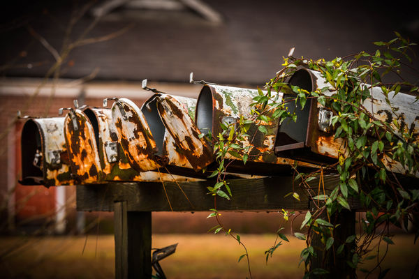
I have to comment on this image and I'm not good enough to make any constructive comments. The mailboxes are beautifully sharp. The BG is pleasantly blurred. The corners are toned down to keep me into the subject. The lightness of the BG surrounding the subjects is of just the right intensity. The reason I have to comment is the emotional strings being pulled. The wonderful anticipation of awaiting the arrival of an expected letter or parcel; the friendship developed with the mailman. And now the coldness of the instant information age. This image shows me goodness from the past, satisfaction in present advances, and sadness of some modern "improvements." I think, in my case, this is a very successful photograph.
Apr 18, 2015 15:40:32 #

Lynn L wrote:
I have to comment on this image and I'm not good e... (show quote)
And, Lynn,
Your comment was exemplary of an exceptionally engaging and sensitive statement of how that image made you feel...and, I'm sure, put into better words than some of us could muster about how it made us feel.
Good on ya, and thanks.
I can only add "Amen"
Dave
Apr 18, 2015 16:00:39 #

I can only agree with Dave when he says Lynn has nailed it with his assessment of the wonderfully evocative photograph. We don't have these mail boxes in The Uk, all of our mail is pushed through our doors. But we do have those lovely red "pillar boxes"
Apr 18, 2015 19:22:22 #
jim hill
Loc: Springfield, IL
St3v3M wrote:
richensley's WPC Entry has been selected for the Photo Critique Forum* to find out what could have done to make it better.
Be nice, but be honest as this may help everyone with their craft. Thank you everyone!
From WPC 1515 - Mailboxes RESULTS http://www.uglyhedgehog.com/photo_contest_ratings.jsp?pcnum=165
* If you are new to the Photo Critique Forum please read the Section Rules http://www.uglyhedgehog.com/t-279264-1.html
.
Be nice, but be honest as this may help everyone with their craft. Thank you everyone!
From WPC 1515 - Mailboxes RESULTS http://www.uglyhedgehog.com/photo_contest_ratings.jsp?pcnum=165
* If you are new to the Photo Critique Forum please read the Section Rules http://www.uglyhedgehog.com/t-279264-1.html
.
Billy must be sleeping in the hammock. So, let may mention a few things I might do if it were mine - which it isnt - so take thiese critique points with a large grain of sea salt.
It is, as all have already commented, a really lovely emotion filled photograph. It stands alone as a success. There are possibly a couple things that might be done to make a stronger image.
1. Remove, maybe by cloning out, the out of ficus branches across the top of the image. Or possibly by dropping the top edge down to just below the largest branch. I don't think this would be too bad as it would take the subject out of center.
2. It is my opinion, and probably mine alone, that the vignetting is a little too much. It's good to darken the edges and corners slightly to contain the eye but I think this a bridge too far. I think it was done for emotional impact but it looks gimmicky to me.
3. Finally, it might be advantageous, and I strongly emphasize MIGHT, to crop to just inside the left edge of the left side box. This might help to bring a sense of mystery along with the already strong emotional impact.
Or, leave it as it is. It's a lovely photograph.
I do try to return so many favors granted to me since I first began posting in Critique with critiques as I see them. This forum has helped me a lot.
Congratulations on making a beauty.
Apr 18, 2015 21:54:59 #
Jim. I just want to thank your for your technical analysis of this photo. Your tree trimming I like. The crop suggestion would be an improvement. I'm not sure I agree about the darkened corners. I've not been exposed to this chain of thought on this type of photography. When I made money in photography I made it taking good portraits and very good weddings. But I was not, and am not, a truly creative photographer. I did well because I was willing to spend $$ going through NYI and PP of A's weekly cram courses at Lake Winona. I got to steal ideas from the best portrait & wedding photographers in the whole USA. Now perhaps you can see why I really appreciate everyone's input. It would be real nice for and old dog to learn a new way of thinking photographically. TNX for your help. Lynn
Apr 18, 2015 23:17:28 #
jim hill
Loc: Springfield, IL
Lynn L wrote:
Jim. I just want to thank your for your technical ... (show quote)
I thought I was commenting on rich hensley. Now I is really Confucius.
What part of N. IL are you inhabiting? I'm in Springfield. Two blocks from state capitol.
Edit:
Just checked your posts and I saw steam power. Must have got the wires crossed somehow. I think that's the only one of yours I have ever critiqued.
I tried wedding photography once. Hated it! Just didn't like being told who, what, when, where or how to photograph. Although the couple liked the finished portfolio I never did it again. Also tried a little commercial photography. Was terrible at it. Customers hated my way of doing things and I wasn't about to change for any reason - not even bigger money.
My hats off to all who are able to put up with all that. You must have had a really strong constitution.
Keep up the good work.
Apr 18, 2015 23:27:06 #
jim hill wrote:
I thought I was commenting on rich hensley. Now I is really Confucius.
What part of N. IL are you inhabiting? I'm in Springfield. Two blocks from state capitol.
What part of N. IL are you inhabiting? I'm in Springfield. Two blocks from state capitol.
DeKalb, two blocks from NIU.
Apr 19, 2015 17:41:27 #

I love the way you have framed this .. tight .. the doors on the mailboxes in disarray. Your DOF is perfect. Your subject is sharp and the OOF background is clear enough to let us know this is a rural area. I love the warmth of your colours. Nicely done.
Apr 19, 2015 17:51:18 #
I would agree with Jim on the removal of the foliage plus get rid of the vignetting, never a big fan of such. If the subject is solid and the composition is good there is no need for the 'dressing'.
I would also eliminate the 90 degree roof angle, it is a distraction IMO.
Finally I would go with the roof line to use as 'level'. This would create a better leading line from upper right to lower left by turning the picture slightly CCW.
Good snap all around .......... just sharing my preferences.
I would also eliminate the 90 degree roof angle, it is a distraction IMO.
Finally I would go with the roof line to use as 'level'. This would create a better leading line from upper right to lower left by turning the picture slightly CCW.
Good snap all around .......... just sharing my preferences.
Apr 20, 2015 12:48:08 #
Nightski wrote:
I love the way you have framed this .. tight .. the doors on the mailboxes in disarray. Your DOF is perfect. Your subject is sharp and the OOF background is clear enough to let us know this is a rural area. I love the warmth of your colours. Nicely done.
I just read your link:
http://www.luminous-landscape.com/about/briots-view/vision_11_critiquing_photographs.shtml
Thank you, I'll use that, critique technically and separate my own 'preferences/opinion' from true critiquing .....
Apr 20, 2015 12:58:32 #
jim hill
Loc: Springfield, IL
Beercat wrote:
I just read your link:
http://www.luminous-landscape.com/about/briots-view/vision_11_critiquing_photographs.shtml
Thank you, I'll use that, critique technically and separate my on 'preferences/opinion' from true critiquing .....
http://www.luminous-landscape.com/about/briots-view/vision_11_critiquing_photographs.shtml
Thank you, I'll use that, critique technically and separate my on 'preferences/opinion' from true critiquing .....
I don't like this link. Took my task manager to get out of it.
Apr 20, 2015 13:11:25 #
jim hill wrote:
I don't like this link. Took my task manager to get out of it.
Is that a truth technically or is it just you, meaning an opinion :lol:
I got out of it just fine 8-)
Apr 20, 2015 13:30:11 #
jim hill
Loc: Springfield, IL
Beercat wrote:
Is that a truth technically or is it just you, meaning an opinion :lol:
I got out of it just fine 8-)
I got out of it just fine 8-)
Sorry - I just found a screen problem, Dammit! I hate these frigging machines. Just har two viruses removed that were causing a white screen.
ARGGGHHHH!
Apr 20, 2015 18:55:40 #
After reading the comments of others,I still love the foliage .. the vignetting could be more subtle.
If you want to reply, then register here. Registration is free and your account is created instantly, so you can post right away.