Low Contrast Black & White - for when you're feeling mellow :)
Mar 26, 2015 17:19:20 #

James56 wrote:
You've picked some great subjects Linda. I like al... (show quote)
Thanks so much for your lovely comments and support, James. Much appreciated!
I should have clarified that our assignment was to find the low contrast (or high) in the scene/subject themselves, not as a function of editing.
Mar 26, 2015 17:19:40 #
SX2002 wrote:
Lovely Linda, really like the barn... :thumbup:
Thank you very kindly, Ron. So pleased you enjoyed.
Mar 26, 2015 17:20:59 #
Camshy wrote:
The first one does not do much for me, but I really like the others ones! They are very nice!
Thanks so much, Mary! That one was actually for a "symmetry or balance" exercise, and I was so excited to find it (behind another building downtown; didn't know it existed), I didn't really care what the subject was - LOL.
Mar 26, 2015 17:21:44 #
MissStephie wrote:
I really like the last image.....
Thanks so much! That cemetery is a very interesting, and quite moving, place to visit.
Mar 26, 2015 17:22:57 #
Linda From Maine wrote:
In the class I'm taking right now, we're exploring high contrast vs. low contrast b&w images. Just because these aren't in-your-face WOW, does it mean they don't offer some interest? Not a rhetorical question, am really asking for your feedback :)
btw, the biggest thing I've learned in this class is that it's very stressful trying to produce quality images "on demand" LOL
btw, the biggest thing I've learned in this class is that it's very stressful trying to produce quality images "on demand" LOL
No 1. Good image . Very symmetrical and good balance the bench is a very nice element. The result is a strong composition and a good image. It does not, however, speak to me personally. I like it; but it is not blowing me over.
No. 2 Yes the chickens help. What is more important her, though, is that you have layered your composition. Grass, barn, trees, lighter trees. All of these items become distinct layers of the composition and produce a very nice landscape that, in my opinion, has a lot of impact. This image speaks to me in very loud tones. I really like it.
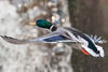
No. 3 The best of the bunch in my opinion because of the bird and those fantastic and very different hops lines. You don't have to know what they are to see the impact of this photo. It is fantastic in black and White.
Mar 26, 2015 17:26:54 #
Treepusher wrote:
Talk about eye of the beholder, lol. Everyone loving a different shot here. My own fav is the barn and soft trees in the woods behind it. The heron is a terrific image, pulls your eye right to the bird, but something about the barn scene keeps me coming back to it.
Certainly lots of nice tonal range in them all. The first shot (to me) begs for color, altho it's a nice study. The rest work really well in the B/W format.
Excellent work!
Certainly lots of nice tonal range in them all. The first shot (to me) begs for color, altho it's a nice study. The rest work really well in the B/W format.
Excellent work!
Thanks so much, Randy. Intriguing to hear you mention color for #1 as I shot that after a rain, under overcast skies, and as you can see below with a quick edit of the color file, there wasn't much color there :) (if you are moved to Glow it, go for it!)

Mar 26, 2015 17:29:11 #
Sylvias wrote:
Very interesting set, excellent work, I love the barn and the pickup truck with the chickens milling around. Also the composition of the Heron. :D
Thanks for your lovely comments, Sylvia. Much appreciated!
Mar 26, 2015 17:33:48 #
ebrunner wrote:
No 1. Good image . Very symmetrical and good bala... (show quote)
Thank you so much for your detailed critique, Erich. I am so appreciative of your time and thoughtful comments. Converting the heron was a last-second plan when I wasn't that happy with what I was about to submit. So I have to confess I didn't shoot it with b&w in mind. But I was able to express my "message," which I can't always articulate :) What I said:
I'm usually more interested in their graphic nature in high-contrast light, but their textures were very appealing on this overcast day. The presence of a great blue heron was a delightful surprise - lagniappe, as they say in New Orleans.
I composed for the lines: the even spacing gives me a sense of calm and order, though their diagonal aspect feels more dynamic - which seems right for something associated with agricultural and growing plants. I also gave them 2/3 of the vertical space to emphasize their height and importance.
Mar 26, 2015 18:08:50 #
Nice take on them, Linda. I especially love #2 with the barn & the old truck. :-) :thumbup:
Mar 26, 2015 18:59:14 #
DOOK wrote:
Nice take on them, Linda. I especially love #2 with the barn & the old truck. :-) :thumbup:
Thank you so much, Earl. Very glad you enjoyed!
Mar 26, 2015 19:16:49 #
I like them all. #1 I could see an old person in a wool coat and a bag on the ground next to them, or someone of interest. #2 Excellent grey tones contrast, composition, and perspective, also the truck adds greatly to the picture.
#3 the heron is the clincher highlighted by the clean tones in the clouds, and repeating leading lines makes a complete picture - very well done, a wall hanger.
#4 not sold, many interesting patterns and shapes, something about the perspective and main subject emphasis missing.
#3 the heron is the clincher highlighted by the clean tones in the clouds, and repeating leading lines makes a complete picture - very well done, a wall hanger.
#4 not sold, many interesting patterns and shapes, something about the perspective and main subject emphasis missing.
Linda From Maine wrote:
In the class I'm taking right now, we're exploring high contrast vs. low contrast b&w images. Just because these aren't in-your-face WOW, does it mean they don't offer some interest? Not a rhetorical question, am really asking for your feedback :)
btw, the biggest thing I've learned in this class is that it's very stressful trying to produce quality images "on demand" LOL
btw, the biggest thing I've learned in this class is that it's very stressful trying to produce quality images "on demand" LOL
Mar 26, 2015 20:36:13 #

Linda From Maine wrote:
In the class I'm taking right now, we're exploring high contrast vs. low contrast b&w images. Just because these aren't in-your-face WOW, does it mean they don't offer some interest? Not a rhetorical question, am really asking for your feedback :)
btw, the biggest thing I've learned in this class is that it's very stressful trying to produce quality images "on demand" LOL
btw, the biggest thing I've learned in this class is that it's very stressful trying to produce quality images "on demand" LOL
my favorite is the chicken shot! i also like the cemetary shot.
i recently spent an afternoon hanging out in the marietta georgia confederate cemetary. didn't get any good shots though as it was early in the afternoon and the sun was out.
cemetaries are fun places to hang out, as long as it isn't permanent. :-D
Mar 26, 2015 20:39:24 #
Dan L wrote:
I like them all. #1 I could see an old person in a... (show quote)
Thanks so much for your time and detailed critiques, Dan. Much appreciated!
Mar 26, 2015 20:40:55 #
merrytexan wrote:
my favorite is the chicken shot! i also like the cemetary shot.
i recently spent an afternoon hanging out in the marietta georgia confederate cemetary. didn't get any good shots though as it was early in the afternoon and the sun was out.
cemetaries are fun places to hang out, as long as it isn't permanent. :-D
i recently spent an afternoon hanging out in the marietta georgia confederate cemetary. didn't get any good shots though as it was early in the afternoon and the sun was out.
cemetaries are fun places to hang out, as long as it isn't permanent. :-D
Thank you kindly, MT. So glad you enjoyed.
Mar 26, 2015 20:59:07 #

Beautiful examples of low contrast b/w, Linda. I'm finding I like the low contrast as much as I do the more dramatic high contrast image. Oh..you are so right about producing quality images on demand. Very stressful but a great exercise to keep us on our toes. :-D
Linda From Maine wrote:
In the class I'm taking right now, we're exploring high contrast vs. low contrast b&w images. Just because these aren't in-your-face WOW, does it mean they don't offer some interest? Not a rhetorical question, am really asking for your feedback :)
btw, the biggest thing I've learned in this class is that it's very stressful trying to produce quality images "on demand" LOL
btw, the biggest thing I've learned in this class is that it's very stressful trying to produce quality images "on demand" LOL
If you want to reply, then register here. Registration is free and your account is created instantly, so you can post right away.