Low Contrast Black & White - for when you're feeling mellow :)
Mar 26, 2015 14:52:31 #

In the class I'm taking right now, we're exploring high contrast vs. low contrast b&w images. Just because these aren't in-your-face WOW, does it mean they don't offer some interest? Not a rhetorical question, am really asking for your feedback :)
btw, the biggest thing I've learned in this class is that it's very stressful trying to produce quality images "on demand" LOL
btw, the biggest thing I've learned in this class is that it's very stressful trying to produce quality images "on demand" LOL
Symmetry, balance
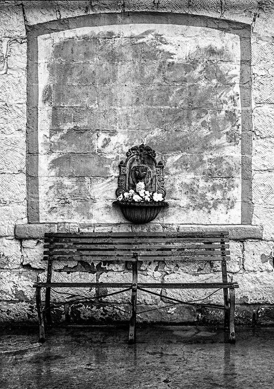
(Download)
2. The chickens cooperated nicely :)
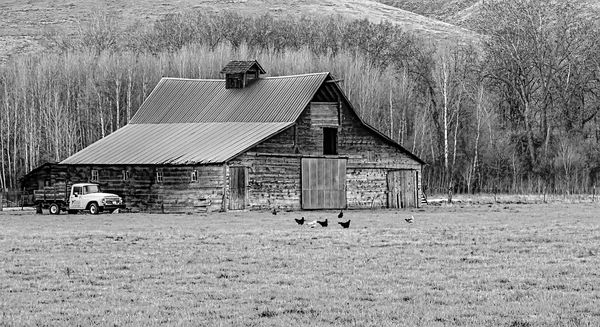
(Download)
3. Great blue heron on hops growing apparatus.
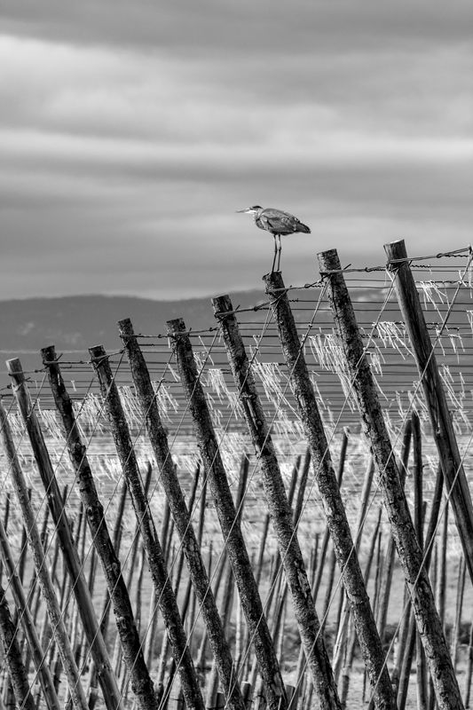
(Download)
4. Roslyn Historical Cemetery, Washington State
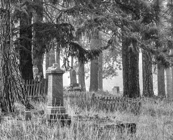
(Download)
Mar 26, 2015 15:18:49 #

Linda From Maine wrote:
In the class I'm taking right now, we're exploring high contrast vs. low contrast b&w images. Just because these aren't in-your-face WOW, does it mean they don't offer some interest? Not a rhetorical question, am really asking for your feedback :)
btw, the biggest thing I've learned in this class is that it's very stressful trying to produce quality images "on demand" LOL
btw, the biggest thing I've learned in this class is that it's very stressful trying to produce quality images "on demand" LOL
All Very nicely done Linda... Love the heron!👍👍👍
Mar 26, 2015 15:23:24 #

Linda From Maine wrote:
In the class I'm taking right now, we're exploring high contrast vs. low contrast b&w images. Just because these aren't in-your-face WOW, does it mean they don't offer some interest? Not a rhetorical question, am really asking for your feedback :)
btw, the biggest thing I've learned in this class is that it's very stressful trying to produce quality images "on demand" LOL
btw, the biggest thing I've learned in this class is that it's very stressful trying to produce quality images "on demand" LOL
My favs are the barn scene and the cemetery.
Mar 26, 2015 15:25:01 #
FrodoBaggins wrote:
All Very nicely done Linda... Love the heron!👍👍👍
Thank you, Frodo! Very glad you enjoyed.
Mar 26, 2015 15:25:13 #
photophile wrote:
My favs are the barn scene and the cemetery.
Thanks so much, Karin.
Mar 26, 2015 15:28:58 #

A very good set Linda and I especially like the Heron and the cemetery.
Mar 26, 2015 15:33:49 #
Benivere
Loc: Houston, Texas
Linda, I'm intrigued by the class you're taking, but the images don't necessarily speak to me as benefiting from the lower contrast.
The "Symmetry, balance" and "Great blue heron" images work well using the softer contrast, possibly because there is a strong tonal range in the images that help with definition. The "chickens" image has good overall tonal range as well.
Usually, I've been taken with images that "feel" soft that use soft contrast, such as fog. Those seem to ask to be presented that way (as opposed to the "rule" that something in every photo needs to be white and something black).
Thanks for sharing!
Mar 26, 2015 15:40:58 #

You've picked some great subjects Linda. I like all of these and your processing. Like a lot of photography, the processing of B & W (just like color) is highly personal and subjective. I have so many filters for processing B & W, I can't keep up with what I have. But it is fun to experiment. Some prefer dark and dramatic, others like high contrast and grainy, and still others like soft and dreamy. I don't think there is a right of wrong, but rather if it's pleasing to you...then mission accomplished. Glad to hear your involved with learning by taking classes. And Yes...trying to create quality work on demand on a daily basis can be frustrating and stressful. Some do better than others. But it takes a toll on me, and thus I'm in a bit of a slump at the moment, so I'm taking a break. Hats off to your seeking ways to improve.
Mar 26, 2015 15:47:20 #
Mar 26, 2015 15:59:40 #

Linda From Maine wrote:
In the class I'm taking right now, we're exploring high contrast vs. low contrast b&w images. Just because these aren't in-your-face WOW, does it mean they don't offer some interest? Not a rhetorical question, am really asking for your feedback :)
btw, the biggest thing I've learned in this class is that it's very stressful trying to produce quality images "on demand" LOL
btw, the biggest thing I've learned in this class is that it's very stressful trying to produce quality images "on demand" LOL
The first one does not do much for me, but I really like the others ones! They are very nice!
Mar 26, 2015 16:11:36 #

Mar 26, 2015 16:36:17 #

Talk about eye of the beholder, lol. Everyone loving a different shot here. My own fav is the barn and soft trees in the woods behind it. The heron is a terrific image, pulls your eye right to the bird, but something about the barn scene keeps me coming back to it.
Certainly lots of nice tonal range in them all. The first shot (to me) begs for color, altho it's a nice study. The rest work really well in the B/W format.
Excellent work!
Certainly lots of nice tonal range in them all. The first shot (to me) begs for color, altho it's a nice study. The rest work really well in the B/W format.
Excellent work!
Mar 26, 2015 16:53:11 #

Very interesting set, excellent work, I love the barn and the pickup truck with the chickens milling around. Also the composition of the Heron. :D
Mar 26, 2015 17:13:34 #
angler wrote:
A very good set Linda and I especially like the Heron and the cemetery.
Thank you very kindly, Jim!
Mar 26, 2015 17:15:44 #
Benivere wrote:
Linda, I'm intrigued by the class you're taking, b... (show quote)
Thanks so much for your comments, Benivere. I really appreciate your taking the time to express your viewpoint. Interesting, and much appreciated!
I should have clarified that the low contrast was not a result of anything in editing, but from the scenes themselves - which is perhaps why you found some interest in the ones you mentioned.
Thanks again, and welcome to UHH!
If you want to reply, then register here. Registration is free and your account is created instantly, so you can post right away.