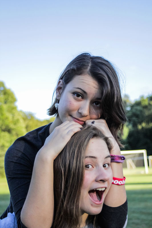
My People aren't Popping
Dec 31, 2013 09:59:07 #
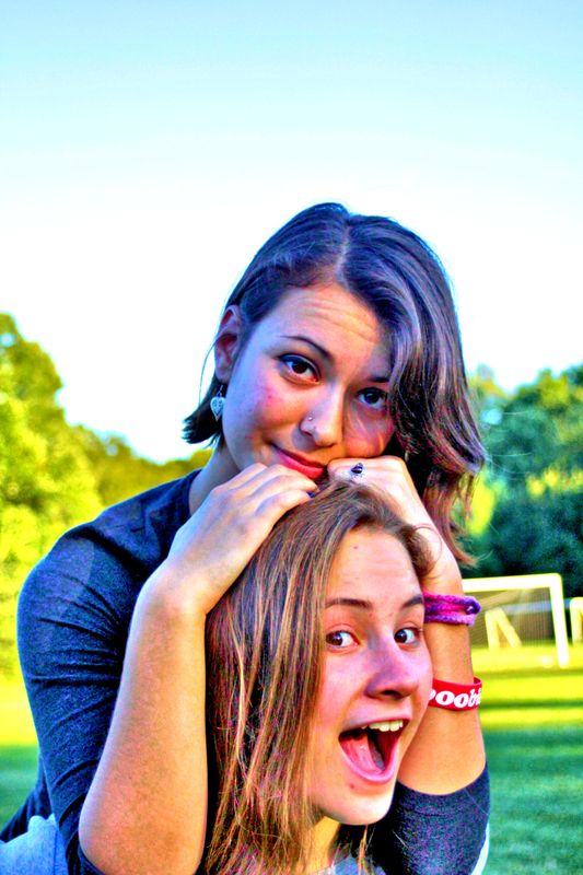
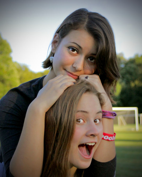
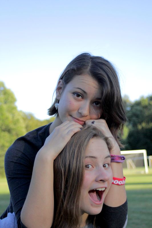
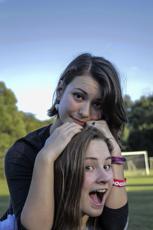
Here are my tries............
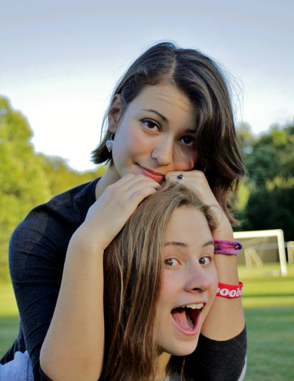
Added some fill light, adjusted contrast & saturation.....
Added some fill light, adjusted contrast & saturation.....
Dec 31, 2013 10:01:02 #
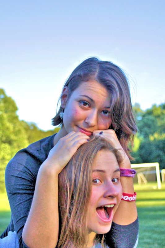
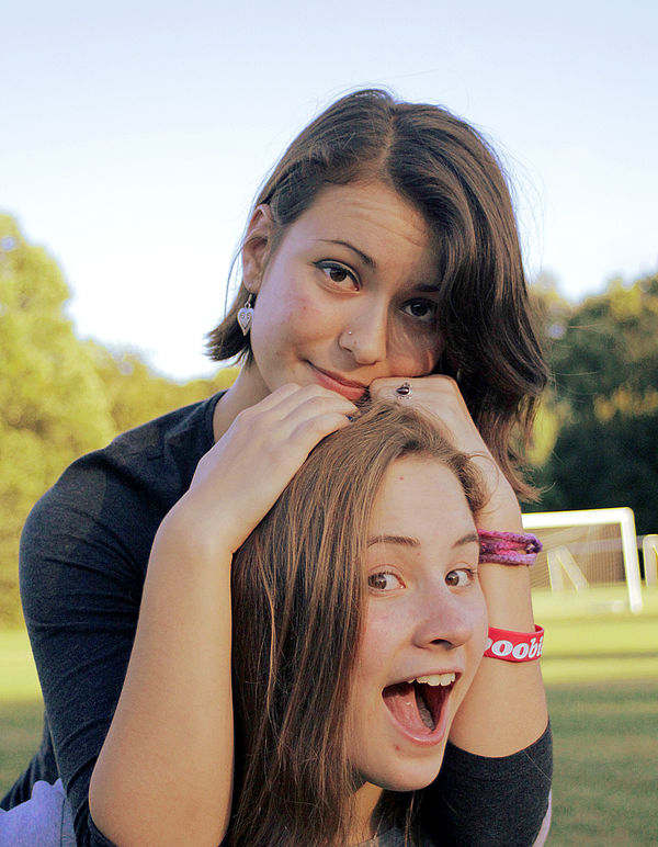
Cropped top and right side, sorry did not really pay much attention to the details. I used Microsoft Office Picture Manager.
Dec 31, 2013 11:22:20 #

Dec 31, 2013 11:25:10 #
ricardolegraham wrote:
Yeah, go ahead and do whatever you want to with it. Same goes for anyone else out there! :thumbup:
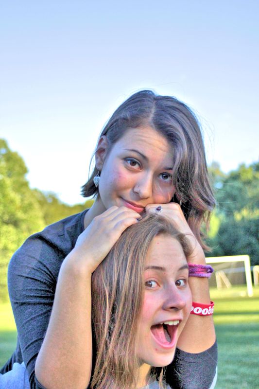
Here is my attempt. This is what I would do to it if it were my image. I used GIMP.
Color Balance Cyan-Red +15
Yellow -blue -11
Levels Left pointer 20 Center Pointer 1.19
Curves: Mid highlights (2 divisions from right) raise curve slightly
Mid Shadows (two divisions from left) lower curve slightly
(this increases mid tone contrast. Don't overdo it)
Hue/Saturation SAT + 19
Sharpen to taste using Unsharp Mask
Could be improved further by burning lower face and/or dodging upper one.
Dec 31, 2013 11:47:15 #
ricardolegraham wrote:
Yeah, go ahead and do whatever you want to with it. Same goes for anyone else out there! :thumbup:
Cool Beans :-D Watch out here I come :mrgreen:
:-) ;-)
Dec 31, 2013 11:51:05 #
ricardolegraham wrote:
Are you referring to the one in which the guy tells us to use the "Cartoon" filter? The link is to a search result page...
Yes, that's the one. I usually use Elements, but I tried GIMP with settings as suggested in this tutorial. It didn't do much for me. :cry: Some of the other reedits presented here are much better. Go Hoggers!
Dec 31, 2013 20:05:42 #
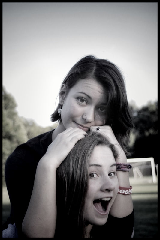
Here is another for you to look at. Ran it thru topaz b&w to desaturate down leaving small amount of color, smoothed a couple skin blemishes.
Jan 1, 2014 07:50:19 #
The simple GIMP starting point is Colors menu, select the Brightness and Contrast tool. Lower the brightness to around -9 and increase the contrast to 18. Example image shown below.
If you need further adjustments click on the Levels bar in the Brightness and Contrast tool. From Levels click on the Curves bar for the new tool and adjust colors using the Color Channels.
Sharpen as required. No sharpening on these examples.
If you need further adjustments click on the Levels bar in the Brightness and Contrast tool. From Levels click on the Curves bar for the new tool and adjust colors using the Color Channels.
Sharpen as required. No sharpening on these examples.
Brightness and Contrast Only
Levels and Curves Tools

Jan 1, 2014 08:00:47 #
ricardolegraham wrote:
So this is a photo that's been giving me a bit of ... (show quote)
Is this too dark?
Jan 1, 2014 08:01:27 #
You mean, you actually loaned your camera out to someone? Hmmm....you're MUCH nicer than I'll ever be! You never know what might happen in the hands of another user and if something REALLY bad were to happen to the camera - then who would you blame?
Jan 1, 2014 08:06:53 #
ronwande wrote:
Here is my attempt. This is what I would do to it... (show quote)
Nice job, ronwande. :thumbup: :thumbup: :thumbup:
Jan 1, 2014 08:33:52 #
B-n-L
Loc: Nevada
NiagaraJim wrote:
I gave it a shot, hope you like it.
:thumbup: :thumbup: :thumbup:
Jan 1, 2014 08:53:16 #
swallowtail wrote:
Is this too dark?
It's more than just too dark. For example: the flesh tones are too pale, check the sky and you can see banding, which means you pushed the image too far. I can't say how because I don't know the program you used.
Don't despair, it's a fair attempt.
Jan 1, 2014 08:53:41 #
Set everything to Auto and relax, when in doubt the camera is always smarter than you.
Jan 1, 2014 09:56:35 #
If you want to reply, then register here. Registration is free and your account is created instantly, so you can post right away.