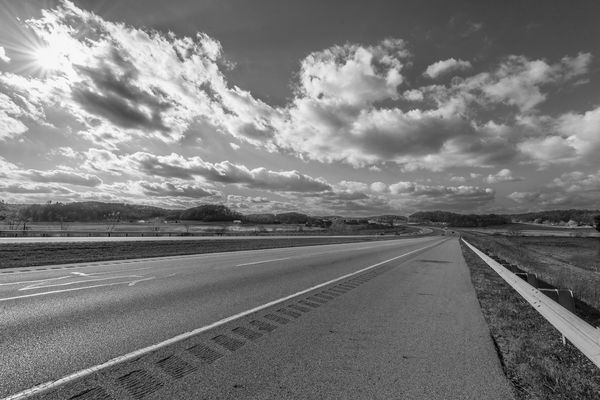
Nikon 14-24mm Wide Angle Fall Landscape
Nov 14, 2013 15:13:33 #
Hi Everyone,
I contemplated posting this for about a week, but finally decided to see what all of you have to say critiquing this image. I hope it gets posted since it is 31.5 MB.
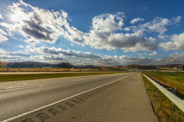
I had to run an errand and knew I was running out of time to take this shot, so I headed out one early morning to try to catch the sun correctly. When I arrived, it was completely grey and overcast - bummer! I drove right on by another 40 miles and ran several errands. On my way back, the sun was slightly shining, so after finishing at my last stop, I went out of my way to arrive at this spot again. I got out of my car standing along the busy highway (speed limit is 70 mph), put on my blinkers, and stood in front of my car along the guard rail being blown every time a semi drove by! I snapped a few shots, and then saw the sun about to be at an optimum place in the clouds. I waited, and when I thought it was just about right, I pressed the shutter release button and this is what I ended up with.
I feel like it has a lot of varying quality features all in the same image. The way I included the sun star, some minor sun flare, the disappearing perspective of the highway initially being initiated by the guard rail and the rumble strip, the slow curvature of the road disappearing into the gap of the hills, the late fall and almost disappearing color of the leaves (just enough for color), the sun lighting the golden field to the left and counter balanced by the bright yellow tree(s) to the far distant right, the well lit guard rail on the front side and the dark shadow directly behind it (good contrast), the alternating light and dark vegetation, and the nice definition of the clouds amongst the light to dark deep blue sky from left to right. :) I just think it kind of all comes together and the area of the picture is really quite large, on a fairly mild downward slope which the wide angle lens has captured.
Taken with a Nikon D800, 14-24mm f/2.8 lens, 15 mm, ISO 200, f/16, 1/640 sec, no flash, white balance = Shade, and spot metering (forgot to change it before taking the shot). Post processed some in ACR and Photoshop CC. Maybe just a tad in LR 5.2 - not sure. This image was not cropped at all.
OK, fellow photographers, have at it! Thanks ahead of time for all your thoughts, praises, constructive criticisms, and helpful suggestions. They are really appreciated. :)
Sincerely,
Tom
I contemplated posting this for about a week, but finally decided to see what all of you have to say critiquing this image. I hope it gets posted since it is 31.5 MB.
I had to run an errand and knew I was running out of time to take this shot, so I headed out one early morning to try to catch the sun correctly. When I arrived, it was completely grey and overcast - bummer! I drove right on by another 40 miles and ran several errands. On my way back, the sun was slightly shining, so after finishing at my last stop, I went out of my way to arrive at this spot again. I got out of my car standing along the busy highway (speed limit is 70 mph), put on my blinkers, and stood in front of my car along the guard rail being blown every time a semi drove by! I snapped a few shots, and then saw the sun about to be at an optimum place in the clouds. I waited, and when I thought it was just about right, I pressed the shutter release button and this is what I ended up with.
I feel like it has a lot of varying quality features all in the same image. The way I included the sun star, some minor sun flare, the disappearing perspective of the highway initially being initiated by the guard rail and the rumble strip, the slow curvature of the road disappearing into the gap of the hills, the late fall and almost disappearing color of the leaves (just enough for color), the sun lighting the golden field to the left and counter balanced by the bright yellow tree(s) to the far distant right, the well lit guard rail on the front side and the dark shadow directly behind it (good contrast), the alternating light and dark vegetation, and the nice definition of the clouds amongst the light to dark deep blue sky from left to right. :) I just think it kind of all comes together and the area of the picture is really quite large, on a fairly mild downward slope which the wide angle lens has captured.
Taken with a Nikon D800, 14-24mm f/2.8 lens, 15 mm, ISO 200, f/16, 1/640 sec, no flash, white balance = Shade, and spot metering (forgot to change it before taking the shot). Post processed some in ACR and Photoshop CC. Maybe just a tad in LR 5.2 - not sure. This image was not cropped at all.
OK, fellow photographers, have at it! Thanks ahead of time for all your thoughts, praises, constructive criticisms, and helpful suggestions. They are really appreciated. :)
Sincerely,
Tom
14-24 mm Wide Angle Late Fall SE Ohio Landscape
Nov 14, 2013 16:04:55 #

You do have good leading lines. They lead you into the photo, the problem for me is they lead you down the road but to nowhere. The sky is interesting but there is no place for my eye to land. No point of interest.
Nov 14, 2013 17:29:13 #
Country's Mama wrote:
You do have good leading lines. They lead you into the photo, the problem for me is they lead you down the road but to nowhere. The sky is interesting but there is no place for my eye to land. No point of interest.
Country's Mama,
I definitely know what you are talking about. When I look at the real image on my larger screen as opposed to the little 'replica' on the UHH site, it seems much more open but also much more defined and then it kind of 'rides off into the sunset' for me as quite an exacting perspective image with perspective lines going way back into whatever grade in school where we were taught about perspective. It reminds me of looking down railroad tracks, but with a curve in them and nice scenery to look at on the sides. That is what I am talking about and saying what the picture conveys. Thank you. :)
Tom
Nov 14, 2013 17:44:08 #
lighthouse
Loc: No Fixed Abode
I agree with CM.
But I can defintely see what you mean about the lines disappearing to the distance.
I think the problem is that the "distance" is in the middle of your photo.
If that perspective is what you were after I think you needed to sacrifice the sky so that the "distance" was in the top 20% of the photo.
It can work like you have done but I don't think your lines are strong enough in this shot and there is no horizon interest.
So that makes your midpoint horizon really weak.
Arizona/Utah, red dirt, mesas, a bit of elevation and long roads come to mind. The mesas provide horizon interest, they stand out.
trc wrote:
Country's Mama, br br I definitely know what you ... (show quote)
Nov 14, 2013 17:48:01 #

Nov 14, 2013 18:43:44 #
lighthouse wrote:
I agree with CM. br br But I can defintely see wh... (show quote)
lighthouse and St3v3M,
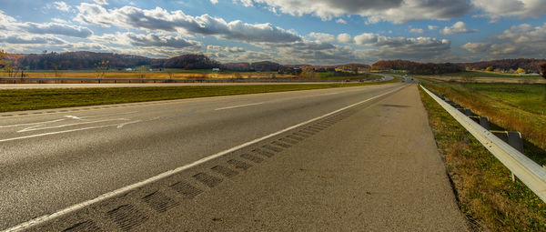
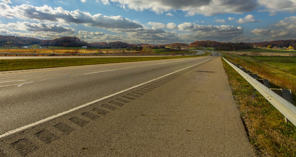
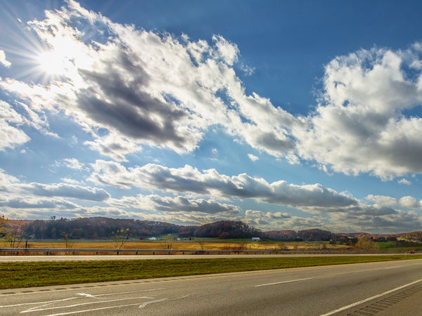
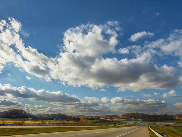
Here are two versions of the same image doing what I understand you to say. The problem with these are that I am losing what I believe to be some important sky as well as the sun. Perhaps that isn't necessary and doesn't add anything to the photo and perhaps it is just me with tunnel vision? :)
You both are more than welcome to do what you want with this image. That goes without saying since it is posted in this particular forum. Feel free to make whatever changes, so I can see what you mean and get a better grasp of how it will be improved. Thank you very much.
Tom :)
Cropped Not too much
Cropped More
Nov 14, 2013 19:13:41 #
lighthouse
Loc: No Fixed Abode
I think "cropped more" addresses perfectly my issues with the original.
I now find my eyes drawn towards the horizon along your lines with significant enough features there to provide interest.
I know you have lost some of what you have wanted to capture but I do think it is a stronger image.
I now find my eyes drawn towards the horizon along your lines with significant enough features there to provide interest.
I know you have lost some of what you have wanted to capture but I do think it is a stronger image.
Nov 14, 2013 19:17:25 #
trc wrote:
lighthouse and St3v3M, br br Here are two version... (show quote)
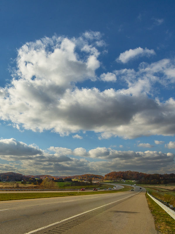
Since you invited me I thought I would have fun with it.
Original

Black and White
Wide Crop
Wide Crop 2
Vertical Crop
Nov 14, 2013 19:37:42 #
lighthouse wrote:
I think "cropped more" addresses perfectly my issues with the original.
I now find my eyes drawn towards the horizon along your lines with significant enough features there to provide interest.
I know you have lost some of what you have wanted to capture but I do think it is a stronger image.
I now find my eyes drawn towards the horizon along your lines with significant enough features there to provide interest.
I know you have lost some of what you have wanted to capture but I do think it is a stronger image.
I guess it does draw the eyes more toward the 'vanishing point,' but it sure does flatten it out like a pancake and takes away some of the 'attractions' I really liked in the image. Oh well, I guess I can't have everything!
Perhaps the image just isn't salvagable and should be scrapped. :) Thanks lighthouse.
Tom
Nov 14, 2013 19:39:26 #

Very nice shot there, once downloaded and then click to enlarge it give a far better look and shows much more detail.
I think withe the enlarged version it looks fantastic, the other 2 versions do not do it justice. Download the image, then left click on it to enlarge and just look at all the details you are missing .
Pete
I think withe the enlarged version it looks fantastic, the other 2 versions do not do it justice. Download the image, then left click on it to enlarge and just look at all the details you are missing .
Pete
Nov 14, 2013 19:48:02 #
trc wrote:
Country's Mama, br br I definitely know what you ... (show quote)
Clicking the download image and then left clicking on the image presents it in a much larger form and 1 can scroll up down and across to see all the details actually in the photo and bring it into a much better perspective to me.
Pete
Nov 14, 2013 19:51:28 #
Nov 14, 2013 19:52:00 #
St3v3M wrote:
Since you invited me I thought I would have fun with it.
Most certainly - you're free to do whatever you want to change it and make it better and more acceptable. As I just told lighthouse, perhaps it isn't salvageable and the image should just be scrapped. Worse things have certainly happened to me through my many years of existence! :)
As for your changes, I think I honestly like the vertical crop the best with the wide crop coming in second and wide crop 2 third. The B&W just doesn't do much for me and comes in last; all by itself! However, all cause me 'great sorrow' since I seemed to have lost some aspects of the original that drew me into the photo to begin with - Hah!
I sure do appreciate you taking the time, St3v3M, to edit and send your works of art. They give me several different perspectives to look at and keep in mind. Hopefully you had a lot of fun and enjoyment - honestly - and it broke up this latter part of the day for you. It really can be fun to play around with images that aren't your own. It's a great time for experimentation. I know, because I like to do that to enhance my PP'ing skills, learn, and see what interesting productions I can end up with. :)
Thanks again. If you have any other thoughts or versions, let me know and feel free to post. :thumbup:
Tom
Nov 14, 2013 19:54:33 #
trc wrote:
I guess it does draw the eyes more toward the 'vanishing point,' but it sure does flatten it out like a pancake and takes away some of the 'attractions' I really liked in the image. Oh well, I guess I can't have everything!
Perhaps the image just isn't salvagable and should be scrapped. :) Thanks lighthouse.
Tom
Perhaps the image just isn't salvagable and should be scrapped. :) Thanks lighthouse.
Tom
I disagree with you here, your not looking at the image in the right way.
Nov 14, 2013 19:55:40 #
lighthouse
Loc: No Fixed Abode
dooragdragon wrote:
I disagree with you here, your not looking at the image in the right way.
:thumbup: :thumbup: :thumbup:
If you want to reply, then register here. Registration is free and your account is created instantly, so you can post right away.