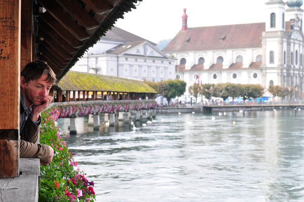
At the bridge in Lucerne
Nov 10, 2013 21:08:41 #

I was taking photos of the beautiful bridge at Lucerne Switzland when I turned my attention to this young man. What could he be thinking.
And what was I thinking. I attempted some pp to straighten the horizon and to improve some detail on the background only to spoil the forground which is the subject. Would croping improve the photo? What is your take?
And what was I thinking. I attempted some pp to straighten the horizon and to improve some detail on the background only to spoil the forground which is the subject. Would croping improve the photo? What is your take?
Nov 10, 2013 21:25:35 #

Personally, I love it just the way it is! A very pleasing artistic look to it, with your subject exposed just right.
Nov 10, 2013 23:26:29 #

It would probably help if you did selective editing rather than universal changes. For instance, it would help if you could tone down just about the whole area to the right of the young man (building and water). Eyes move from dark places to light, so unfortunately, once we take a brief look at the guy's face on the left, our attention gets swept to the white building on the right.
Nov 11, 2013 00:34:59 #

Beautifully composed. A skilled Photoshop jockey would use adjustment layers to mute the sky, buildings and water. What you have is a very nice staring point.
Nov 11, 2013 05:01:59 #
lighthouse
Loc: No Fixed Abode
Nah, I wouldn't crop. The comp and subject looks great.
I bet you could make it sing in mono though and by evening out the skin tones.
I suggest getting rid of the graffiti too.
I bet you could make it sing in mono though and by evening out the skin tones.
I suggest getting rid of the graffiti too.
Nov 11, 2013 07:55:56 #
Bob,
What you say is true that I find my eyes moving from the young man's face to the church on the right and that is what displeases me. I'm not a photo shop person yet but hope to be in the future . Thanks for your input.
What you say is true that I find my eyes moving from the young man's face to the church on the right and that is what displeases me. I'm not a photo shop person yet but hope to be in the future . Thanks for your input.
Bob Yankle wrote:
It would probably help if you did selective editing rather than universal changes. For instance, it would help if you could tone down just about the whole area to the right of the young man (building and water). Eyes move from dark places to light, so unfortunately, once we take a brief look at the guy's face on the left, our attention gets swept to the white building on the right.
Nov 11, 2013 07:56:23 #
Thank you for your comment Linda.
Linda From Maine wrote:
Personally, I love it just the way it is! A very pleasing artistic look to it, with your subject exposed just right.
Nov 11, 2013 07:56:42 #
I would crop, to a vertical. It looks to me as if it would work with a 4:5 aspect ratio cropped from right. I don't think the church adds anything, but because it is so bright it drags the eye away from the thoughtful man. I think the picture works very well with just the man and the bridge in a vertical crop, and it's a nice shot! :thumbup:
Nov 11, 2013 07:57:06 #
Thanks for the encouragement Dave.
Dave Johnson wrote:
Beautifully composed. A skilled Photoshop jockey would use adjustment layers to mute the sky, buildings and water. What you have is a very nice staring point.
Nov 11, 2013 08:09:56 #
Thanks Chuck. I'll try croping and see if I like it.
Chuck_893 wrote:
I would crop, to a vertical. It looks to me as if it would work with a 4:5 aspect ratio cropped from right. I don't think the church adds anything, but because it is so bright it drags the eye away from the thoughtful man. I think the picture works very well with just the man and the bridge in a vertical crop, and it's a nice shot! :thumbup:
Nov 11, 2013 10:42:11 #
pebbles wrote:
Bob,
What you say is true that I find my eyes moving from the young man's face to the church on the right and that is what displeases me. I'm not a photo shop person yet but hope to be in the future . Thanks for your input.
What you say is true that I find my eyes moving from the young man's face to the church on the right and that is what displeases me. I'm not a photo shop person yet but hope to be in the future . Thanks for your input.
There are a number of Photoshop users on this forum. If you were to post your photo again in Download mode, and give them permission, I'm pretty sure they would be glad to share their edits with you.
Nov 12, 2013 10:48:45 #
Don't even out the skin tones! This looks like a meth user or homeless man in a fairyland, I love the reality it brings.
Nov 12, 2013 12:17:18 #
Interesting take. I agree. He looks like he is struggling with some personnel issues.
jrb1213 wrote:
Don't even out the skin tones! This looks like a meth user or homeless man in a fairyland, I love the reality it brings.
Nov 12, 2013 16:38:21 #
lighthouse
Loc: No Fixed Abode
pebbles wrote:
Bob,
What you say is true that I find my eyes moving from the young man's face to the church on the right and that is what displeases me. I'm not a photo shop person yet but hope to be in the future . Thanks for your input.
What you say is true that I find my eyes moving from the young man's face to the church on the right and that is what displeases me. I'm not a photo shop person yet but hope to be in the future . Thanks for your input.
I am sorry.
I disagree.
That is exactly what we want some photos to do.
And we specifically use or look for compositional features to make that happen, eg leading lines, thirds, colour contrast.
We want our eyes to lock on the initial strong point (which they do), then we want our eyes to find an excuse to travel around the photo (which apparently this one does) and then we want our eyes to travel back to the strong focal point. I think that would happen with this one.
So what you percieve as a negative may not be a negative at all.
It may be your natural "photographers eye" working perfectly.
Be careful telling yourself that it is wrong.
You may be stifling your creative instinct.
Nov 13, 2013 08:01:52 #
Bob,
This was very uplifting. Guess I need to learn to shut down my analytical left brain and let the creative right brain do its thing.
This was very uplifting. Guess I need to learn to shut down my analytical left brain and let the creative right brain do its thing.
lighthouse wrote:
I am sorry. br I disagree. br That is exactly what... (show quote)
If you want to reply, then register here. Registration is free and your account is created instantly, so you can post right away.