Good to Great
Nov 9, 2013 11:04:34 #

MtnMan wrote:
What do you mean by an "abstract image"?
An abstract image is one that relies on patterns, lines and textures rather than being a pictorial representation of a scene, at least that's how I understand it.
Graham
Nov 9, 2013 11:21:28 #

Graham Smith wrote:
An abstract image is one that relies on patterns, lines and textures rather than being a pictorial representation of a scene, at least that's how I understand it.
Graham
Graham
I wondered if you were suggesting using one of the filter treatments in, for example, Topaz?
Nov 9, 2013 11:29:20 #
MtnMan wrote:
I wondered if you were suggesting using one of the filter treatments in, for example, Topaz?
Not at all, just straight forward B&W, personally I'm not keen on the use of "enhancement filters" such as the weird and whackey ones that are used. (Not keen is an understatement)
Graham
Nov 9, 2013 12:23:58 #
Graham Smith wrote:
Not at all, just straight forward B&W, personally I'm not keen on the use of "enhancement filters" such as the weird and whackey ones that are used. (Not keen is an understatement)
Graham
Graham
Thanks!
Nov 9, 2013 13:04:58 #

MtnMan wrote:
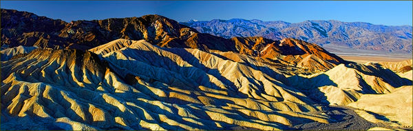
I like this...so it is good in my book. I'm looking for suggestions to make it great.
I'm thinking flipping might lead the eye in better.
Other ideas?
Zabriski point in Death Valley. Taken shortly after dawn last Februrary. Two shot pano.
I'm thinking flipping might lead the eye in better.
Other ideas?
Zabriski point in Death Valley. Taken shortly after dawn last Februrary. Two shot pano.
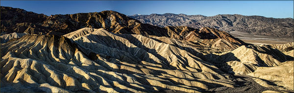
I may have over done it a bit, but I like the colors and texture that it shows. It is definitely a great photo even without any of my tinkering with it.
Hue/Satur - HDR - Dodge/burn
Nov 9, 2013 13:14:18 #
CajonPhotog wrote:
I may have over done it a bit, but I like the colors and texture that it shows. It is definitely a great photo even without any of my tinkering with it.
Perhaps increasing the white balance temperature would yield a similar result...and be more true to the natural light. I recall it as a bit more yellow but that could be faulty memory or differences in computer screens displaying it. One thing I notice is the colors displayed on UHH do not match the colors of the image displayed in Lightroom side by side.
I pretty much always use auto white balance and this could be a case where adjustment makes sense. As I noted it was right after dawn so I suspect the light was somewhat yellowish compared to mid-day.
The panorama mapping might have affected the color as well.
Warmed and with a grad neutral density filter on the right
Nov 9, 2013 13:35:57 #

CajonPhotog wrote:
I may have over done it a bit, but I like the colors and texture that it shows. It is definitely a great photo even without any of my tinkering with it.
I really like how you've warmed it up here, Cajon. Like you said, it is a great photo. I think it's because the light was right when he shot it. You have brought that out even more.
Nov 9, 2013 13:44:24 #

MtnMan wrote:
I like this...so it is good in my book. I'm looking for suggestions to make it great.
I'm thinking flipping might lead the eye in better.
Other ideas?
Zabriski point in Death Valley. Taken shortly after dawn last Februrary. Two shot pano.
I'm thinking flipping might lead the eye in better.
Other ideas?
Zabriski point in Death Valley. Taken shortly after dawn last Februrary. Two shot pano.
I don't have the PP skills to do this, but I think if you could even out the blue sky, you would have a stellar image-- it seems a little dark on the left side. I don't know if this is an exposure issue with the two images-- or a polarizer-angle of view image. What angle of view (lens) did you use for the two shots? Personally, I would prefer a monochrome version.
Nov 9, 2013 16:26:54 #
LoneRangeFinder wrote:
I don't have the PP skills to do this, but I think if you could even out the blue sky, you would have a stellar image-- it seems a little dark on the left side. I don't know if this is an exposure issue with the two images-- or a polarizer-angle of view image. What angle of view (lens) did you use for the two shots? Personally, I would prefer a monochrome version.
I probably used a polarizer so with the panorama the effect would be more on one side. But it was also just after dawn so the sky color was quite varied from east to west.
Nov 9, 2013 16:35:58 #
MtnMan wrote:
I probably used a polarizer so with the panorama the effect would be more on one side. But it was also just after dawn so the sky color was quite varied from east to west.
Any idea what the angle of view would be? I would guess it would be the coverage of the lens times number of shots minus the overlap. More curiosity than anything....
Nov 9, 2013 16:47:18 #

MtnMan wrote:
Perhaps increasing the white balance temperature w... (show quote)
I'm so glad to see what you've done with this version, which is more true to the scene. That formation is like caramel ice cream with chocolate topping and you nailed it in this version. I think you can smoothe out that sky too, it is probably interaction between the polarizer and the pano blend but with no clouds to stop you, you have free rein to fix it. Very nice. I do think it would make a nice monochrome too.
Nov 9, 2013 19:54:38 #
Nightski wrote:
I really like how you've warmed it up here, Cajon. Like you said, it is a great photo. I think it's because the light was right when he shot it. You have brought that out even more.
TY, you have warmed the cockles of my heart, but I do see now on the post that I definitely did over do the edit. It appears that there is way too much blue in there. I really like Mtnmn's 2nd edit, it really brings out all the colors especially on the mountains in the far background.
If you want to reply, then register here. Registration is free and your account is created instantly, so you can post right away.