Good to Great
Nov 8, 2013 19:22:53 #

I like this...so it is good in my book. I'm looking for suggestions to make it great.
I'm thinking flipping might lead the eye in better.
Other ideas?
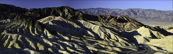
Zabriski point in Death Valley. Taken shortly after dawn last Februrary. Two shot pano.
I'm thinking flipping might lead the eye in better.
Other ideas?
Zabriski point in Death Valley. Taken shortly after dawn last Februrary. Two shot pano.
Nov 8, 2013 20:08:32 #

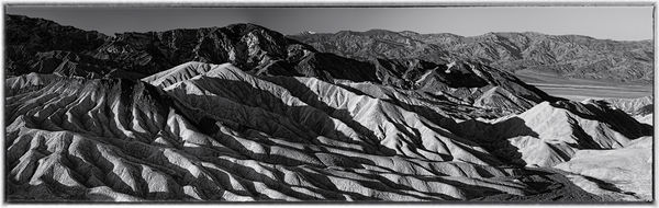
This is not normally my "go-to" solution, but I noticed your photo had great texture and contrast, not so exciting colors. Hence, monochrome. Had to adjust left side to brighten it somewhat, and left side needed to be darkened, but overall, it balances out nicely. Needs to be viewed in Download mode for best effect.
Variation on Good
Nov 8, 2013 20:11:28 #
Flip it if you like it better the other way (although I don't think it really matters all that much).
However, my suggestion to make it great: Print it out already! This photo will look truly awesome up on the wall. The colors are great and the contrast is perfect. It's a powerfully majestic, compelling image. A shame if it doesn't make it beyond the digital realm.
However, my suggestion to make it great: Print it out already! This photo will look truly awesome up on the wall. The colors are great and the contrast is perfect. It's a powerfully majestic, compelling image. A shame if it doesn't make it beyond the digital realm.
Nov 8, 2013 20:23:58 #
I would not flip the image. I think that the lines in the foreground lead you to the ridge than sinks to the right. This is the way your eye (my eye anyway) wants to go. I love the contrast and I like the colors. The detail in this photo is staggering. The only thing I might try to change is the lower right corn is a tad bright. If you could tone that down a bit, your picture, which is already great, would be perfect.
Nov 8, 2013 20:55:44 #

MtnMan wrote:
I like this...so it is good in my book. I'm looking for suggestions to make it great.
I'm thinking flipping might lead the eye in better.
Other ideas?
Zabriski point in Death Valley. Taken shortly after dawn last Februrary. Two shot pano.
I'm thinking flipping might lead the eye in better.
Other ideas?
Zabriski point in Death Valley. Taken shortly after dawn last Februrary. Two shot pano.
My humble opinion on this beautiful image:
Do not flip.
Print in color, very big.
If you want to warm it up, saturate the colors a little, but I don't think that is necessary at all.
Nov 8, 2013 21:27:52 #
Bob Yankle wrote:
This is not normally my "go-to" solution, but I noticed your photo had great texture and contrast, not so exciting colors. Hence, monochrome. Had to adjust left side to brighten it somewhat, and left side needed to be darkened, but overall, it balances out nicely. Needs to be viewed in Download mode for best effect.
Thank you. I normally don't go monochrome either and would not have thought of it on this one. But I agree it is very interesting on this.
Nov 8, 2013 21:29:43 #
ebrunner wrote:
I would not flip the image. I think that the lines in the foreground lead you to the ridge than sinks to the right. This is the way your eye (my eye anyway) wants to go. I love the contrast and I like the colors. The detail in this photo is staggering. The only thing I might try to change is the lower right corn is a tad bright. If you could tone that down a bit, your picture, which is already great, would be perfect.
Thank you. I hadn't thought it through that way and my eye tracks as yours does. No problem to burn down the corner.
Nov 8, 2013 22:19:42 #

MtnMan wrote:
I like this...so it is good in my book. I'm looking for suggestions to make it great.
I'm thinking flipping might lead the eye in better.
Other ideas?
Zabriski point in Death Valley. Taken shortly after dawn last Februrary. Two shot pano.
I'm thinking flipping might lead the eye in better.
Other ideas?
Zabriski point in Death Valley. Taken shortly after dawn last Februrary. Two shot pano.
Amazing shot, MtnMan. The light, the shadows, the leading lines. It's mesmerizing. It's one of those shots that make me wish I was there. I like the color. But I'm a color gal. It takes a lot to get me to choose b&w.
Nov 9, 2013 08:59:17 #
MtnMan wrote:
Thank you. I normally don't go monochrome either and would not have thought of it on this one. But I agree it is very interesting on this.
As soon as I saw the photo my thoughts were monochrome as well. Interesting shot.
Nov 9, 2013 10:22:38 #
jteee wrote:
As soon as I saw the photo my thoughts were monochrome as well. Interesting shot.
Could you tell us what made you opt for monochrome, JT? Interested to know your thoughts.
Nov 9, 2013 10:39:03 #
Nightski wrote:
Could you tell us what made you opt for monochrome, JT? Interested to know your thoughts.
I liked the patterns that the deep contrast provided. I thought that monochrome might accentuate that greater than the color version and make for a more dramatic image. Usually, however, when posts ask for "color or b/w" there seems to be a 50/50 split. So obviously it is a personal preference type of thing. :-D :-D
Nov 9, 2013 10:49:17 #

Nightski wrote:
Could you tell us what made you opt for monochrome, JT? Interested to know your thoughts.
To me the monochrome allows the viewer to concentrate on the amazing patters of light and shadow, particularly of the undulating terrain in the foreground. An abstract image of those in Monochrome could be stunning.
Graham
Nov 9, 2013 10:49:29 #
jteee wrote:
I liked the patterns that the deep contrast provided. I thought that monochrome might accentuate that greater than the color version and make for a more dramatic image. Usually, however, when posts ask for "color or b/w" there seems to be a 50/50 split. So obviously it is a personal preference type of thing. :-D :-D
I might enter the monochrome in the Fair next summer. I noticed that monochrome panorama had the least entries. I might also enter it in the camera club's annual competition to see if they like it. It comes up next month.
I have Topaz B&W so can try a bunch of different monochrome treatments on it to see what I like best.
Nov 9, 2013 10:51:23 #
Graham Smith wrote:
To me the monochrome allows the viewer to concentrate on the amazing patters of light and shadow, particularly of the undulating terrain in the foreground. An abstract image of those in Monochrome could be stunning.
Graham
Graham
What do you mean by an "abstract image"?
Nov 9, 2013 10:52:27 #
MtnMan wrote:
I might enter the monochrome in the Fair next summer. I noticed that monochrome panorama had the least entries. I might also enter it in the camera club's annual competition to see if they like it. It comes up next month.
I have Topaz B&W so can try a bunch of different monochrome treatments on it to see what I like best.
I have Topaz B&W so can try a bunch of different monochrome treatments on it to see what I like best.
You have a nice photo to work with, good luck.
If you want to reply, then register here. Registration is free and your account is created instantly, so you can post right away.