WPC 1342 - Fall Colors ANALYSIS
Oct 25, 2013 23:28:48 #

damdannyboy has graciously volunteered the WPC 1342 - Fall Colors entry for critique and analysis to find out what they could have done to make it better. Be nice, but be honest as this will help everyone with their craft. Thank you damdannyboy and thank you everyone!
from WPC 1342 - Fall Colors RESULTS http://www.uglyhedgehog.com/photo_contest_ratings.jsp?pcnum=85
from WPC 1342 - Fall Colors RESULTS http://www.uglyhedgehog.com/photo_contest_ratings.jsp?pcnum=85
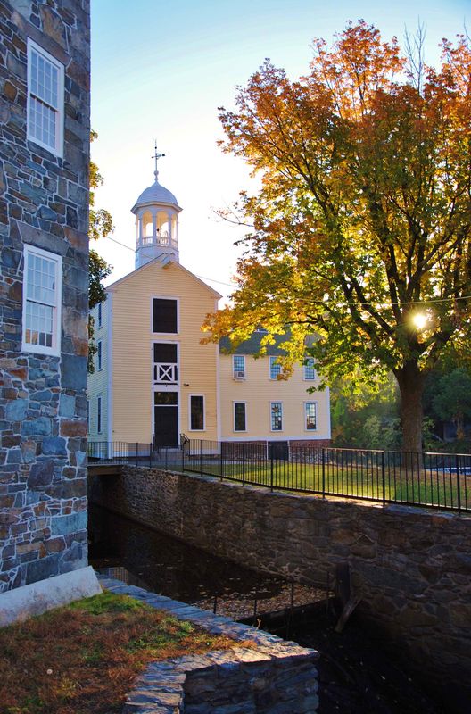
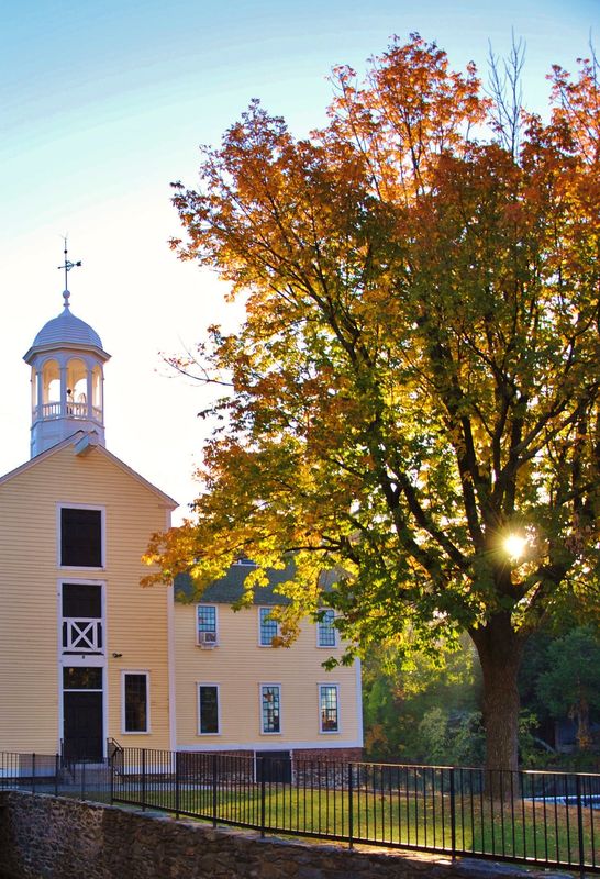
Americana in the Fall (Slater Mill Pawtucket RI)
Oct 26, 2013 07:07:07 #

I struggle with images like this as well. I find it hard with the sun in the background getting exposure right. I think overall it is a good image although you are losing some detail in the dark areas. I also see some banding in the sky. i think that several different exposures of this scene would have helped get the detail in the dark areas. I also think that maybe dodging and burning my help with the lights and dark's as well. While i cannot down load the image it does appear to be sharp in the details. I would also add that the wall on the left in my opinion is a bit distracting, i am not sure if you could have moved to camera right and lost the wall and maybe used the canal to move you more through the image to the church but i think that would have helped with composition. i also would have removed the power line in the photo while it is not overbearing it does hold my eye a bit.
Oct 26, 2013 09:46:46 #

One thing that would have brought the eye to the right place would be setting your f stop to 22. That would have got the sun burst effect through the trees, which would have brought the eye to the tree and not the wall on the left.
Oct 26, 2013 12:02:57 #

jhud202 has hit the nail on the head - the focal point. As I see it, this image actually has 3 focal points, and since the dark wall is closest, that's what I look at first. The sun coming through the tree mutes the colors of the tree and makes it something to look away from. In a contest that's about fall color, the tree's colors should be the dominant thing in the image. Maybe a cropping to take out the wall at the left and shooting at a different time of day to get more emphasis on the tree's colors.
Oct 26, 2013 19:58:33 #

Take out the electric lines, move camera to remove the corner of the closest building, and it's hard to tell but it could be a little sharper. Overall nice job.
Oct 27, 2013 10:25:28 #

St3v3M wrote:
damdannyboy has graciously volunteered the WPC 1342 - Fall Colors entry for critique and analysis to find out what they could have done to make it better. Be nice, but be honest as this will help everyone with their craft. Thank you damdannyboy and thank you everyone!
from WPC 1342 - Fall Colors RESULTS http://www.uglyhedgehog.com/photo_contest_ratings.jsp?pcnum=85
from WPC 1342 - Fall Colors RESULTS http://www.uglyhedgehog.com/photo_contest_ratings.jsp?pcnum=85
I don't know if it is sunup or sunrise but depending an hour earlier or later would yield a much more pleasing photo. As others have noted you want the tree color to pop for Fall Colors as the subject. They don't with the photo taken at this time. Right place, wrong time.
Oct 27, 2013 20:17:35 #

St3v3M wrote:
damdannyboy has graciously volunteered the WPC 1342 - Fall Colors entry for critique and analysis to find out what they could have done to make it better. Be nice, but be honest as this will help everyone with their craft. Thank you damdannyboy and thank you everyone!
from WPC 1342 - Fall Colors RESULTS http://www.uglyhedgehog.com/photo_contest_ratings.jsp?pcnum=85
from WPC 1342 - Fall Colors RESULTS http://www.uglyhedgehog.com/photo_contest_ratings.jsp?pcnum=85
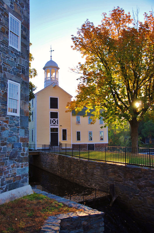
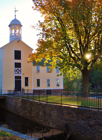
I did, I did, I graciously volunteered! I can't believe this scheme even worked, as we all know when you post photos and ask for c/c you get some good advice, but it's soon lost in the mix? :roll: For some strange reason I'm hung up with this composition and I need help! My first question is about the banding, what causes this and what's the best way to handle it? :-( I'm reposting the photo with the power line removed, so everyone won't get hung up on that! So have at it and thanks for you great advice so far. I would like thank Steve for letting me volunteer. (ha, ha.)
Slater Mill

Oct 27, 2013 20:21:20 #
Oct 27, 2013 20:27:12 #
damdannyboy wrote:
I did, I did, I graciously volunteered! I can't be... (show quote)
most such banding is a form of posterization that comes from working with (or ending up in) too small a range of tones, usually because of data compression.
Oct 30, 2013 01:34:11 #

As far as composition is concerned, I think the problem is you are trying to get too much into the picture. There are too many elements competing for my attention. The very prominent wall on the left side has nothing to do with your subject (which, I presume is the tree/colour). Secondly there is an unfortunate dark band across the lower part of the picture which is in too great a contrast to the subject and distracts greatly. Lastly the tree itself - it is very difficult to get a good representation of fall colour with the sun glaring through the branches. Now, if the leaves are backlit by the sun shining through them magic can happen. Here one cannot really see the colours without squinting. There is an old rule about selecting your subject and composing to emphasize the features of the subject that make it special, then removing all impediments to that (i.e. remove all distractions). This does not mean that you cannot include some context but it should not be a distraction. The banding in the sky is caused by JPEG compression. The detailed explanation of this phenomenon will take some time (perhaps in a private message if you are interested). Here you have compressed a 10.7 MB file into a 1.7 MB file. No wonder you have banding. Cheers,, Don
Oct 30, 2013 11:33:01 #
Memphis
Loc: Seattle
Wow, removing that power line made a huge difference! Maybe, moving a bit to the left to not include the tall stone wall and get more of the grass and lower wall in the foreground...light and colors are very nice there.
Oct 30, 2013 19:12:50 #
Oct 30, 2013 20:01:49 #
damdannyboy wrote:
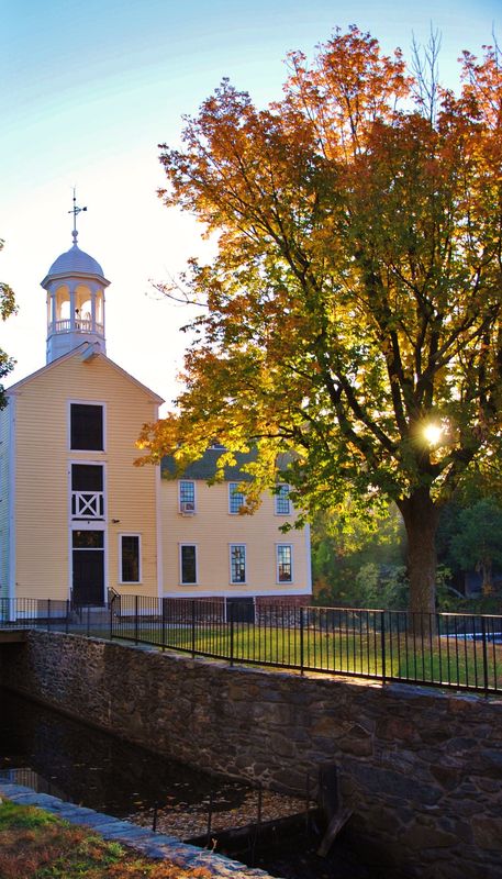
I worked on the crop, let me know? 8-)
damdannyboy
damdannyboy
Ok Im not an expert like closer to a complete novice but I will tell you that the cropped one without powerline is 2000 percent better.
Oct 30, 2013 23:05:52 #
Feb 1, 2014 13:01:18 #

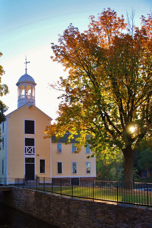
Agree completely with building on left being a distraction. Pan to the right,loose the building, and catch the full tree in the shot. Better I think?? Thx Clipper.
If you want to reply, then register here. Registration is free and your account is created instantly, so you can post right away.