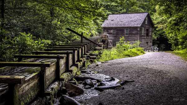
Grist Mill from the Smoky Mountains
Oct 24, 2013 08:22:20 #

I took this photo several months ago and just getting around to working on it. It was done in photomatix pro and photoshop cc. I would like some critiques on this image please.
What could i do to make it better.
What could i do to make it better.
Oct 24, 2013 08:37:36 #

Oct 24, 2013 08:38:44 #
Hi normanhall, I lke it as is. Some people will say that since it's a grist mill, the mill should be larger because the water flume appears to be the main focus of the picture, or they'll say the picture is a little dark and needs to be lightened, but I like your image because it portrays how most mill operations that I've seen have looked and I really like the water flume. I say thumbs up on a great picture.
normanhall wrote:
I took this photo several months ago and just getting around to working on it. It was done in photomatix pro and photoshop cc. I would like some critiques on this image please.
What could i do to make it better.
What could i do to make it better.
Oct 24, 2013 08:46:34 #

Oct 24, 2013 08:47:51 #
Oct 24, 2013 09:04:26 #
Pentony
Loc: Earth Traveller
:thumbup::thumbup::thumbup::thumbup::thumbup:
content - very interesting, want to look at it again and again
DOF - several points of interests - excellent
composition - house offset-ted, water impression gives both still and moving - excellent
focus - perfect
color - matches what the human eye sees - great
detail - several things to look at - which I liked
future plans:
1. blow it up to hang on the wall
2. use it as a post card
3. experiment by creating additional prints in
a. black and white
b. sepia
c. other
4. add it to my portfolio
thanks for sharing :lol:
Oct 24, 2013 09:20:00 #
Thanks you very much for the critique. I was wanting to use the flume to lead into the mill as well as the road. I was also hoping to capture the age of this building and show the seclusion and how it was hid in the woods.
Oct 24, 2013 10:13:32 #
Pentony
Loc: Earth Traveller
normanhall wrote:
Thanks you very much for the critique. I was wanting to use the flume to lead into the mill as well as the road. I was also hoping to capture the age of this building and show the seclusion and how it was hid in the woods.
You did just that and more. Enlarge it, frame it and hang it on display.
Oct 24, 2013 12:22:18 #

I would basically agree with "Pentony"
#1 -- Enlarge to poster size for the wall
#2 -- Make it a Calendar Cover or Main Photo
#3 -- Make it into Post Cards
#4 -- Use it as a background for your own Business/Contact Cards
(put your lettering and info in the lower right portion)
#1 -- Enlarge to poster size for the wall
#2 -- Make it a Calendar Cover or Main Photo
#3 -- Make it into Post Cards
#4 -- Use it as a background for your own Business/Contact Cards
(put your lettering and info in the lower right portion)
Oct 24, 2013 12:51:18 #
normanhall wrote:
What could i do to make it better.
Absolutely nothing! :thumbup: :thumbup: :thumbup:
(I should add that I do not generally care for HDR. Far too much HDR looks overprocessed to meno longer photographic. This picture is exactly how I would like it to look had I processed it!) Two more :thumbup: :thumbup:
Oct 24, 2013 13:55:11 #
Froggy
Loc: Guernsey Channel Islands UK
normanhall wrote:
I took this photo several months ago and just getting around to working on it. It was done in photomatix pro and photoshop cc. I would like some critiques on this image please.
What could i do to make it better.
What could i do to make it better.
well done lovely photo, I would hang it
Oct 24, 2013 16:47:41 #

normanhall wrote:
Thanks you very much for the critique. I was wanting to use the flume to lead into the mill as well as the road. I was also hoping to capture the age of this building and show the seclusion and how it was hid in the woods.
You succeeded! Pentony and Mark gave excellent critiques and I agree with all they said.
Oct 24, 2013 17:18:41 #

Ditto, can't add much of anything to what's been said other than great job! You lit the scene perfectly, well composed, wonderful textures and leading lines, and good coloration. Kudos!
Oct 24, 2013 20:54:39 #
normanhall wrote:
I took this photo several months ago and just getting around to working on it. It was done in photomatix pro and photoshop cc. I would like some critiques on this image please.
What could i do to make it better.
What could i do to make it better.
Wow just did the same shot on Friday last week
Oct 24, 2013 21:02:48 #
I agree it is a nice shot. But to my eye it is over sharpened with too much contrast. The color leans a bit much to the blue side of the spectrum, but that is a personal taste thing. I would also knock down the highlights a tad. If you ever re shoot this may I suggest that you use a CP filter.
Was this post pros on a monitor that was color balanced?
What gear was use?
Was this post pros on a monitor that was color balanced?
What gear was use?
If you want to reply, then register here. Registration is free and your account is created instantly, so you can post right away.