To enhance or not to?
Aug 29, 2013 10:56:23 #
erpatterson78
Loc: Ohio
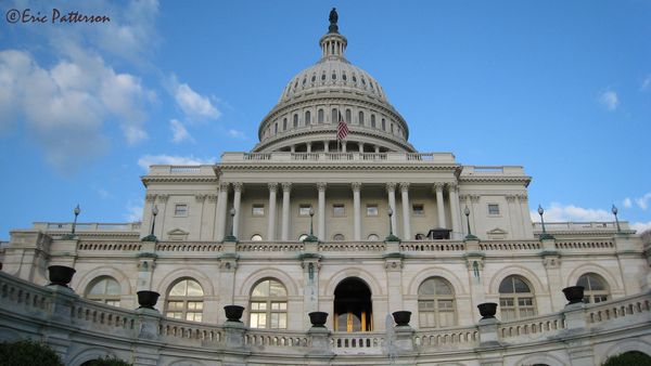
I took a photo in DC of the capital. It's one of my favorites that I took; however while I really like the original, I like the enhanced version as well. I like the way the capital looks but I hate the sky. I was wanting to get some opinions of the two images and any input from some others on the site. Would you change anything, if so what?
Thanks for looking and commenting.
Eric
Thanks for looking and commenting.
Eric
Original
Enhanced
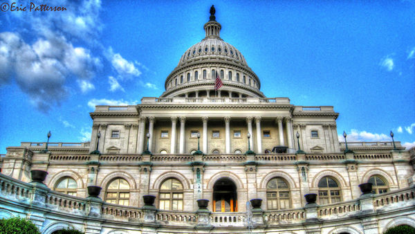
CS2 +25 to contrast
Aug 29, 2013 11:02:23 #

Eric - I'm certainly no expert, but I like the first better. The enhanced one looks way too 'fake' to me. Maybe try taking the original and just apply a little processing?
Aug 29, 2013 11:07:38 #
erpatterson78 wrote:
I took a photo in DC of the capital. It's one of my favorites that I took; however while I really like the original, I like the enhanced version as well. I like the way the capital looks but I hate the sky. I was wanting to get some opinions of the two images and any input from some others on the site. Would you change anything, if so what?
Thanks for looking and commenting.
Eric
Thanks for looking and commenting.
Eric
I'm no expert either but prefer #2. Jumps right out at you. Makes the first shot seem dull and drab by comparison. Keep in mind, I also like Elton John.
Aug 29, 2013 11:09:09 #
Aug 29, 2013 11:13:41 #

erpatterson78 wrote:
I took a photo in DC of the capital. It's one of my favorites that I took; however while I really like the original, I like the enhanced version as well. I like the way the capital looks but I hate the sky. I was wanting to get some opinions of the two images and any input from some others on the site. Would you change anything, if so what?
Thanks for looking and commenting.
Eric
Thanks for looking and commenting.
Eric
Eric, as long as you understand this is my personal opinion, I absolutely do not like the second image of the Capitol. By the same token, the first one is a bit dull. The Capitol is such a majestic building that an image does not need much "enhancing" - I think on the first image I'd only try and make the colour just a tad brighter and increase the contrast a bit, no more than that.
I use PSE11, selected Enhance -> adjust lighting -> brightness/contrast, and dragged the slider for brightness to 15, for contrast to 40, which gave me an image that pleased my eye.
EstherP
Aug 29, 2013 11:22:56 #
erpatterson78
Loc: Ohio
First off, I respect and appreciates everyone opinion. Please don't feel afraid to hurt my feelings :)
I believe this was taken back in 2008. At the time I felt this image was awesome, over time looking at it, it went from awesome to good. Now I look at it and I still love it, but it's just missing something. I thought I would mess around with Photomatix and see what I could do. I sort of liked image 2 because it turned it from bland to an image with some details. Although image #2 I hate the glow around the capitol and not a fan of how the sky turned out. I don't want to user to focus on the sky or the glow which is what I feel is happening with #2. I still want the focus to be on the capitol and the arc of the bottom which I think is a cool touch in the photo. EstherP I'll try to mess with what you said, I have Cs2 but I think I know what your talking about.
oh and John, Elton John is awesome! :)
Aug 29, 2013 11:25:04 #

erpatterson78 wrote:
I took a photo in DC of the capital. It's one of my favorites that I took; however while I really like the original, I like the enhanced version as well. I like the way the capital looks but I hate the sky. I was wanting to get some opinions of the two images and any input from some others on the site. Would you change anything, if so what?
Thanks for looking and commenting.
Eric
Thanks for looking and commenting.
Eric
Not - I don't like the glow around the building.
Aug 29, 2013 11:38:39 #
erpatterson78
Loc: Ohio
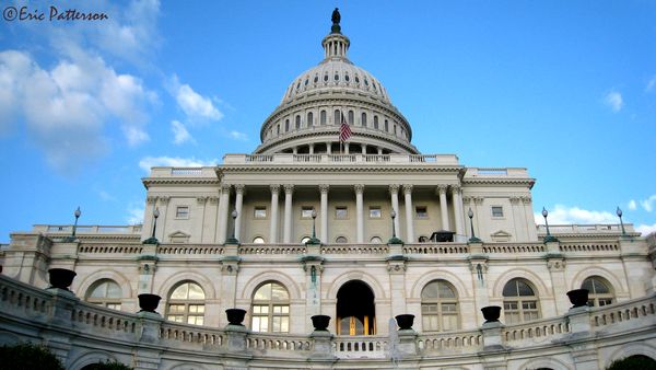
Updated the contrast in CS2 to +25. Esther I tried the 15 brightness and 40 contrast and I felt it was a little overpowering to my eye. I'll play around with it a little more in CS2 and not in Photomatx to see if I can get something I like.
Aug 29, 2013 11:50:54 #
jim lumento
Loc: Shelton, Ct
Eric,
That is a tough call. I like them both alot. One good thing about the original shot. the lighting pronounces the clouds.
Also, How did you get your name on the photo? Like to learn that
That is a tough call. I like them both alot. One good thing about the original shot. the lighting pronounces the clouds.
Also, How did you get your name on the photo? Like to learn that
Aug 29, 2013 11:58:41 #
erpatterson78
Loc: Ohio
Thanks Jim. I use Photoshop CS2. There is a text tool - T I select it then on the photo left click and drag to size my box. I hold down alt and hit 0169 and it will put on the copyright symbol. Then type your name. You can change the font and size also. When your done use the pointer tool (forget the real name) and you can move your text where you like on your image.
Aug 29, 2013 12:04:32 #
Aug 29, 2013 12:05:10 #

The enhancement on thr third is well done and moderate, looks normal and beautiful.
Whatever enhances a photo is OK with me; why keep something that depends on light, lens quality, luck when it doesn't look OK and you can enhance it? It is like saying those other factors "think better" than your eyes and you have no say. No,no. Your rain and eyes have the last say. The first one must have been taken with technology of that year or prior years and at time passes, we see the difference that technology makes. It has happened to me, photos I kept because I though were good at the time can be terribly dull and unappealing now. I look back to those pictures with nostalgia and think that the current ones taken with the best cameras we can afford will follow the same fate. The new people 50 years from may look at today's technology ( sorry for this) with derision. Those guys? What were they thinking? They had to use a card? Upload? Enhance? OMG!
Whatever enhances a photo is OK with me; why keep something that depends on light, lens quality, luck when it doesn't look OK and you can enhance it? It is like saying those other factors "think better" than your eyes and you have no say. No,no. Your rain and eyes have the last say. The first one must have been taken with technology of that year or prior years and at time passes, we see the difference that technology makes. It has happened to me, photos I kept because I though were good at the time can be terribly dull and unappealing now. I look back to those pictures with nostalgia and think that the current ones taken with the best cameras we can afford will follow the same fate. The new people 50 years from may look at today's technology ( sorry for this) with derision. Those guys? What were they thinking? They had to use a card? Upload? Enhance? OMG!
Aug 29, 2013 12:21:06 #

Aug 29, 2013 12:48:45 #
erpatterson78
Loc: Ohio
Bubu wrote:
The enhancement on thr third is well done and mode... (show quote)
ha ha ha that's so true. I've done that myself :)
Aug 29, 2013 12:49:27 #
erpatterson78
Loc: Ohio
EstherP wrote:
Eric, as long as you understand this is my persona... (show quote)
Thanks for the advice and help Esther!
If you want to reply, then register here. Registration is free and your account is created instantly, so you can post right away.