Posts for: Chicflat
Jul 31, 2019 16:55:15 #
CHG_CANON wrote:
The image would be stronger with just the center f... (show quote)
Thank you for your comments. As to the second parargraph, the lens is a sigma 18-200, if that means more. Also, I had just gone outside it was humid from the rain the night before, so you are right there. As far as the f4 is concerned, I wanted an f8, but Aperture value mode on my canon wasn't working for me so I switched over to manual and manual focus. I struggled with having to shoot facing south for pov the best pleased me. I made a number of shots with different settings trying to get the exposure right, and this seemed to be the best. But you are right in that I am constantly having to work on my technique. I was using back focus button to try to get the focus right, but the sun again was giving my problems, even though I did want the bright light I was shooting in. The lens filter is something I often forget about, so your remark is particularly helpful as a reminder to check that box when I set up a shot.
I will play with the cuts you suggest, since what you are saying go directly to the heart of my question. Thank you for your insight. I appreciate the extent of your analysis, both in my post and in others, where I have seen your pertinent and concise remarks that really are a help to us.
Jul 31, 2019 16:37:14 #
Curmudgeon wrote:
Not until you mentioned them.  I was focused on the blue flower and the white counterpoint. Now I would suggest you remove them.
I was focused on the blue flower and the white counterpoint. Now I would suggest you remove them.Thanks for looking. You seem to echoe my thoughts.
Jul 31, 2019 14:08:09 #
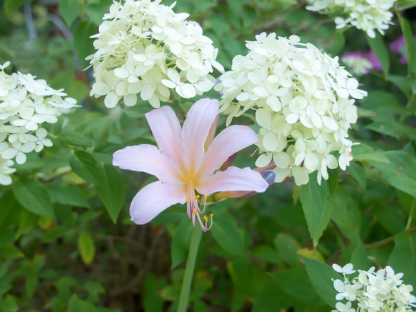
When the purple blossom emerged, I knew I wanted to capture it against the white of the hydrangea. In my head is the title "homage," which is a clue to my intent after I first opened the image. I created a layer mask to adjust the yellows in the center of the purple flower; I cleaned up some clutter in the leaves and brightened the whites slightly. All of this was in Elements 13 using both raw and the regular editing venue.. All that said, are the purple blossoms in the upper right corner too great a distraction? When I composed the shot I had thought that those blossoms would give some visual movement and counterpoint for the central bloom. Now I think they are a distraction. What are your thoughts?
Jul 13, 2019 11:49:54 #
Linda, I didn't see "analysis" in the list. I was just glad to have improved. Joe, I would love to see your garden; we live in Tulsa. Thank you guys for the encouragement; it is so helpful'
Jul 12, 2019 18:47:55 #
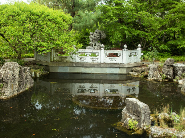
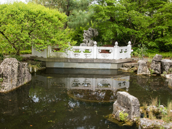
Joe, I see the differences. I had thought to straiten but using the grid I decided that the vertical alignment with the bridge posts was ok; your approach is better. Your vignetting and pond rework really do give a better emphasis to the bridge. Thanks for your commentary; it will help me to approach my work with abetter sense of how the picture may impact. And yes, this is a pubic garden: Shaw Gardens in St. Lois, Mo.
Jul 12, 2019 16:00:42 #
Since my last post I have made a number of eforts at using layers to improve my pp at the suggestion of Linda from Maine. I think I like this image and so I present it for review. I made an adjustment layer for levels, selecting all of the bridge with the brush. I lowered the highlights, I guess on the bridge so that it wasn't just glaring at me. I wanted a little of the weathered aspect of the bridge and to increase the contrast a bit; these objectives the were part of my intent as I made my adjustments. Following this effort, aI did an inverse still in levels, because I wanted to make a slight adjustment in the greens of the foliage in order to gem a little more contrast in the values (?) there. First then, thank you for your help in that I finally found how to actually work with the mask. Second, thanks to any who can add more advice. This was shot in camera raw. I use Elements 13 for pp.
Jul 3, 2019 18:44:58 #
I worked on the original from raw with those sliders for highlights, blacks and whites. In the editor I worked some with levels and also brightness and contrast. The trees were a real problem, as I said. so I used them as the basis for whether I had gone too far with any adjustments that I had made. I selected my wife, who was literally glaring (white) to tone her down from the gross overexposure. Those were about all I attempted. I can't figure out how to use masks. I never have any confidence the I have done anything. As far as layers are concerned, I am at a loss as to what to select that I could work with other than my wife. But yes I try most of my adjustments with layers.
Jul 3, 2019 18:31:16 #
Linda, I like your crop, which I hadn't thought of. Your treatment interests me, because one of the adjustments I had been trying in elements kept messing up the little tree. The light that morning really was brutal and I was really having trouble with the tree. The charming lady, my wife, was waiting for the National Quilting Museum to open and was wishing the morning was less uncomfortable..
Jul 3, 2019 18:17:25 #
Thanks for looking, and I agree with both of you.
Jul 3, 2019 18:09:30 #
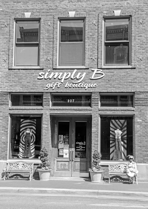
I can do that, Stan, since the windows are questionable as you see it. My original thought was to capture the entire archictural site; maybe too much.
Jul 3, 2019 18:04:07 #
Yes, Kwgw, I like it, but I'm not certain about it.
Jul 3, 2019 17:55:40 #
Thank you, Nancy. I appreciate your observations.
Jul 3, 2019 17:44:33 #
More recently I have tried conversions of some of my images to black and white. This photo was taken well into a very bright morning in Paducah, Ky. We were on a trip part of which included some time in the city. I like architecture. Anyway, I thought this particular image might make a nice conversion. However, anyone who has looked at it has shown almost no reaction to it. So my question is - and I am sorry if this is in the wrong section - if it were yours would you you discard it? Would you possibly disregard it for now hoping for a stroke of inspiration sometime? Honestly, I have pushed the limits of my pp skills, but who knows. My question is not to what is acceptable about it, but really, were you who have a much better eye and skill set than mine to discard the whole thing, what elements or features of the photo specifically would inform your choice?
Jun 27, 2019 16:43:08 #

Jun 23, 2019 11:48:44 #
vicksart wrote:
I'm following up with some of the little, often missed details that might go unnoticed to those just looking for the views.
The followup is what happens when life gives you snow; you have a snowball fight....in June!
The followup is what happens when life gives you snow; you have a snowball fight....in June!
The last of the cheshire, the tabby ,and the siamese remind me of going places with my daughter's girl scout troop (of from eight to eleven girls. While all these are great in thin set I like the third and the last. So much character and good spirits in the group shot.