Discard or disregard
Jul 3, 2019 17:44:33 #
Chicflat
Loc: Tulsa, Ok,
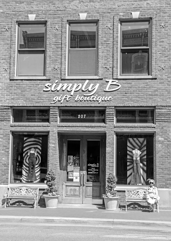
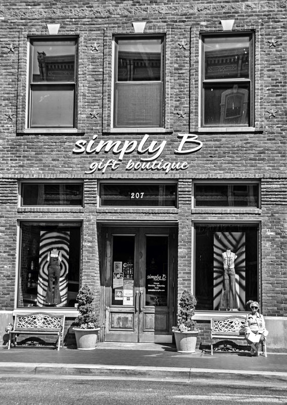
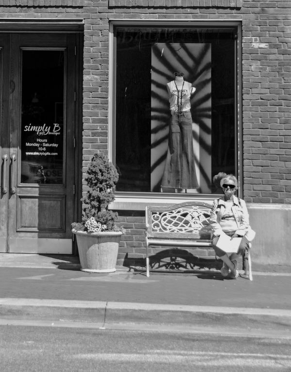
More recently I have tried conversions of some of my images to black and white. This photo was taken well into a very bright morning in Paducah, Ky. We were on a trip part of which included some time in the city. I like architecture. Anyway, I thought this particular image might make a nice conversion. However, anyone who has looked at it has shown almost no reaction to it. So my question is - and I am sorry if this is in the wrong section - if it were yours would you you discard it? Would you possibly disregard it for now hoping for a stroke of inspiration sometime? Honestly, I have pushed the limits of my pp skills, but who knows. My question is not to what is acceptable about it, but really, were you who have a much better eye and skill set than mine to discard the whole thing, what elements or features of the photo specifically would inform your choice?
Jul 3, 2019 17:53:22 #
I like the picture. However, I think there's so much to absorb that the eye doesn't know which is the most important point to focus on. For me, I think it's the lady on the right. Also, it seems like the picture is a tad bright...which makes sense since you indicate it was taken on a very bright morning. I'm a raw hobbyist so I can't be depended on to give a "professional" opinion, ha. Thank you for sharing. It motivates me to try some conversion to B/W at some point.
Smiles,
Nancy
Smiles,
Nancy
Jul 3, 2019 17:55:40 #
Jul 3, 2019 18:01:57 #
It you like it keep it. Frame it, display in your dining room. It is your image, in the end only you decide.
Keep it, for a few months, and look at it again. No reason to discard it. Don't delete if you are undecided.
Take more pictures--I think this one says something.
Keep it, for a few months, and look at it again. No reason to discard it. Don't delete if you are undecided.
Take more pictures--I think this one says something.
Jul 3, 2019 18:04:07 #
Jul 3, 2019 18:05:51 #

Great image. To make it an outstanding image you need to do two things. Crop out the windows and convert the image to a horizontal. Then, and increase the contrast in post processing. That way the eye focuses on where that lady is sitting on a bench. It is a keeper and could sell in a fine art gallery.
Jul 3, 2019 18:09:30 #
Chicflat
Loc: Tulsa, Ok,
I can do that, Stan, since the windows are questionable as you see it. My original thought was to capture the entire archictural site; maybe too much.
Jul 3, 2019 18:13:41 #

Jul 3, 2019 18:14:08 #
Chicflat wrote:
Yes, Kwgw, I like it, but I'm not certain about it.
What to be certain about? I have literally thousands of images saved, that I like, and received less than enthusiastic responses from everyone. No matter, I look at them anyway. They are mine.
Jul 3, 2019 18:17:25 #
Jul 3, 2019 18:23:59 #

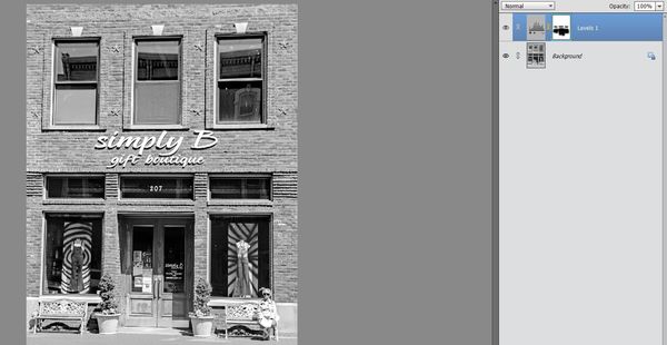
If you desire, you can adjust levels or curves and add more clarity (or whatever your software offers) to bring out more details in the architecture and avoid the slightly washed-out look. #1 below has a one-click HDR application from an online app (befunky.com) + levels tweaks. This one may look too dark on UHH - if so, think half way between yours and mine 
Though I rarely do street photography, #2 is what interested me: is she day-dreaming of her youth when she wore the clothing displayed in the window?
Appreciate your posting to PP Forum!
Though I rarely do street photography, #2 is what interested me: is she day-dreaming of her youth when she wore the clothing displayed in the window?
Appreciate your posting to PP Forum!
Jul 3, 2019 18:31:16 #
Chicflat
Loc: Tulsa, Ok,
Linda, I like your crop, which I hadn't thought of. Your treatment interests me, because one of the adjustments I had been trying in elements kept messing up the little tree. The light that morning really was brutal and I was really having trouble with the tree. The charming lady, my wife, was waiting for the National Quilting Museum to open and was wishing the morning was less uncomfortable..
Jul 3, 2019 18:34:59 #
Chicflat wrote:
I use PS Elements when I'm not too lazy to get out of my recliner (hence the quick online edit using my Chromebook Linda, I like your crop, which I hadn't thought of. Your treatment interests me, because one of the adjustments I had been trying in elements kept messing up the little tree. The light that morning really was brutal and I was really having trouble with the tree. The charming lady, my wife, was waiting for the National Quilting Museum to open and was wishing the morning was less uncomfortable..
 ). Are you working with layers? If yes, you can do selective edits utilizing a mask. If not, you should still be able to adjust levels somewhat. You can also try evening out the exposure prior to your b&w conversion, then apply levels to help with mid-tones and overall pop.
If you want to post your raw (20 mb max on UHH) or a jpg pre-conversion, folks will be able to direct you further.
Jul 3, 2019 18:44:58 #
Chicflat
Loc: Tulsa, Ok,
I worked on the original from raw with those sliders for highlights, blacks and whites. In the editor I worked some with levels and also brightness and contrast. The trees were a real problem, as I said. so I used them as the basis for whether I had gone too far with any adjustments that I had made. I selected my wife, who was literally glaring (white) to tone her down from the gross overexposure. Those were about all I attempted. I can't figure out how to use masks. I never have any confidence the I have done anything. As far as layers are concerned, I am at a loss as to what to select that I could work with other than my wife. But yes I try most of my adjustments with layers.
Jul 3, 2019 19:12:07 #
Chicflat wrote:
I am trying to read between the lines here, so I'm going to make a few assumptions I worked on the original from raw with those slide... (show quote)
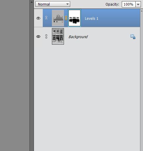
1. It sounds like you're saying that by adjusting the blacks you made the trees too dark or with adjusting whites, you made them too bright. That is the perfect time for a mask. A levels adjustment creates a mask automatically. Click the mask so that it is active: has a green box around it. Now, using a soft brush with black color, all you have to do is paint any area of the image that you do not want affected by your edit. You can also change opacity so that rather than it being all or nothing, your mask is just a certain percent strength.
2. When you say you don't have confidence that you've done anything, simply disable the mask to view before/after. Practice by doing extreme adjustments so you can more easily see the difference when you mask out the effect.
If you want to follow up on these comments with this or another photo, please feel free. I'll be back online tomorrow. In the meantime, below is what I did with levels on just blacks and midtones. My edit caused the darkest parts of the windows and doors to be too black, so after clicking the mask to make it active, I painted over those areas on my photo. Doing this causes those parts to be unaffected by the levels adjustment.
(Download)
Green box around the mask means it's active. Painting on the IMAGE itself with black prevents your edit from applying to that part of the picture.
If you want to reply, then register here. Registration is free and your account is created instantly, so you can post right away.