Discard or disregard
Jul 3, 2019 19:50:24 #

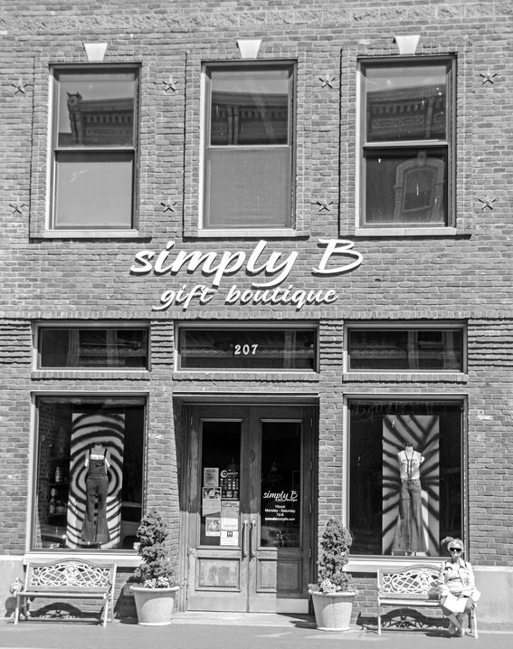
Good initial photo, very expert adjustments. Was thinking about some of my own today - the "why did I take that", where's the "hook" that makes it something more? Do photos have a "use by" date? Well enough taken photos, often landscapes, no resonance, as easily deleted (or tossed if slides) as the odd bad or awkward shot. Curious.
Jul 3, 2019 20:37:54 #

Chicflat wrote:
More recently I have tried conversions of some of ... (show quote)
...I would edit out the sidewalk...
Jul 3, 2019 21:21:45 #
To me the main draw is symmetry with the subject the one asymmetry, so I'd crop out second floor and the shop name and anything else that weakened the symmetry. I'd maybe drive the blacks way down and increase the contrast in the shadows area with a curves adjustment. Nice image!
Jul 3, 2019 22:08:09 #
Chicflat wrote:
More recently I have tried conversions of some of ... (show quote)
(Full disclosure: I can claim some experience with black & white film photography but am lousy at post-processing digital images. I have started scanning old black & white films and hope to post-process some of the digitized images. So far its been a rough road!)
I like your image. A few thoughts (some of this has been alluded to in other posts):
I think these kinds of "head on" architectural images mostly work best if the vertical lines are truly vertical and the horizontal lines are truly horizontal. In that regard your image needs some adjustments (don't ask me how to do this!).
You have an interesting visual arrangement of lines and geometric shapes. I think it would be enhanced by increasing the contrast to get some pure black and pure white into the picture.
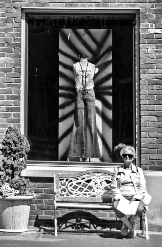
The figure of your wife adds interest and a potential element of mystery. To emphasize this, I would try eliminating all detail in the shop windows.
After doing the above, I would play around with cropping. As some have said, maybe crop out the upper floor?
Just some thoughts from someone still struggling with basic photo editing!
Jul 3, 2019 22:20:50 #

Linda From Maine wrote:
If you desire, you can adjust levels or curves and... (show quote)

Or maybe an even tighter crop?
Jul 4, 2019 05:59:18 #

TriX wrote:
Or maybe an even tighter crop?
In the first photo the step part of the sidewalk is catawampus and also I looked at the upper windows for a story, none there, so the upper windows are best eliminated.
I agree with TriX about Crop but add to that straightening and perspective ... those are three basic tools that add so much. Of course, contrast etc add so much expression to B&W photos. The last needs a name to give a story to the photo, perhaps "The Old Does Not Wear The New"
Perspective was applied a couple of times.. also straightening... cloned the pot to make it smaller on the left and added a few brick. and cropped tighter

Jul 4, 2019 06:20:30 #

Linda From Maine wrote:
If you desire, you can adjust levels or curves and... (show quote)
Big improvement Linda. The vertical and horizontal lines really hurt the big picture so I took your edit and straightened a little. Took down the highlights just a little.

Jul 4, 2019 07:15:04 #

TriX wrote:
When I first cropped, I noticed that Mrs. Chicflat was much softer than the middle of the frame. I was thinking of how that is often true with lenses - the edges being softer - but another thought occurred to me just now, so I wanted to mention for future reference for OP and others. Heat rising from pavement can cause issues with clarity and focus.Or maybe an even tighter crop?
Jul 4, 2019 07:19:20 #
fergmark wrote:
Excellent point that you and others have made, Mark. PS Elements does not have a great option for adjusting verticals. It can be done in filters (camera distortion) and, if one is patient, with a combination of transform tools such as skew and distort.Big improvement Linda. The vertical and horizontal lines really hurt the big picture so I took your edit and straightened a little. Took down the highlights just a little.
Jul 4, 2019 07:56:14 #

I added some contrast, transformed in ACR, and did some content-aware fill.

Jul 4, 2019 08:01:39 #
Linda From Maine wrote:
Excellent point that you and others have made, Mark. PS Elements does not have a great option for adjusting verticals. It can be done in filters (camera distortion) and, if one is patient, with a combination of transform tools such as skew and distort.
I started with distortion and realized that wasn't going to work, so I started again with lens correction to both horizontal and vertical perspective, then followed by a little stretching with distortion.
Jul 4, 2019 09:50:21 #
dpullum wrote:
In the first photo the step part of the sidewalk i... (show quote)
Yep, I agree. I was on an IPad with limited tools, so just a quick crop, but I like you, noticed the need ro straighten. Good job.
Jul 4, 2019 10:57:32 #

I think we are changing the subject a bit with the post processing. Linda's examples are excellent and it is a much better image that way. Gaining experience in post processing is very important as you will learn. As I read your question I saw you questioning if you should discard it because it was't art appreciated by others. It is a memory for you of your life's experiences and is important. Art is one thing and documenting your life is another. Once in a while both occur in one image. Do not discard it.
Jul 4, 2019 11:11:02 #
wildconc2001 wrote:
Appreciate your comments, Larry. The edits subsequent to mine were better because they discussed distortion and straightening I think we are changing the subject a bit with the... (show quote)

This has been an excellent thread IMO for the pp tips, the alternate ideas for storytelling, and the supportive comments regarding not being too hasty to discard images that contain memories.
Happy Independence Day!
Linda
section manager
Jul 4, 2019 11:29:32 #
Same to you Linda and to all the Hedgehogs.
It's been several years since I decided to start commenting again. The tone has certainly changed for the better. I'm sure you'll remember the anger that was exhibited 3 or 4 years ago which defeated the whole purpose of this site. It's good to see how much you've advanced with your photos and post processing.
It's been several years since I decided to start commenting again. The tone has certainly changed for the better. I'm sure you'll remember the anger that was exhibited 3 or 4 years ago which defeated the whole purpose of this site. It's good to see how much you've advanced with your photos and post processing.
If you want to reply, then register here. Registration is free and your account is created instantly, so you can post right away.