Worked with layers
Jul 12, 2019 16:00:42 #
Chicflat
Loc: Tulsa, Ok,
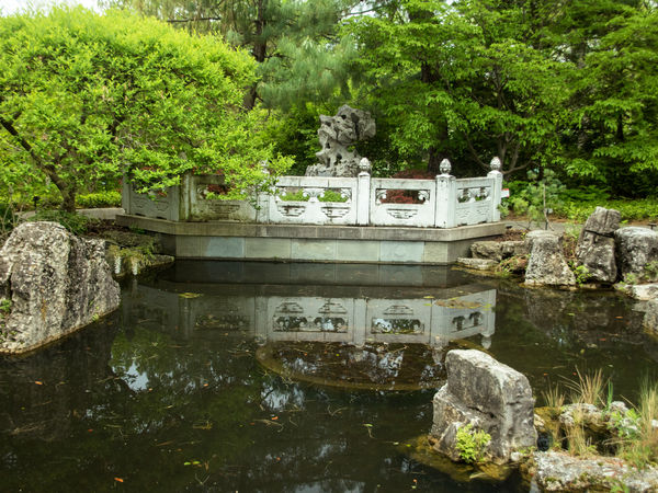
Since my last post I have made a number of eforts at using layers to improve my pp at the suggestion of Linda from Maine. I think I like this image and so I present it for review. I made an adjustment layer for levels, selecting all of the bridge with the brush. I lowered the highlights, I guess on the bridge so that it wasn't just glaring at me. I wanted a little of the weathered aspect of the bridge and to increase the contrast a bit; these objectives the were part of my intent as I made my adjustments. Following this effort, aI did an inverse still in levels, because I wanted to make a slight adjustment in the greens of the foliage in order to gem a little more contrast in the values (?) there. First then, thank you for your help in that I finally found how to actually work with the mask. Second, thanks to any who can add more advice. This was shot in camera raw. I use Elements 13 for pp.
Jul 12, 2019 17:52:10 #
Ysarex
Loc: St. Louis
Chicflat wrote:
Since my last post I have made a number of eforts ... (show quote)
It's a nice garden scene. Congrats on getting a mask and layers functioning. You asked for any more advice so here's a couple additional thoughts:
Did you use a tripod to take the photo?
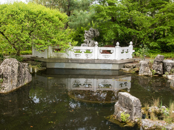
If you look closely at the tops of the bridge pillars you'll see a thin green (left side) and red (right side) outline. That's chromatic aberration and comes from your lens. Not to worry nearly all of our lenses do that and it's too expensive to design and manufacturer out so we live with it and fix it in software. I removed it in the image below.
I straightened the bridge and removed the clockwise tilt (which then required the crop).
I slightly warmed the color.
I take the bridge and it's reflection to be the subject and so I made changes to enhance the subject as opposed to the rest of the image. Biggest change was to vignette (darken) the image to the corners with the vignette centered on the bridge. I also lowered color saturation below the bridge (water and rocks). And I raised the contrast of the bridge reflection.
I also used Layers and masks to accomplish the above.
It's obvious you're in a commercial or public garden because of the marker signs visible along the path -- I removed then as a distraction.
Joe
Jul 12, 2019 18:47:55 #
Chicflat
Loc: Tulsa, Ok,
Joe, I see the differences. I had thought to straiten but using the grid I decided that the vertical alignment with the bridge posts was ok; your approach is better. Your vignetting and pond rework really do give a better emphasis to the bridge. Thanks for your commentary; it will help me to approach my work with abetter sense of how the picture may impact. And yes, this is a pubic garden: Shaw Gardens in St. Lois, Mo.
Jul 12, 2019 19:15:43 #

It's always a great feeling to overcome a pp hurdle - congrats! I don't know if you intended to post this where your previous topic was, Post Processing Forum instead of Analysis? So many similar sections of UHH 
When you get a chance, I hope you'll check in with your previous topic; quite a bit more was said and demonstrated after the first flurry of activity:
https://www.uglyhedgehog.com/t-599171-1.html
.
When you get a chance, I hope you'll check in with your previous topic; quite a bit more was said and demonstrated after the first flurry of activity:
https://www.uglyhedgehog.com/t-599171-1.html
.
Jul 12, 2019 19:32:06 #
One more note: While I moderate PP Forum, UHH Admin monitors Photo Analysis, so if your topic gets moved to Gallery, it wasn't my fault 🤗
Jul 12, 2019 20:04:05 #
Ysarex
Loc: St. Louis
Chicflat wrote:
Joe, I see the differences. I had thought to straiten but using the grid I decided that the vertical alignment with the bridge posts was ok; your approach is better. Your vignetting and pond rework really do give a better emphasis to the bridge. Thanks for your commentary; it will help me to approach my work with abetter sense of how the picture may impact. And yes, this is a pubic garden: Shaw Gardens in St. Lois, Mo.
Oh my goodness I didn't recognize it! -- that's the Friendship Chinese Garden. Next time you visit you can stop by and visit my garden too. I'm just a few blocks from there.

Joe
Jul 13, 2019 08:39:55 #
mizzee
Loc: Boston,Ma
Well done. You have a nice touch. Noticeable improvement without looking overprocessed.
Jul 13, 2019 10:17:35 #

Ysarex wrote:
It's a nice garden scene. Congrats on getting a ma... (show quote)
Joe, real nice job. Edits done with Photoshop ?? Because you are referencing layers I am assuming Photoshop and not Lightroom. Or perhaps some other editor ?? ~FiddleMaker
Jul 13, 2019 11:49:54 #
Chicflat
Loc: Tulsa, Ok,
Linda, I didn't see "analysis" in the list. I was just glad to have improved. Joe, I would love to see your garden; we live in Tulsa. Thank you guys for the encouragement; it is so helpful'
Jul 13, 2019 13:19:11 #
AirWalter
Loc: Tipp City, Ohio
Chicflat wrote:
Since my last post I have made a number of eforts ... (show quote)
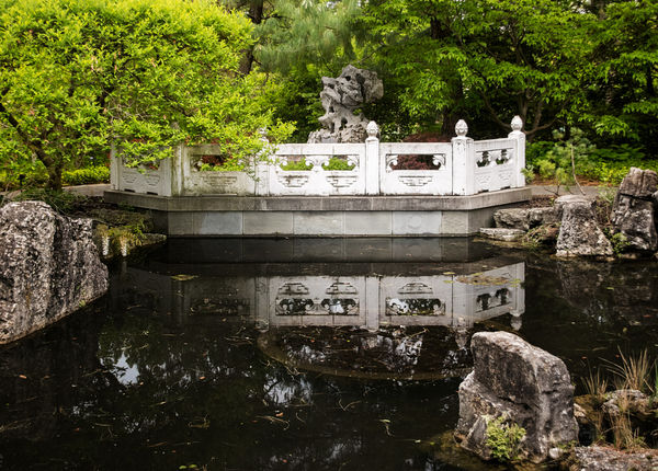
I like your "final image" much better than the one that someone took over and changed just about everything in it to suit themselves. Yours looks more realistic where as the other persons looks over cooked.


Jul 13, 2019 13:34:57 #
Chicflat wrote:
Since my last post I have made a number of eforts ... (show quote)
Chicflat, you answered my question on how you processed this image. I see you used Elements 13. I am using the monthly subscription version of Lightroom Classic CC with Photoshop and others. This is way overkill for me as I am just a casual hobbyist. I am better off with Elements. ~FiddleMaker
Jul 13, 2019 15:00:24 #
Looks like some old folk commenting here. Many year ago the preserve was renamed Missouri Botanical Garden, founded by Henry Shaw. The picture is of the pond Viewing Platform in the Chinese Garden; the platform is the traditional viewing area for the Arched Bridge on the other side of the small pond (with Pagoda too!). A beautiful preserve in the middle of Southwest St Louis, with an emphasis on ecology. The place is loaded with little black signs, which are not hard to clone out of most pictures.
I think the best (and good) interpretation of the picture is the "final Image" - with a little straightening. As a Photoshop user I choke up when I have to work in elements.
Boris
I think the best (and good) interpretation of the picture is the "final Image" - with a little straightening. As a Photoshop user I choke up when I have to work in elements.
Boris
Jul 13, 2019 16:21:46 #
Boris77 wrote:
Looks like some old folk commenting here. Many yea... (show quote)
Boris, I am nearing 80 years old and have never used Photoshop. So I know nothing about using Photoshop. As a very old and rapidly aging dumb-ass, am I better off with Elements since I am not even a novice ??
Jul 13, 2019 18:52:26 #
FiddleMaker wrote:
Boris, I am nearing 80 years old and have never used Photoshop. So I know nothing about using Photoshop. As a very old and rapidly aging dumb-ass, am I better off with Elements since I am not even a novice ??
You only have a few years on me.
I was lucky and had a job that required the company use of Photoshop. They paid me to learn it! Thus I convinced myself to buy the program at home. The upgrades were cheaper then.
On the down side I was skilled enough at drawing (with a mouse) that I never went deep into the program. I ended up with the last version of Photoshop 6 when they went to subscriptions. I have found that I can work the latest subscription version a friend has, and often figure out the new features, but that the subscription offers me nothing new for my practical photo editing.
(I am not a pixel peeper.)
I bought Photoshop Elements 15 just to see what it offered. It feels like a different program than my Photoshop. I strongly suggest that you settle in with a late version of Photoshop ELEMENTS and have a happy life editing your pictures. It appears that Adobe is trying to make your life easier with their new command structure.
Then we can both push for 85!
Boris
If you want to reply, then register here. Registration is free and your account is created instantly, so you can post right away.