Intentional Camera Movement (ICM) Background with Stationary Figure
Nov 14, 2023 17:11:06 #

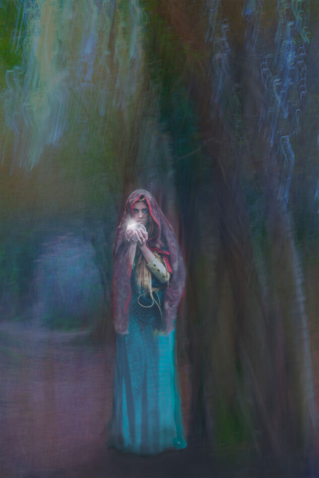
With this one I decided to simply use the ICM element as a background for a composite with a view to creating an overall effect not unlike a pastel drawing. You can decide whether that's what it looks like. The ICM result gives a sort of half-predictable effect. You know the direction of movement will be fairly obvious but, by adding more movement in a different direction, or of a different type, within the same shutter opening period, the result seems to get a little less predictable. Maybe with more experience I'll find it easier. Here, I combined two ICM shots for the background, used different Blend Modes for each and backed the the lower layer with a solid colour layer. That got rid of any burned-out whites. Your critique would be helpful if you have the time, and is appreciated. I should add that you've seen the figure previously, it was just handy to re-use her in this experiment.
Nov 14, 2023 17:39:27 #

You’re get really good at this treatment. When you shot the ICM what subject did you use?
Nov 14, 2023 18:02:33 #
NJFrank wrote:
You’re get really good at this treatment. When you shot the ICM what subject did you use?
Trees Frank. That was the subject of this weeks talk on Camversation - next week it is water, so I’ll be bothering everyone again I expect!
Nov 14, 2023 20:52:15 #

Nov 14, 2023 21:46:02 #
Nov 14, 2023 23:50:00 #

magnetoman wrote:
With this one I decided to simply use the ICM elem... (show quote)
I really enjoyed looking at your piece here Magnetoman, Thanks for the description...if you don't mind I'd like to try my hand at it.
Nov 15, 2023 00:55:01 #
UTMike wrote:
Very good, but your last one takes the prize, David.
Thanks again Mike.
Nov 15, 2023 00:55:27 #
Curmudgeon wrote:
Another beautiful rendition Dave
Thanks again Jack.
Nov 15, 2023 01:05:26 #
veralisa296 wrote:
I really enjoyed looking at your piece here Magnetoman, Thanks for the description...if you don't mind I'd like to try my hand at it.
I think you’ll find it an enjoyable exercise Veronica, I’m pleased you find it of interest. If you’ve not done any ICM previously a good starting point is: lowest ISO your camera offers, smallest f-stop (highest number), and around a quarter to half a second shutter speed. Choose something vertical and swipe the camera upwards or downwards whilst pressing the button. You can move the camera in more than one direction, increase length of shutter opening etc etc once you get the feel of it. Try to avoid the sky initially as it burns out and makes horrible squiggles all over the place. Hope this helps. Don’t be afraid to compare notes with me if it will help - but remember I’m still learning!
Nov 15, 2023 02:47:51 #

You're on the front line in our battle against AI dominance. Show those algorithms who's boss  .
.
.Nov 15, 2023 03:21:32 #
R.G. wrote:
You're on the front line in our battle against AI dominance. Show those algorithms who's boss .
.Good to know you’re with me on this RG, we seem to be thin on the ground!
Nov 15, 2023 06:01:10 #

You have given a how-2 make an ICM background sandwich "combined two ICM shots for the background, used different Blend Modes for each and backed the the lower layer with a solid colour layer. That got rid of any burned-out whites." The result is a fantastic "pastel drawing" effect.
In actual brush-on-canvas we layer a solid color or wash on the white primed canvas, you have done the same, "backed the the lower layer with a solid colour layer." This is a standard to a painter, and should be a "follow the directions" receipt for photo based creations.
I have watched hour long webinars where the presenter wanders along and does not look, analyze and say this is what they are going to do and why. I think they do not know. You in one paragraph have planned and executed and we now have no excuse for not doing a practice of our own with the steps preserved on a text so we can pull out the receipt and be successful if a year passes. We owe you a hat tip of gratitude for your detailed directions... Thank You.
My critique... The light-left/right-dark yen-yang is well done. The "Fate-goddesses of destiny" blends well in color and texture and becomes one with the background... no small accomplishment... skillfully done.
My only negative is that the background above her head should be about only twice that below her feet. While the ICM effect is beautiful... it is not the story. The main character and her blending with the background is the story. Remembering the TBCClub rule indubitably in my mind... that which does not add ... detracts, score points off. All that excess background above her adds nothing.
Again thank you magnetoman for the how and why discussion.
Nov 15, 2023 06:37:14 #
dpullum wrote:
You have given a how-2 make an ICM background sand... (show quote)
Many thanks for the advice Don - absolutely correct, it will be done!
Nov 15, 2023 06:45:07 #
magnetoman wrote:
Many thanks for the advice Don - absolutely correct, it will be done!
The space above her head is generous but not without its purpose. it creates the atmosphere of the woman standing in a large space, either outdoors or in a room with a high ceiling. I would lose some of it but not as much as Don is suggesting. It might end up a bit claustrophobic if the upper edge is too low.
Nov 15, 2023 06:52:29 #
R.G. wrote:
The space above her head is generous but not without its purpose. it creates the atmosphere of the woman standing in a large space, either outdoors or in a room with a high ceiling. I would lose some of it but not as much as Don is suggesting. It might end up a bit claustrophobic if the upper edge is too low.
Yes, about where the angled brown line converges with the foreground tree would do I think RG. Thanks for your interest and suggestion.
If you want to reply, then register here. Registration is free and your account is created instantly, so you can post right away.