Check out Landscape Photography section of our forum.
Why the nasty color cast?
Nov 28, 2022 19:30:16 #
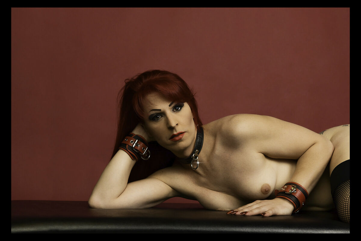
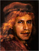
The original is bright and clear. When I load onto UHH, this nasty cast appears. Ideas?
Nov 28, 2022 19:58:32 #

dat2ra wrote:
The original is bright and clear. When I load onto UHH, this nasty cast appears. Ideas?
Keep it! Great photograph as it appears.
Nov 28, 2022 20:02:07 #

dat2ra wrote:
The original is bright and clear. When I load onto UHH, this nasty cast appears. Ideas?
Very nice image!!!
Lovely young lady!!
I have no clue as to why your image is darker than what you posted.
Why don't you remove and repost it !!
Check out Film Photography section of our forum.
Nov 28, 2022 22:06:14 #
It could be a color space problem. Read this thread from Jan 19, 2016, especially the long comment by apaflo on page 2. One of the most useful facts I've learned from UHH.
"My photos uploaded to UH contest look washed out" by Mormorazzi
https://www.uglyhedgehog.com/t-362867-2.html
"My photos uploaded to UH contest look washed out" by Mormorazzi
https://www.uglyhedgehog.com/t-362867-2.html
Nov 28, 2022 22:07:08 #

davidrb wrote:
Keep it! Great photograph as it appears.
I agree! You might not like the color but the pose and the model make for a nice photo
Nov 29, 2022 03:55:55 #
RogStrix
Loc: UK
Math78 wrote:
It could be a color space problem. Read this thread from Jan 19, 2016, especially the long comment by apaflo on page 2. One of the most useful facts I've learned from UHH.
"My photos uploaded to UH contest look washed out" by Mormorazzi
https://www.uglyhedgehog.com/t-362867-2.html
"My photos uploaded to UH contest look washed out" by Mormorazzi
https://www.uglyhedgehog.com/t-362867-2.html
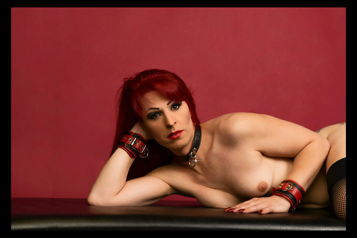
It is indeed a colour space problem, and plays interesting tricks with my pc. If however, you open the download/original in Adobe Elements (or whatever) and use the IMAGE/Convert Color Profile/Convert to sRGB option (or AdobeRGB, whatever your preference) then resave it, it should retain the nice bright red appearance rather then the brown cast it currently gives.
I've attached the download with the sRGB option selected.... It is so much better and I can understand your frustration...
Nov 29, 2022 05:36:37 #
This is what's to great about UHH. Somebody posts a photo or asks a very specific problem and members will jump in with a solution.
I plan to take advantage of this level of expertise. I know in advance that some critiques might be harsh but ultimately, it will make me a better photographer
I plan to take advantage of this level of expertise. I know in advance that some critiques might be harsh but ultimately, it will make me a better photographer
Check out The Dynamics of Photographic Lighting section of our forum.
Nov 29, 2022 07:24:38 #

davidrb wrote:
Keep it! Great photograph as it appears.
Color cast what color cast ?!?! I agree "Great photograph as it appears."
Nov 29, 2022 08:56:41 #

dpullum wrote:
Color cast what color cast ?!?! I agree "Great photograph as it appears."
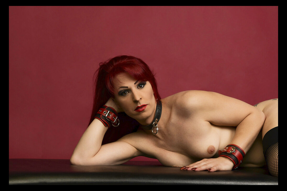
Don't you think the second one posted is better?
Nov 29, 2022 09:07:51 #

dat2ra wrote:
The original is bright and clear. When I load onto UHH, this nasty cast appears. Ideas?
You are editing in Adobe RGB, and UHH displays thumbs sRGB. Convert to sRGB for the web
Nov 29, 2022 09:28:46 #
RogStrix
Loc: UK
kymarto wrote:
You are editing in Adobe RGB, and UHH displays thumbs sRGB. Convert to sRGB for the web
not quite true. Whatever the OP is editing in is leaving it with the Exif displaying 'Color Space : Uncalibrated/Unknown (-1)'. I'm not familiar with his workflow but I guess it's easy to miss a tick to select the 'Color Space' during the save process.
I've also tried saving the OP's download as an AdobeRGB image, and this is how it comes out:
On my monitor the image appears 'softer' then the sRGB image. Please don't ask me to explain why, I'm already working past my usual knowledge level, lol:
Check out Wedding Photography section of our forum.
Nov 29, 2022 11:42:39 #
Photographers want the colors to be right, to be what they see on their monitors. All photos uploaded to UHH should be in sRGB color space, not Adobe RGB 1998 or ProPhoto.
BTW, you could crop 20% off from the left.
BTW, you could crop 20% off from the left.
Nov 29, 2022 11:55:39 #
RichieC
Loc: Adirondacks
It's a preview issue. The original ( the version that loads when one clicks on download) is nice and colorful as you no-doubt expect it to look.
You could go to Photoshop > Edit > Assign Profile> and fool around (Click preview - so image changes to which ever profile you temporarily choose as you click down though the extensive list ) till you find one that matches what UHH does to thumbnails- which is kill 'em. LOL.
Embedding a specific profile is the answer here so it looks best as a thumbnail.. but that may affect your original as well. Maybe there is a magic one... LOL I just don't have time to figure it out- but this is where you will find your solution.
Also change profiles on a duplicate. Changing profiles doesn't appear to be reversible!
RE: Photo Itself
Your subject is pretty, photo nicely exposed. Could open up shadow detail a touch perhaps, but composition I think could be improved.. her nose is just about dead center (really her head) , I think the shape/lines of her hip and stocking tops would be interesting to see. So pan left so left shoulder dead center.
IMHO :)
Nov 29, 2022 13:16:50 #

Nov 29, 2022 13:57:18 #
Between her hair and the background, throw in her nail polish and wrist thingee, I think the eye would see everything tinged regardless of the settings, the eye plays games with you at times.
If you want to reply, then register here. Registration is free and your account is created instantly, so you can post right away.
Check out Film Photography section of our forum.