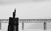
Color or B&W - Which do you prefer
Jan 3, 2020 16:43:07 #

johngault007 wrote:
I prefer the B&W version Linda :)
Yes, Vince, B&W with the changes Linda provided to suit your taste is much better.
Yes, Vince, B&W with the changes Linda provided to suit your taste is much better.
I agree!
Jan 3, 2020 17:03:08 #
Jan 3, 2020 17:39:51 #
Cany143
Loc: SE Utah
Vince68 wrote:
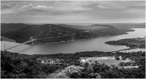
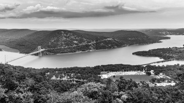
Here are two photos taken in August 2019, same cap... (show quote)
To answer your actual question, in this particular instance, a b&w conversion might be a better choice.
The accompanying revision was done solely with Lr Classic, the beginning point being your initial conversion rather than your color original. There were at least 6 gradient filters used (I didn't count) from the top down to produce a sky that seemed appropriate to the overall scene. Each time a gradient was applied, varying degrees of highlight, shadow, white, black, contrast, texture, dehaze and/or clarity was adjusted for a particular tone, and in a particular area within the zone where it was applied. An oval, radial gradient was applied on the left side of the image, centering the effect about 1/3 of the way from the top. The purpose of doing so was to lower the values while increasing the contrast in that area. Diagonally placed linear gradients were applied to both the upper left and upper right corners since their brightness relative to the (now) darker center portion of the sky pulled 'the eye' out of the frame. These various adjustments in the sky area took about 3-4 minutes; I felt it worthwhile because it seemed (to me) that the overall composition was negatively affected by cropping the sky out. The lower 2/3 --everything below the horizon line-- received minor contrast, black point and sharpening tweaks, and again, with an eye toward maintaining a 'balanced' (top to bottom) composition, I removed a small portion from the bottom.
If anything, the above should suggest that multiple local adjustments will do far more than global adjustments can, whether working on either a b&w version or a color version of most shots.
Jan 3, 2020 18:34:13 #

Cany143 wrote:
Stunning work, Jim! All following this thread will appreciate your detailed information about how accomplished. Thanks much.To answer your actual question, in this particular... (show quote)
Jan 3, 2020 19:03:36 #

Yes as stated above, I thought, when first seeing this a few hrs ago, dehaze. That would have been my first and probably most useful move. Too much mist in the air without it. Keep after it with mono conversions and you may learn to like it. Make initial adjustments and then convert is the best practice. You may enjoy and upgrade to a version that has a dehaze slider. It’s a great option. Have fun.
Jan 3, 2020 20:02:48 #
I agree with Linda, you have to work on your color version first. I used software that I don't believe you have. Started with Photoshops Camera raw filter and increased highlights, contrast, whites and black. Moved on to Dehaze and added Clarity with sliders. Then flattened and saved the photo. Went on to Aurora HDR and made a basic HDR using just one picture and picked the one with the best contrasting sky. Now I used just the sky and applied it to my photoshop file using a mask. Next made a B&W Layer and moved the sliders around to increase my black and white contrast. Added one more layer Brightness/Contrast and increased both.
All this took me about 20 minutes. I love a good challenge.
All this took me about 20 minutes. I love a good challenge.
Jan 4, 2020 01:52:27 #
Cany143 wrote:
To answer your actual question, in this particular... (show quote)
Jim, thanks for looking, advice, and taking the time to comment. I like the results you achieved on the sky. I couldn't get it to look as good as what you did, so in my second go around I cropped most of the sky out. As I said, I don't do hardly any B&W conversion and I wanted to get feedback and tips from those that do.
Jan 4, 2020 01:57:26 #
pesfls wrote:
Yes as stated above, I thought, when first seeing this a few hrs ago, dehaze. That would have been my first and probably most useful move. Too much mist in the air without it. Keep after it with mono conversions and you may learn to like it. Make initial adjustments and then convert is the best practice. You may enjoy and upgrade to a version that has a dehaze slider. It’s a great option. Have fun.
Unfortunately, dehaze is an adjustment that I don't have in LR 6.14. Thats one of the downfalls of not having the latest and greatest. Thanks for looking and taking the time to comment.
Jan 4, 2020 02:11:25 #
Jim-Pops wrote:
I agree with Linda, you have to work on your color... (show quote)
Jim, so what your saying is, I should make adjustments to the color image first, then convert it to B&W and make other adjustments? As I mentioned in a previous reply, some videos I have watched have said to start with first converting to B&W, which is what I did by moving the vibrance and saturation sliders all the way to the left first. I thought I had read that here on UHH too, but I might be mistaken about that.
I do have Photoshop and Lightroom, but the older CS6 and LR 6.14 versions. Isn't using ACR in Photoshop the same as making those same adjustments in Lightroom? I will admit, I am not a very competent user of PS even though I have had it for a long time. Layers and masks are not something I am very adept with. I do have Aurora HDR, but didn't consider using it for this B&W conversion.
Thank you for taking the time to look, make adjustments, and explain what you did. This is what I was looking for to begin with.
Jan 4, 2020 07:01:06 #

bbrowner wrote:
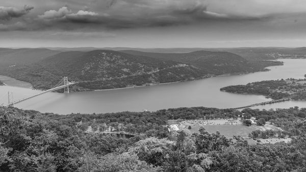
I took the liberty of adding my 2 cents (2 images)... (show quote)
I like your version, Barry; I would have liked to have seen more sky and less foreground.
Jan 4, 2020 08:59:07 #

I’ll have to go with the color. Though I’m a fan of black and white, this one is pretty flat. Other folks’ versions have more pop to them.
Jan 4, 2020 09:23:18 #

Jan 4, 2020 09:56:54 #
Answering your questions.
I think you should make changes to color first. You have more control even in Lightroom you can go to HSL/Color section and start sliding some of the color bars improving contrast. Remember the color in not important the contrast is what you want to improve.
Yes, ACR in Photoshop is the same as Lightroom's adjustment sliders. I just go to photoshop and start from their rather than go back and forth between the two programs.
I used the Aurora HDR while the photo was still color getting the effect. I then imported the file and made it a layer over the base color picture. Then just opened up the sky with a mask. In this case the Aurora software didn't help me with the rest of the picture.
Once happy with the color picture having all the contrast I wanted I made the conversion to B&W. Once B&W I applied additional sharpening and contrast for the final picture.
Jan 4, 2020 10:54:14 #

In working this image I tried to add some contrast without losing the values and going too far. I did this with camera raw first and then the black and white tool in Photoshop. Just another thought on the conversion.
Jan 4, 2020 11:53:34 #
Seems to me that the thrust of the question is answered by the black/white version being better. I know that for some people photography is just something you do, like eating or talking. But it's also an art; the artistic aspect of the b/w is easily evident compared to the ho-hum color -- even with enhancements to the color. For the most part, color is a distraction for me. Sometimes it's good or ok, but mostly it's b/w for me.
If you want to reply, then register here. Registration is free and your account is created instantly, so you can post right away.