Color or B&W - Which do you prefer
Jan 3, 2020 14:32:39 #
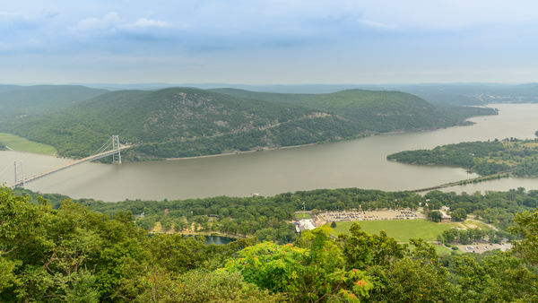
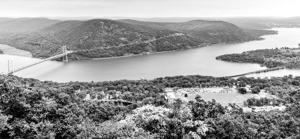
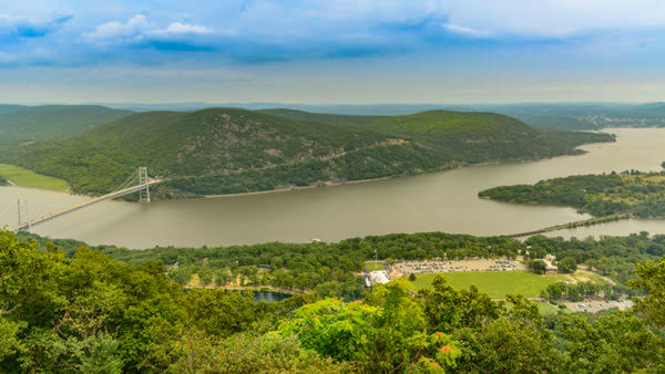
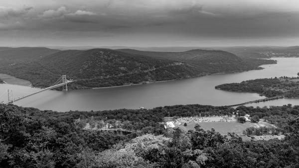
Here are two photos taken in August 2019, same capture, one processed in color, one processed in B&W using Lightroom only. Which do you prefer. I do not do much B&W conversion if any, so any suggestions from those that do B&W would be appreciated.
The photos were taken on top of Bear Mountain in NY, off of Perkins Memorial Drive. The bridge over the Hudson River is the Bear Mountain Bridge for those not familiar with the area. It was a pretty overcast day, not much sun or clouds, so the sky is not much to write home about.
The photos were taken on top of Bear Mountain in NY, off of Perkins Memorial Drive. The bridge over the Hudson River is the Bear Mountain Bridge for those not familiar with the area. It was a pretty overcast day, not much sun or clouds, so the sky is not much to write home about.

Jan 3, 2020 14:42:22 #

Vince, is it OK if I post an edit to accompany my comments?
Jan 3, 2020 14:43:33 #
Linda From Maine wrote:
Vince, is it OK if I post an edit to accompany my comments?
Yes Linda, go ahead.
Jan 3, 2020 15:01:25 #
Vince68 wrote:
With the poor light and the haze, and the color of the river, you are starting with a photo of similar tones which causes the b&w to be similarly lacking in any crisp whites or blacks or definition.Yes Linda, go ahead.
For me, the reason to convert this photo to b&w is to make the image more about the curves of the meandering river and the gently rolling hills.
It was easier to accomplish that goal by adding saturation and exposure changes to the color photo prior to conversion. I'm only using an online app so this is just a hint of what could be done with more robust software. After I picked a b&w pre-set option, I did additional edits to levels. Then I cropped out the sky, which IMO did not add to the story.
Thanks much!
Jan 3, 2020 15:08:17 #

I prefer the B&W version Linda :)
Yes, Vince, B&W with the changes Linda provided to suit your taste is much better.
Yes, Vince, B&W with the changes Linda provided to suit your taste is much better.
Jan 3, 2020 15:17:37 #
Linda From Maine wrote:
With the poor light and the haze, and the color of... (show quote)
Thanks Linda.
In the B&W conversion that I did, the first adjustments that I made were to the vibrance and saturation sliders by moving them completely to the left to get rid of the color. Once I did that, then I started making my other adjustments. I have watched some videos that said to do that first, and if memory serves me correctly, I thought I read that on here too, but I could be mistaken.
As I said, I don't do much conversion to B&W, and I thought this image might be a good one to try it with, and was looking for suggestions to make it better. I know there are members that do a lot of B&W, so I was hoping for suggestions like you gave. I also am aware that if I want a final B&W image, I should shoot for that result when taking the picture. I was not thinking of making a B&W image when I was out that day.
Jan 3, 2020 15:19:19 #
johngault007 wrote:
I prefer the B&W version Linda :)
Yes, Vince, B&W with the changes Linda provided to suit your taste is much better.
Yes, Vince, B&W with the changes Linda provided to suit your taste is much better.
Thanks for looking and commenting John.
Jan 3, 2020 15:41:00 #
I took the liberty of adding my 2 cents (2 images). All I did was to go to Lightroom with them both, and in the basic develop module I moved the dehaze slider to the right. That's all. I, perhaps, might have done a bit more. But all I wanted to do is to point out what the dehaze slider alone can do.
Black and white v color on these... who knows. It should be what you like best. You've asked us to chose between the two. You're going to get 36 different answers here.
I know the area well. Beautiful there.
Barry
Black and white v color on these... who knows. It should be what you like best. You've asked us to chose between the two. You're going to get 36 different answers here.
I know the area well. Beautiful there.
Barry
Jan 3, 2020 15:49:46 #
bbrowner wrote:
I took the liberty of adding my 2 cents (2 images)... (show quote)
Thanks for looking and the adjustments Barry. I don't have the dehaze slider in LR 6.14... I probaly should have said what version I was using so others would know what tools I had to use.
Jan 3, 2020 15:57:52 #
Vince68 wrote:
I had to smile because I think I read on UHH that one should do a lot to the color image first ... the first adjustments that I made were to the vibrance and saturation sliders by moving them completely to the left to get rid of the color. Once I did that, then I started making my other adjustments. I have watched some videos that said to do that first, and if memory serves me correctly, I thought I read that on here too, but I could be mistaken.
 I'm sure there is no hard and fast rule and that the subject, original colors and the light can inform.
Re my edits to this, I meant to add that I did a slight HDR effect also.
Thanks again for a great topic!
Jan 3, 2020 16:02:01 #
Linda From Maine wrote:
With the poor light and the haze, and the color of... (show quote)
Linda,
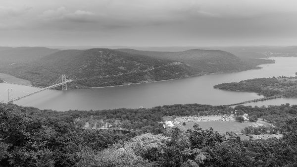
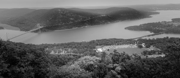
Here is another edit I did of the B&W image. I took your advice and cropped out most of the sky. I added a vignette, and also placed radial filters to darken areas of the mountain that was not facing the sun. I also placed radial filters on the west side of the mountain where there was some sun. I'm not sure they made the image any better or not, but right now just trying some different things.
Please feel free to comment on these edits also.
Jan 3, 2020 16:02:37 #
bbrowner wrote:
That dehaze tool is impressive! I can't recall if it's in my current version of PS Elements. Might be and my one or two attempts with it were failures I took the liberty of adding my 2 cents (2 images)... (show quote)

Jan 3, 2020 16:06:49 #
Vince68 wrote:
Yours gives a better sense of the day and the weather. One of the many reasons I love b&w is the control you have over mood and other aspects. Even the choices of paper tints (like with my Nik Silver Efex) is fun. I often prefer a selenium silvery or blue look if the image doesn't lend itself to starker black/white.Linda,
Here is another edit I did of the B&W image. I took your advice and cropped out most of the sky. I added a vignette, and also placed radial filters to darken areas of the mountain that was not facing the sun. I also placed radial filters on the west side of the mountain where there was some sun. I'm not sure they made the image any better or not, but right now just trying some different things.
Please feel free to comment on these edits also.
Jan 3, 2020 16:18:20 #
Linda From Maine wrote:
Yours gives a better sense of the day and the weather. One of the many reasons I love b&w is the control you have over mood and other aspects. Even the choices of paper tints (like with my Nik Silver Efex) is fun. I often prefer a selenium silvery or blue look if the image doesn't lend itself to starker black/white.
Thanks Linda. I definitely like my second attempt better than the first. The sky did not add anything at all to the image, especially the B&W version of it. Cropping it out is much better... thanks for suggesting that.
Jan 3, 2020 16:23:16 #
Vince68 wrote:
Looking forward to your sharing more of your journey into monochrome Thanks Linda. I definitely like my second attempt better than the first. The sky did not add anything at all to the image, especially the B&W version of it. Cropping it out is much better... thanks for suggesting that.
If you want to reply, then register here. Registration is free and your account is created instantly, so you can post right away.