Color Boost Challenge for PP Enthusiasts
Jan 17, 2018 12:50:44 #
As I go back and look at each edit, I realized that we all, including myself, missed the crooked horizon. Wouldn't a good photo editor recognize it and mark it up?
Jan 17, 2018 12:56:51 #
MCHUGH wrote:
This is my try. To me the published image had a green cast to it. At least it did on my computer screen.
Welcome, MCHUGH. Ah! The joys of different computer screens. There is a lot of green in that image: bushes, trees, and leaves, which may not help. Have you checked your screen for color correction? Many folks don't bother, which is fair enough. No one else has mentioned a green cast. I would be interested if any one else has noticed a color cast.
Please post again but next time click the 'store original' box. That way we can see your image in all it's glory, and I can critique accurately. Thanks.

Jan 17, 2018 13:04:46 #
Shakey wrote:
Welcome, MCHUGH. Ah! The joys of different compute... (show quote)
Yes, my monitors (3) all show a significant green cast in the published image. Not as pronounced in the raw.
Jan 17, 2018 13:09:44 #
mikeroetex wrote:
I'm relatively new to PP and trying to improve my skills. My go at it.
That is a wonderful interpretation, mikeroetex. Rich colors, illusion of depth, excellent crop, and you levelled the road, which everyone missed. However, you need a little more sharpening or the clarity tool (or both as they do different jobs). As someone new to PP, you must have been studying to get this result from your software. Well done. I'll give you four thumbs this time.


Jan 17, 2018 13:13:29 #
SalvageDiver wrote:
As I go back and look at each edit, I realized that we all, including myself, missed the crooked horizon. Wouldn't a good photo editor recognize it and mark it up?
You are correct, SalvageDiver. The road should be level. I got away with that one. maybe he thought it was hill!
Jan 17, 2018 13:25:34 #

SalvageDiver wrote:
As I go back and look at each edit, I realized that we all, including myself, missed the crooked horizon......
Mikeroetex, Blackest and myself picked up on it.
Shakey, I too see a green cast, most noticeable with the people and the trunk of the tree behind the woman on the left. I found that that corner reflected the overall tint. I my edit it was yellow/orange. Green is probably accurate because we tend to pick up reflected light from what surrounds us, which in this case is vegetation.
Jan 17, 2018 13:34:35 #
R.G. wrote:
Mikeroetex, Blackest and myself picked up on it.
Oops, my bad. You're correct. I must have had crooked on my brain.
Jan 17, 2018 13:42:11 #
SalvageDiver wrote:
Oops, my bad. You're correct. I must have had crooked on my brain.
It's just about possible that the ground does slope there, but since the trees are perpendicular to that "horizon", I'm inclined to think it's the shot that's tilted.
Jan 17, 2018 14:06:06 #
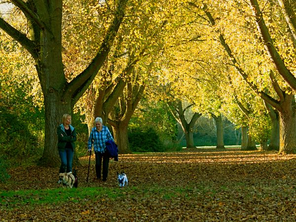
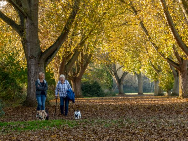
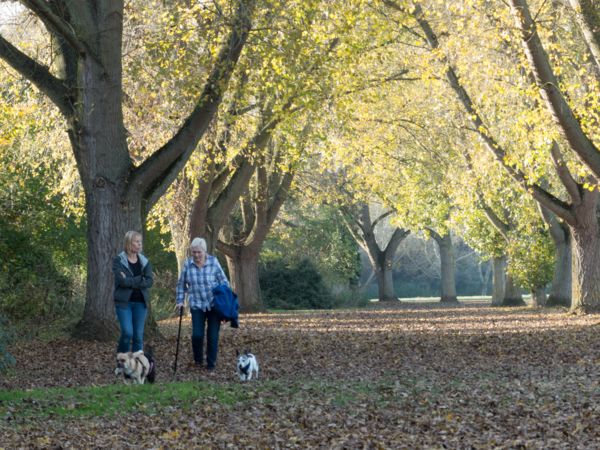
My fault guys. I posted the wrong image. I have asked the publisher to send me the address of the website where it was used.
This is the image I should have posted. Put it down to age, well I am old!
This is the image I should have posted. Put it down to age, well I am old!

Jan 17, 2018 14:26:35 #

Shakey wrote:
That is a wonderful interpretation, mikeroetex. Ri... (show quote)
Thank you! Just a few months since subscribing to LR and PS. Watching lots of youtube and taking an online course!
Jan 17, 2018 14:35:10 #

Shakey wrote:
Here is an image which has been published online.
Your challenge is to produce a similarly color boosted image (or better - richer colors and brighter) from the .jpg or the RAW file posted below.
The first image is the published image.
The .jpg original is below the published image.
The RAW file is below.
Your challenge is to produce a similarly color boosted image (or better - richer colors and brighter) from the .jpg or the RAW file posted below.
The first image is the published image.
The .jpg original is below the published image.
The RAW file is below.
I really do not see how the edited version is better. There is an atrocious color cast there so trying to match that is not exactly a good idea.
Funny part (for me) is that I was about to post a WB correction tutorial...
Your image will be used as the 'sampler'...
More later.
Jan 17, 2018 15:01:37 #
Rongnongno wrote:
I really do not see how the edited version is better. There is an atrocious color cast there so trying to match that is not exactly a good idea.
Funny part (for me) is that I was about to post a WB correction tutorial...
Your image will be used as the 'sampler'...
More later.
Funny part (for me) is that I was about to post a WB correction tutorial...
Your image will be used as the 'sampler'...
More later.
Thank you for your comment, Rongnongno. We do have a rule for this Challenge series, which is 'do not comment until after you have posted your interpretation'. This request was made because folks, like you, want to tell us how to do it but do not post an interpretation of their own. We are here to help each other. It would also be polite if you asked permission to use a member's image, good or bad. You may have overlooked the fact that I posted the correct image, above, after confessing I had posted the wrong image. I hope you will be kind enough to use the correct image. We look forward to seeing your interpretation. And please no advertising.
Jan 17, 2018 15:04:44 #
Shakey wrote:
.../...
Three images:
- Your sample to match
- My vision
- Original raw
You will hard pressed to find additional noise.
Note the details on the upper left corner.. The sky highlight.
Jan 17, 2018 15:05:41 #
Shakey wrote:
Thank you for your comment, Rongnongno. We do have... (show quote)
That was the reason for 'more later' I had to do it to prove my point.
It did not take me long.
Jan 17, 2018 14:35:10
Jan 17, 2018 15:04:44
Used PS CC.
I will post the PSD as a DL on another site upon request to show the method.
Jan 17, 2018 15:05:43 #
I'd like to pose a question to the group, including our esteemed photo editor. As I've search the internet for travel photos used in advertisements, I've noticed that while the colors may be vivid (saturated), the people in the images are not. It seems that when people or animals are used in the main part of the image, they are processed normally, not highly colorful. Is this the perception of others or have I just been overly selective in the images I'm using to base my conclusions on (again).
If you want to reply, then register here. Registration is free and your account is created instantly, so you can post right away.