The Histogram
May 24, 2015 08:52:07 #
photoman022
Loc: Manchester CT USA
Not exactly off-topic, but thank you to the people who've made suggestions about post-processing. You've given me some ideas on how to post process some photos that look overly saturated! Again, thanks!
On topic: The photo looks great to me.
On topic: The photo looks great to me.
May 24, 2015 09:32:14 #

mdorn wrote:
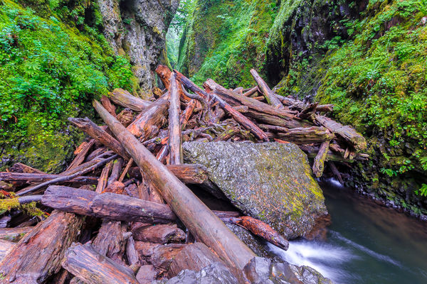
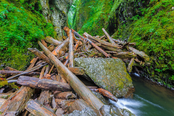
How many photographers rely on this to get the right exposure? I was told recently that the attached photo was OVER exposed, but the histogram shows that it isn't. What's your opinion? Thanks. -M
I gave up on chimping and histograms a while back. After experimenting I found that my camera could capture meaningful data 2 stops beyond what the exposure meter indicated was correct. No, there is nothing wrong with the exposure meter, it's more that the camera captures more data than you are led to believe it captures. As a consequence, all of my histograms are crammed up against the right side. Totally useless for their purpose in determining correctness of exposure. EBTR is a great way to go, but requires some careful "lab" work and really knowing your equipment.
Here's an example.
http://www.uglyhedgehog.com/t-310051-1.html
--Bob
May 24, 2015 09:44:44 #
mdorn wrote:
How many photographers rely on this to get the right exposure? I was told recently that the attached photo was OVER exposed, but the histogram shows that it isn't. What's your opinion? Thanks. -M
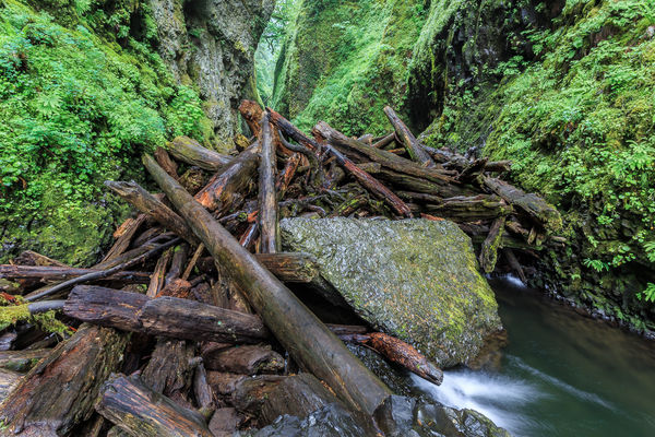
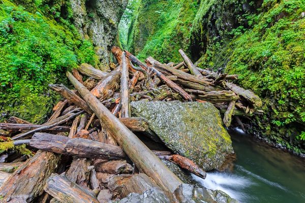
I downloaded your image and took look. It is rather green biased, which I'd expect from the predominance of that colour. That green bias has affected the colour rendition of the entire scene.
I performed an image specific white balance and it improved the image noticeably, in the area of colour rendition.
--Bob
May 24, 2015 09:51:41 #

pecohen wrote:
I downloaded the image to look more carefully at it. Looking at its histogram in HSL it does look blown-out on the saturation curve. I'm not sure how to deal with that problem, but I have to wonder whether your camera is set to boost saturation.
Just looking at the image itself, it did seem to me to be crying out for some PP so I applied a bit of soft-light and soft-light sharpening and to my eye the image was significantly improved. With your permission I could post it.
Just looking at the image itself, it did seem to me to be crying out for some PP so I applied a bit of soft-light and soft-light sharpening and to my eye the image was significantly improved. With your permission I could post it.
Yes. You are welcome to post. Thanks for your time.
May 24, 2015 10:00:49 #
mdorn wrote:
Yes. You are welcome to post. Thanks for your time.
You are quite welcome.
Here you go. I also uploaded your original so the comparison would be easier to make.
--Bob

May 24, 2015 10:01:51 #
rpavich wrote:
The photo looks fine, though underexposing a touch brings out more color.
This histogram cannot tell you what a "good" or "bad" exposure is; it only reports on the distribution of tones present in the field of view; the image.
Personally, I don't use them.
This histogram cannot tell you what a "good" or "bad" exposure is; it only reports on the distribution of tones present in the field of view; the image.
Personally, I don't use them.
Thank you rpavich. I agree that underexposing looks slightly better in terms of color on our monitors, but in the past, many of my images were underexposed when going to print. To avoid post processing them twice (once for print and once for web), I usually get it the way I like it on my screen, then slightly bump up the exposure before sending to print.
How do you deal with the print vs. web issues? Or is it an issue? Is there something I could be doing that both look properly exposed? And before this gets mentioned, yes, my monitor is calibrated properly.
As far as the saturation is concerned, yes, the image is over saturated a bit. However, to me, this is much easier to fix than exposure issues. I'm most concerned about exposure. Thanks again for your comments. -Mark
May 24, 2015 10:09:03 #
rmalarz wrote:
You are quite welcome.
Here you go. I also uploaded your original so the comparison would be easier to make.
--Bob
Here you go. I also uploaded your original so the comparison would be easier to make.
--Bob
Bob, again thank you for taking the time. However, your rendition is not really what I saw when I was there. The logs have a lot more red in them now. I will say that it looks very nice, just not what I remember seeing.
The over-saturated greens and yellows seem to be the issue for many, but in all honesty, this is what my eyes were seeing. Maybe my rods and cones are all screwed up? Very likely. Regardless, I need to remember to pull it down a bit. :-)
May 24, 2015 10:16:51 #
mdorn wrote:
Bob, again thank you for taking the time. However, your rendition is not really what I saw when I was there. The logs have a lot more red in them now. I will say that it looks very nice, just not what I remember seeing.
The over-saturated greens and yellows seem to be the issue for many, but in all honesty, this is what my eyes were seeing. Maybe my rods and cones are all screwed up? Very likely. Regardless, I need to remember to pull it down a bit. :-)
The over-saturated greens and yellows seem to be the issue for many, but in all honesty, this is what my eyes were seeing. Maybe my rods and cones are all screwed up? Very likely. Regardless, I need to remember to pull it down a bit. :-)
Not having seen the scene myself, it's difficult to assess what additional tweaks I'd have to make. What I did, just for information sake, was to render more a mathematical adjustment than an optical one.
Starting with the basic WB, I could easily revise the settings to achieve what would be there had I had the pleasure of seeing the original.
--Bob
May 24, 2015 10:19:07 #
photoman022 wrote:
Not exactly off-topic, but thank you to the people who've made suggestions about post-processing. You've given me some ideas on how to post process some photos that look overly saturated! Again, thanks!
On topic: The photo looks great to me.
On topic: The photo looks great to me.
When I first started out in the digital darkroom, it was horrible. A lot of my images were over-saturated. Although this image is perhaps not the best example, I've really dialed it down since then.
For me, it's more than just documenting the place and time. I prefer to convey a feeling (if that's possible) with my post processing. In this particular case, I decided to go a little heavy on the saturation. In fact, it wasn't even that heavy. In Lightroom I increased the vibrance to 24 and left the saturation at zero. However, changing the yellow hue and darkening the green luminosity may have been a couple steps too far. Thanks for your comments.
May 24, 2015 10:34:56 #
rmalarz wrote:
Not having seen the scene myself, it's difficult to assess what additional tweaks I'd have to make. What I did, just for information sake, was to render more a mathematical adjustment than an optical one.
Starting with the basic WB, I could easily revise the settings to achieve what would be there had I had the pleasure of seeing the original.
--Bob
Starting with the basic WB, I could easily revise the settings to achieve what would be there had I had the pleasure of seeing the original.
--Bob
Yeah, I'm sorry. You are at a disadvantage. If you are ever in the Northwest, I'd be happy to show you around. :-) Many folks don't realize, especially those who live in dry arid climates, that it really is "that green and yellow" up here during certain times of the year.
There was a light rain that day just before my hike. This is the Oneonta Gorge (google it if you are interested). Many famous photographers (to name one: Peter Lik) come here for this spectacular view. The color saturation is amazing, and you think your eyes need to be adjusted. Regardless, this group of logs is the last obstacle a hiker needs to cross in order to experience the beauty. It's not very safe, and those who are not very steady should not venture in. In fact, in 2011 a young man died attempting to cross over. I love this area a lot, and visit often since it's only an hour from my home. Again, thanks for your comments. Your version looks very nice. :-)
May 24, 2015 10:55:51 #
Photocraig wrote:
Exposure looks right on to me. br Detail shows in... (show quote)
Thanks Craig! I think you are right on. Here are my adjustments. I used the adjustment brush in Lightroom to tone down reflection of the logs, and then for those who's retina I compromised, I lowered the saturation of the green and zero'd the yellow hue. This should look better to most.
May 24, 2015 11:47:28 #
mdorn wrote:
Yes. You are welcome to post. Thanks for your time.
May 24, 2015 12:20:07 #
mdorn wrote:
How many photographers rely on this to get the right exposure? I was told recently that the attached photo was OVER exposed, but the histogram shows that it isn't. What's your opinion? Thanks. -M
It is not over exposed and looks great to start processing according to your taste. I noticed that you got some remarks as to the green being too saturated and the suggestion is to check the saturation on your camera - maybe. But, I think people who do not live in Oregon will not believe the green unless we desaturate to the green they are used to. I have had the same critique even though my E-M1 is set to "normal" and I certainly do not saturate the green I photograph around Newport. I sometimes just sit and count the shades of green around me - we have trees and moss along the coast to if you look East. :)
May 24, 2015 12:30:28 #
mdorn wrote:
How many photographers rely on this to get the right exposure? I was told recently that the attached photo was OVER exposed, but the histogram shows that it isn't. What's your opinion? Thanks. -M
It is not over exposed and looks great to start processing according to your taste. I noticed that you got some remarks as to the green being too saturated and the suggestion is to check the saturation on your camera - maybe. But, I think people who do not live in Oregon will not believe the green unless we desaturate to the green they are used to. I have had the same critique even though my E-M1 is set to "normal" and I certainly do not saturate the green I photograph around Newport. I sometimes just sit and count the shades of green around me - we have trees and moss along the coast to if you look East. :) I looked again before posting and I see you are defending the green of the Gorge quite well and you are spot on in claiming the green to be as true as can be especially since it was wet.
May 24, 2015 12:32:22 #
mdorn wrote:
Thanks Craig! I think you are right on. Here are my adjustments. I used the adjustment brush in Lightroom to tone down reflection of the logs, and then for those who's retina I compromised, I lowered the saturation of the green and zero'd the yellow hue. This should look better to most.
Living just across the river (Vancouver), the area is familiar to me too. I hiked back to the waterfall when I was a teenager many decades ago (pre log jam). I like the images that were closer to the original one. The colors are more like real life in the area. (This is really starting to show the subjective nature of the hobby) Also, I am not working with a calibrated monitor, so that might cloud my perceptions of the images.
Here is my attempt at helping the image. Mostly I just backed off the greens and yellows some (but not very far) and adjusted the highlights and whites. I don't care to make the logs darker, but that is just me. The sheen on the logs don't bother me as long as there isn't too much. (That's life here)
As for the original subject, I like to use the histograms. They help me quite a bit in the tonal qualities. I can see how much room I have to adjust lighter and darker areas mostly as compared to the subject matter.
Great picture and discussion. I really like seeing all the discussion and images showing what others are doing with the image. Thanks for posting and allowing re-edits.
If you want to reply, then register here. Registration is free and your account is created instantly, so you can post right away.