WPC 1352 - Photographer's Choice ANALYSIS
Jan 3, 2014 23:16:29 #

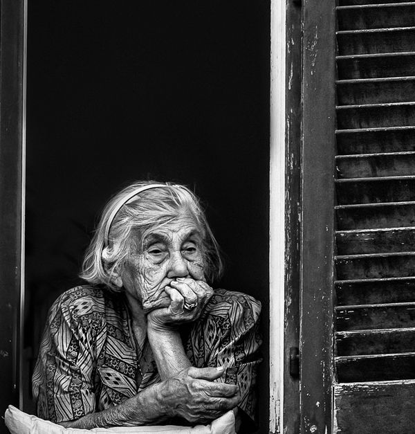
drrj90 has graciously volunteered the WPC 1352 - Photographer's Choice entry for critique and analysis to find out what they could have done to make it better. Be nice, but be honest as this will help everyone with their craft. Thank you drrj90 and thank you everyone!
from WPC 1352 - Photographer's Choice RESULTS http://www.uglyhedgehog.com/photo_contest_ratings.jsp?pcnum=96
from WPC 1352 - Photographer's Choice RESULTS http://www.uglyhedgehog.com/photo_contest_ratings.jsp?pcnum=96
Just Thinking
Jan 4, 2014 00:57:59 #

Two things: I don't think the shutter on the right adds to this image-- and I think it's pretty good. I would have ranked this one with several others--- but I missed it. So as a consolation: Often it's not what YOUR photo was lacking but the quality of the others. There's also no defined criteria for those voting....
Jan 4, 2014 01:02:05 #
LoneRangeFinder wrote:
... There's also no defined criteria for those voting....
What would you have more than:
From http://www.uglyhedgehog.com/t-174303-1.html
*Sample Judging Guidelines for the Weekly Photo Challenges.
1. Is the Photo Technically Correct? (20%)
- Is it the best it can be? Look at the focus, sharpness, detail, depth of field, color, brightness, contrast, saturation, usage of light, etc.
2. Subject Matter / Content (20%)
- Is it creative and live within the WPC Theme?
3. Composition (20%)
- Does it tell a story? Where is your eye lead? Is the photograph balanced, if not, is it creating the visual impact it should?
4. Do you like this photograph? (All Else Aside) (40%)
- Like all art this is dependent on our own tastes, likes, dislikes and the way we see the world and experience it. Do you like it?
TOTAL = (100%)
*12 Elements of a Merit Image http://www.ppa.com/competitions/content.cfm?ItemNumber=1792
Jan 4, 2014 01:05:19 #
St3v3M wrote:
What would you have more than: br br From http://... (show quote)
Steve: there's nothing more you can do. Perhaps, I "misspoke"-- and it would be more accurate to say, submissions/voters don't follow the criteria. I share your frustration-- and please don't take this as criticism directed at you. But obviously this is a popular corner of UHH-- so, hey, what do I know? ;-)
Jan 4, 2014 01:19:22 #
LoneRangeFinder wrote:
Steve: there's nothing more you can do. Perhaps, I "misspoke"-- and it would be more accurate to say, submissions/voters don't follow the criteria. I share your frustration-- and please don't take this as criticism directed at you. But obviously this is a popular corner of UHH-- so, hey, what do I know? ;-)
I am always looking for ways to make it better. Thank you. Steve
Jan 4, 2014 01:24:05 #
St3v3M wrote:
I am always looking for ways to make it better. Thank you. Steve
I know you are-- and given the circumstances I think you do a fine job.
Jan 4, 2014 03:10:44 #
Jan 4, 2014 04:58:28 #

I disagree with the first comment. The shudder must be included, as it helps to define 'the window of my life'. Without the shudder the window is just another frame. JMHO.
Jan 4, 2014 06:08:24 #
St3v3M wrote:
drrj90 has graciously volunteered the WPC 1352 - Photographer's Choice entry for critique and analysis to find out what they could have done to make it better. Be nice, but be honest as this will help everyone with their craft. Thank you drrj90 and thank you everyone!
from WPC 1352 - Photographer's Choice RESULTS http://www.uglyhedgehog.com/photo_contest_ratings.jsp?pcnum=96
from WPC 1352 - Photographer's Choice RESULTS http://www.uglyhedgehog.com/photo_contest_ratings.jsp?pcnum=96
I like the shot. I like the sharpness and detail and the "mood" of it. I think the shutter on the right IS needed to set the scene (looking out a window and thinking) but I would have cropped some off the top (too much black space IMHO) and my eye keeps wandering up there looking for something. Just my opinion.
Jan 4, 2014 07:34:00 #

The picture reminds me of something Dorthea Lange did and the shutter is necessary. I like the unconventional framing with the large black space and putting the subject near the corner.
My big issue with the picture is the exaggerated contrast and sharpness. Neither looks real. I like the strong blacks and whites but I would like to see more mid-tones and less sharpness.
My big issue with the picture is the exaggerated contrast and sharpness. Neither looks real. I like the strong blacks and whites but I would like to see more mid-tones and less sharpness.
Jan 4, 2014 08:10:34 #

If its a portrait crop the shutter and some of the top and bottom,. If its a story its good as it is; the shutter adds to the story.
Jan 4, 2014 08:22:14 #

abc1234 wrote:
The picture reminds me of something Dorthea Lange did and the shutter is necessary. I like the unconventional framing with the large black space and putting the subject near the corner.
My big issue with the picture is the exaggerated contrast and sharpness. Neither looks real. I like the strong blacks and whites but I would like to see more mid-tones and less sharpness.
My big issue with the picture is the exaggerated contrast and sharpness. Neither looks real. I like the strong blacks and whites but I would like to see more mid-tones and less sharpness.
I agree with this critique in every way. I did stop and examine this image for quite some time as I was reviewing the entries. So, it was a contender to my eye. Thanks for submitting this.
Jan 4, 2014 08:39:25 #

Shutter absolutely necessary...maybe a litttttle off the top,but pretty much perfect!!
Jan 4, 2014 09:55:43 #
My personal opinion is that there is a little too much dark space at the top, otherwise I find it to be an attention-grabbing photograph - it tells a story. The problem with this competition is that there were so many great entries to choose from.
Jan 4, 2014 10:40:47 #

I'm looking first at what the image says. It's interesting that there's a pillow under her elbows. That indicates that she spends a lot of time looking out from what is perhaps the darkness of her life to the light of the outdoors. I think the sharpness is a little harsh. I'd like to see her treated a bit more gently. I wouldn't remove anything, just treat her more softly.
If you want to reply, then register here. Registration is free and your account is created instantly, so you can post right away.