Posts for: cgoforth
Dec 8, 2011 17:42:29 #
Heres another one I found that I shot earlier this fall. This is of the public library in Fayetteville, AR.
Its a little tilted but I still like it.
Its a little tilted but I still like it.
Dec 8, 2011 12:19:06 #
arphot wrote:
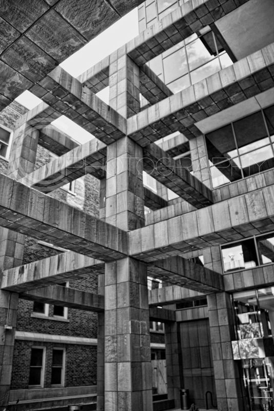
Kind of Escher-esque
http://www.mcescher.com/Gallery/back-bmp/LW389.jpg
Jay Pat wrote:
I had to study #4. Wanted to make sure that wasn't one of those trick photography illusion images. Pat
Kind of Escher-esque
http://www.mcescher.com/Gallery/back-bmp/LW389.jpg
This is the exact image I thought of when I saw those cross beams in #4. And thank you for the suggestion on the digital watermarking, I will look into that.
TO EVERYONE ELSE: Awesome pictures, everybody...lovin it. Giving me ideas for things I want to shoot.
Dec 7, 2011 22:40:18 #
joec wrote:
Here's my contribution:
Joe
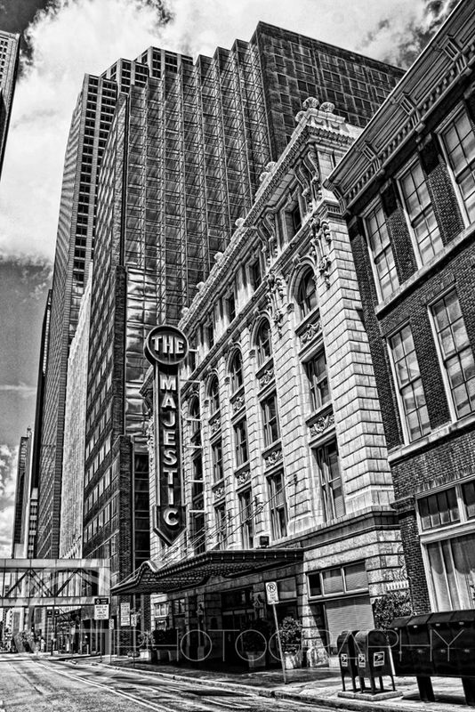
cgoforth wrote:
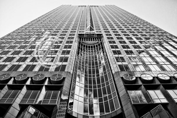
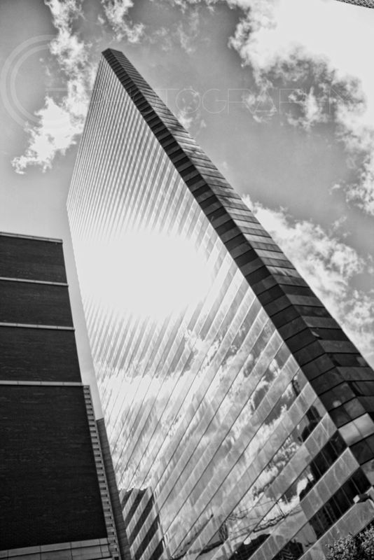
I really enjoy taking architecture pictures and would love to see what some of you have done as well. Here are a few of mine from a recent trip to Dallas. Hope you like them and cc is welcome.
Here's my contribution:
Joe
Very cool shot, Joe...I have actually stayed at that hotel :)
Dec 7, 2011 20:42:56 #
glen123 wrote:
I like all of your photos very much, but I am not an expert . Here are a couple that I took. The second one is in Barcelona, it's the other Majestic
The NYC picture is awesome...epic even. I would hang it on my wall
Dec 7, 2011 20:32:43 #
carlysue wrote:
especially like the perspective of #3 & #4. When do you photograph so that there are no people about?
These were taken early on a saturday morning...I think around 9am. Downtown Dallas is dead on Saturday mornings...
Dec 7, 2011 20:27:28 #
joec wrote:
Would you mind identifying the buildings (other than the Majestic, which is obvious)? I'm just 2.5 hours from there and wouldn't mind trying my hand at them.
Thanks,
Joe
cgoforth wrote:
I really enjoy taking architecture pictures and would love to see what some of you have done as well. Here are a few of mine from a recent trip to Dallas. Hope you like them and cc is welcome.
Would you mind identifying the buildings (other than the Majestic, which is obvious)? I'm just 2.5 hours from there and wouldn't mind trying my hand at them.
Thanks,
Joe
Joe,
I honestly don't remember the names of the buildings but they were all within walking distance of the art museum in downtown Dallas in the Architecture District.
Good luck and be sure to post them here if you get over there to shoot!
Dec 6, 2011 17:08:02 #
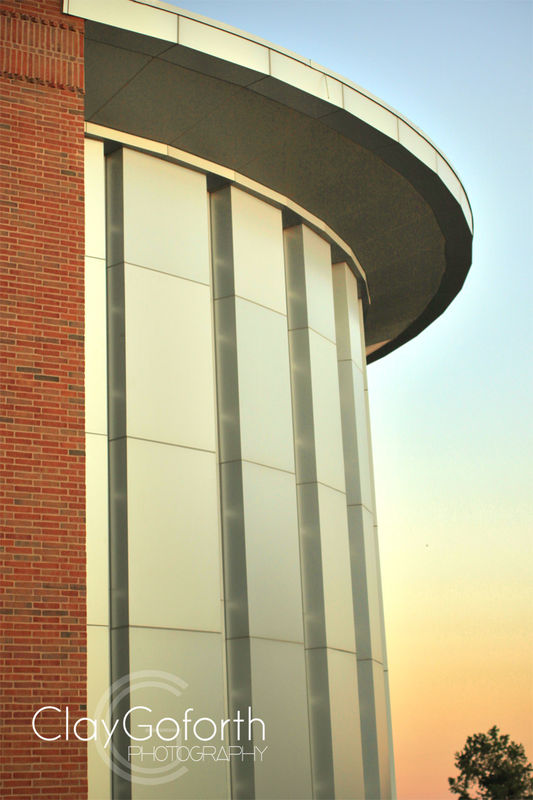
Jay Pat wrote:
Untrained eye here....
I like all of them.
I had to study #4. Wanted to make sure that wasn't one of those trick photography illusion images.
Consistent processing.
If a watermark is needed, yours is low key.
Pat
I like all of them.
I had to study #4. Wanted to make sure that wasn't one of those trick photography illusion images.
Consistent processing.
If a watermark is needed, yours is low key.
Pat
Thanks Jay Pat...
When I saw the architecture of the building in #4 I immediately thought of Escher so you telling me you had to study it means that I accomplished what I had intended.
I go around and around about the watermark thing...I am currently preparing to launch a website and, although I know people can edit the watermarks out, I do want to make it as difficult for people as possible...that way they at least have to work a little to rip me off :)
Dec 6, 2011 16:15:46 #
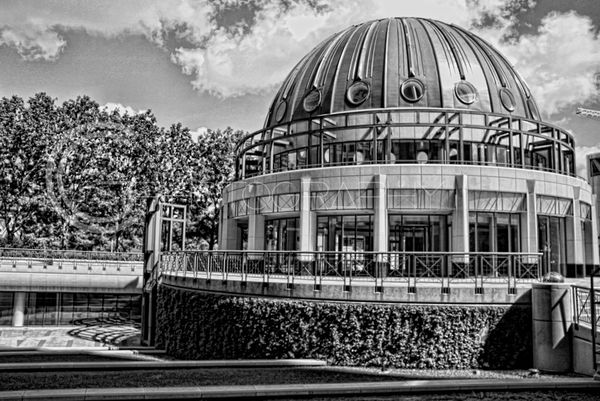
I am aware that the dome picture is not level so no need to cc about that.
Dec 6, 2011 16:01:46 #
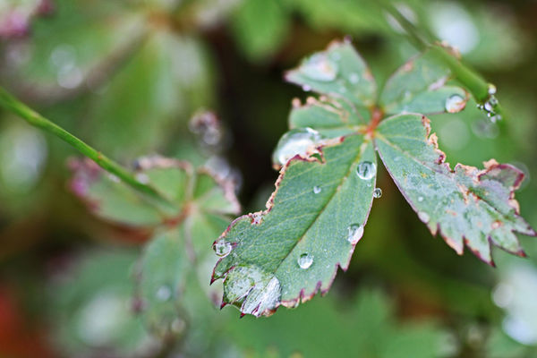
tad1937 wrote:
Still working at it
Macro work is difficult...this is great for an early attempt. Someone later in the thread mentioned using a flash, which I have found to be very helpful, especially when no tripod is available. I am not trying to hijack, just wanted to give an example of a macro shot with a flash not shot on a tripod.
This is out of the camera with no mods other than image size to get it to upload.
Dec 6, 2011 15:18:16 #
I really enjoy taking architecture pictures and would love to see what some of you have done as well. Here are a few of mine from a recent trip to Dallas. Hope you like them and cc is welcome.
Dec 6, 2011 14:59:56 #
Great examle of high key photography style, one that I love the look of. Really nice soft look.
If there was one thing to change, I would reduce the reaches of the vignette off of the subject a little. I think the vignette gives it too much of one of those "old timey photo booth" pictures. I totally understand personal taste though. Just my 2 cents.
Great look!
If there was one thing to change, I would reduce the reaches of the vignette off of the subject a little. I think the vignette gives it too much of one of those "old timey photo booth" pictures. I totally understand personal taste though. Just my 2 cents.
Great look!
Dec 3, 2011 09:16:31 #
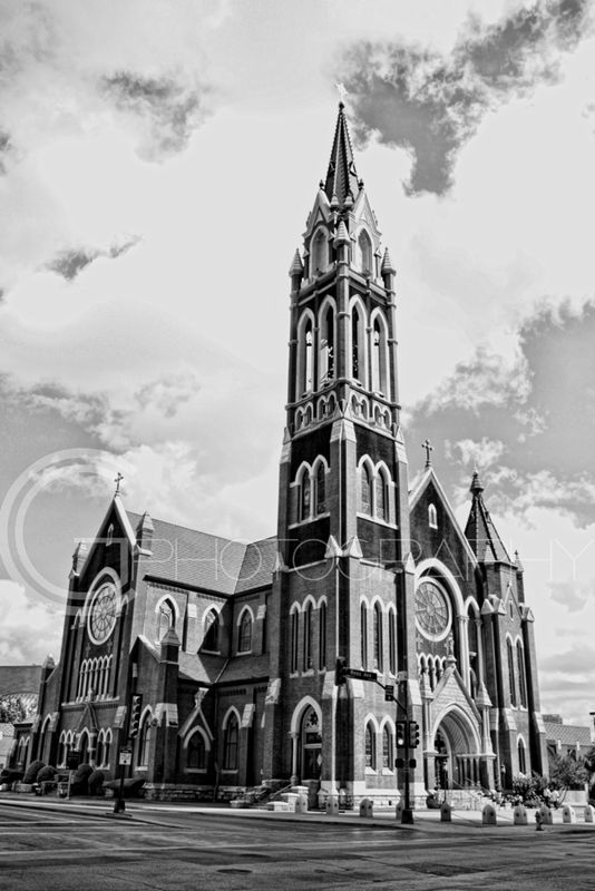
ianhargraves1066 wrote:
Think they all great, nice contrast and tones.
Where are you in NW Arkansas. I have a mountain retreat in Holiday Island and its my favorite place in America. Close (5 miles away) to Eureka Springs.
Ian
cgoforth wrote:
Thought I would share some black and white pictures I recently edited for your enjoyment...feedback is always ALWAYS welcome...unless it is wrong :)
Think they all great, nice contrast and tones.
Where are you in NW Arkansas. I have a mountain retreat in Holiday Island and its my favorite place in America. Close (5 miles away) to Eureka Springs.
Ian
Thanks Ian. I am down around Fayetteville, about 45 minutes from Holiday Island. That is a beautiful area. My wife and I like to go to eureka and eat at the local flavor cafe.
Dec 2, 2011 19:34:35 #
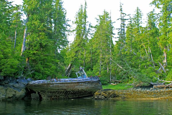
Bruce H wrote:
Where exactly is this boat?
Whale Channel, southern region of the queen Charlotte islands off the coast of British Columbia.
Dec 2, 2011 17:19:54 #
My 20 month old at our downtown square Christmas lighting last night...
I love the "wonder" in her eyes...
I love the "wonder" in her eyes...

Dec 2, 2011 16:36:54 #
sinatraman wrote:
actually there are only a minority of purists on h... (show quote)
I agree with you that garbage still smells bad no matter how pretty the trash can...I wasn't meaning that in my rant. I differ from you (and most I have come to realize) on the rule that black and white photos should have limited gray. Gray tones are used to suggest something that is not absolute black or absolute white, correct? How often in nature, or anywhere for that matter, do you find absolutely blacks and whites? Not often. Things are more often shades and tones of colors, or when in black and white, are gray. That is why I leave a lot of the gray tones in black and white pictures.
Anyway, someone up there requested the shipwreck image in color, as shot, so I attached it here. Lets hear it...