Posts for: Heirloom Tomato
Apr 26, 2014 16:51:38 #
So, the hippies are in Florida. I wondered where they went. Looks like a lot of fun!
Apr 26, 2014 16:44:08 #
Apr 26, 2014 16:41:32 #
Apr 26, 2014 16:19:43 #
Just Fred wrote:
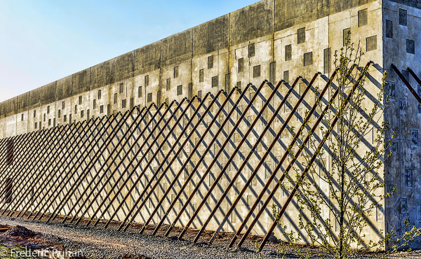
Permission hereby granted to edit and re-post. Thanks!
Thanks! I don't know what you were aiming for, but I tried some different modes in Topaz Adjust and found that I liked the ones that emphasized some color in the building to balance the lattice look. If this misses the mark, give me some guidelines and I'll try again.
Apr 26, 2014 16:12:04 #
Sometimes I wish my cat would turn into one of these cute little puppy dogs! Adorable!
Apr 26, 2014 14:03:35 #
Apr 26, 2014 14:01:53 #
Apr 26, 2014 11:54:52 #
I can certainly see why this scene attracted you. I think it would work better if there was more color in the building, it looks washed out. If the top edge of the building were darker it would help balance the construction and the shadows. May I post an edit so you can see one possible way it would look?
Apr 26, 2014 11:39:31 #
Apr 26, 2014 11:38:28 #
Great captions! I'm glad someone knows what they are thinking.
Apr 26, 2014 11:34:11 #
Apr 26, 2014 11:27:39 #
Apr 26, 2014 11:27:19 #
Linda From Maine wrote:
How pretty!
People give me cute stuff! Thanks, Linda!
Apr 26, 2014 11:26:51 #
halman wrote:
Nice one, Tomato! What size is it?
h2
:thumbup:
h2
:thumbup:
Thanks, h2. The crab is about five inches wide and the shell box a little bigger.
Apr 26, 2014 11:25:59 #