Posts for: tilde531
Nov 24, 2021 09:15:29 #
gessman wrote:
And rightfully so - you should not believe it's be... (show quote)

___________
 LOL
LOL Oh my goodness...you're right! Thank you for setting me straight on 10 years. (Ugh...Life has really taken its toll on my brain).
You can't know how happy it makes me to read your reply, in particular! I have missed your wonderful wit and intellectual banter.
It will be nice to poke around and see if there is anyone else from "the good ol' days" still among the membership...but yes, I do understand ...it has changed so much and not for the lighter/better/more fun of it.
Happy Thanksgiving to you as well!
(If you're inclined to play catsup....ummm....no...that's "catch up"
 my email address is the same tilde531@gmail.com . I'd love that. )
Nov 24, 2021 06:52:51 #
chancler682 wrote:
Nice shots
Chancler,
Your reply to this triggered an email (because this is on a list of "watched topics")...and I want to thank you for that!
I can't believe it's been TWENTY YEARS since this was posted and since I was active with a semblance of eagerness.
Revisiting this post thread, photos and recognised people/usernames has been bittersweet ...and wonderful. 🥰
Apr 12, 2018 14:38:23 #
tilde531 wrote:
Thanks.
Although I wasn't looking for critique (maybe I shared it in the wrong forum?).
It is cropped this way because he wanted a print and I left sacrificial cropping space.
Part of doing this professionally, is knowing the rules and knowing when breaking them, works.
For my purposes, this works.
T~
Although I wasn't looking for critique (maybe I shared it in the wrong forum?).
It is cropped this way because he wanted a print and I left sacrificial cropping space.
Part of doing this professionally, is knowing the rules and knowing when breaking them, works.
For my purposes, this works.
T~
P.S.
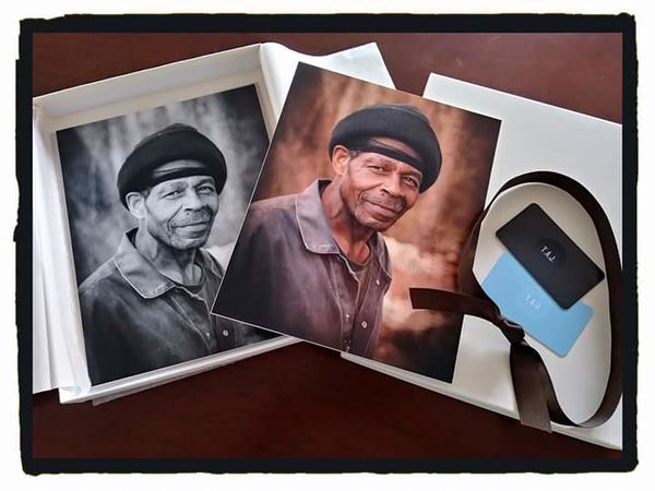
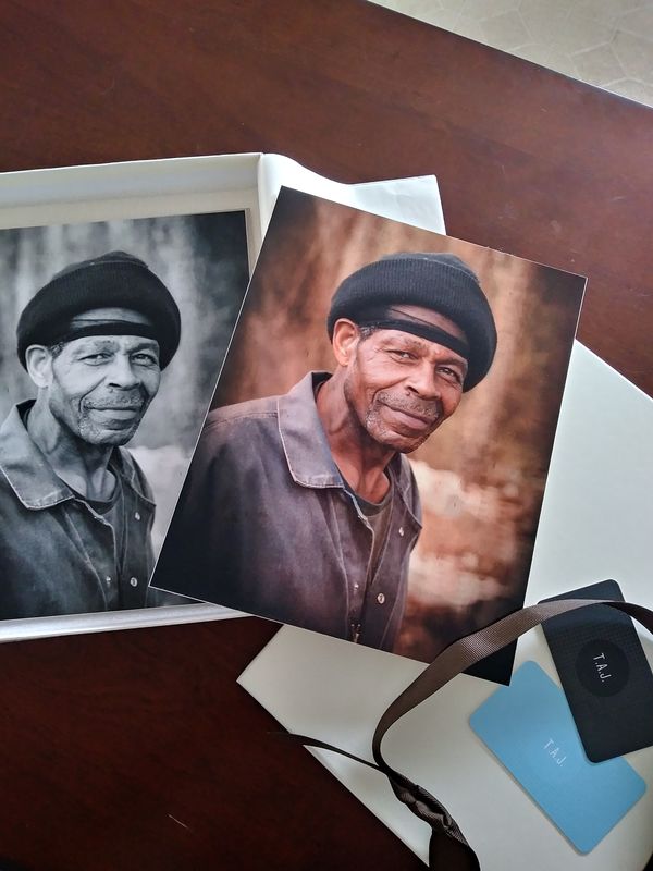
Here is a crap cell snap of the actual prints he ordered. As you can see, he ordered 8x10's...and the crop is correct. I use a crop sensor, archaic beastie (50D) and have to account for the finished product dimensions when cropping in camera.
Apr 12, 2018 13:35:35 #
Apr 12, 2018 13:34:59 #
jonsommer wrote:
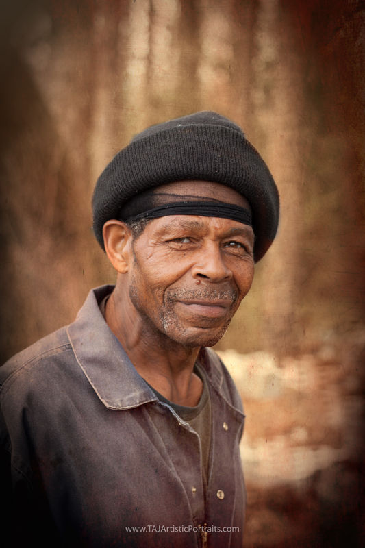
Very well done portrait, interesting background, nice color pallett, good emotion. What I don’t like is your cropping, too much empty space above his head, and again, his head is centered in the photo with empty space on his right side that adds nothing to the portrait. If you applied some ‘rule of thirds’ ideas/concepts to your cropping I think you would have an even better and more dynamic portrait.
Thanks.
Although I wasn't looking for critique (maybe I shared it in the wrong forum?).
It is cropped this way because he wanted a print and I left sacrificial cropping space.
Part of doing this professionally, is knowing the rules and knowing when breaking them, works.
For my purposes, this works.
T~
Apr 9, 2018 18:41:13 #
 thanks! He was rather suprised by it, too. I love when that happens.
 I gifted him a print for pausing to let me take his portrait...expecting to be gifting him a b&w version...which is my specialty.
But when I saw this...I knew I'd HAVE to give him a choice.
He chose this version...and I kept the b&w one (although this one is mt personal fave as well ;))
Apr 9, 2018 12:24:57 #
Apr 9, 2018 07:21:04 #
I can see it in his eyes
(As many in this series are: this is an impromptu 5-minutes, tops, outdoor portrait "just because".
I used an archaic beastie Canon EOS 50D, Ambient available light, 50mm prime @f2.8 processing in LR and Topaz. It is a mobile upload so there may be some compression...but does anyone really care? 😊)
He loved it and it landed me a wedding his boss saw it.
Feb 1, 2018 20:14:50 #
Feb 1, 2018 20:13:50 #
Maybe not the super moon shots you were hoping for...but these shots are "super", nonetheless!
Feb 1, 2018 16:16:32 #
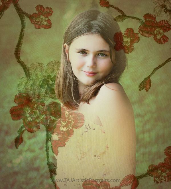
photophile wrote:
I like the double exposure most.
Thanks! I'm rediscovering how much fun they can be.
All 3 portraits are actually double exposure ...I can't decide which is my favorite.
Feb 1, 2018 16:14:38 #
rlaugh wrote:
Excellent work my friend!!
😊 Thank you.
Feb 1, 2018 14:40:01 #
Dr.Nikon wrote:
Quality work ...a pleasure to view ...
Thanks! 😊
Feb 1, 2018 13:55:09 #
New Year; New work
Edgy Emily: Remix
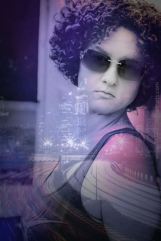
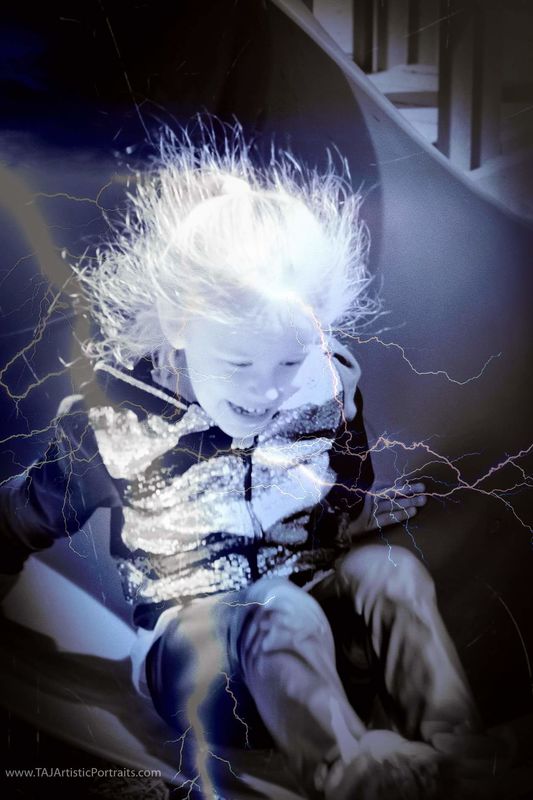
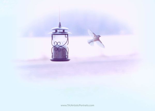
Experimenting with double exposure...which is making a comeback, apparently!
Creative manipulation of recent action at the backyard feeder
Feb 1, 2018 11:34:53 #
Love it!
We have a plethora of cardinals around here...they must think Spring is around the corner.
I hope they're right!
We have a plethora of cardinals around here...they must think Spring is around the corner.
I hope they're right!