Posts for: Ozychatie
Jan 16, 2024 22:48:58 #
JohnSwanda wrote:
We don't know how many people who answered "both" meant always RAW+JPEG and how many meant sometimes one and sometimes the other, depending on the subject and intended use. I think there may be a lot of the latter.
Jan 16, 2024 17:42:38 #
Aug 31, 2023 09:20:47 #
Well thanks everyone. Interesting that different folk are seeing different colours/casts. I guess this can be attributed to many variables - monitors, eyes, perceptions etc.
Aug 31, 2023 03:30:14 #
Hi everyone,
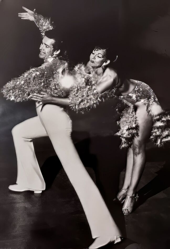
Thanks for the responses. The top image was on my ex dance coach's (real life friend) Facebook page. With his approval I saved the image of him to my HP laptop.
There was no scanning involved on my part and it was already in black and white.
My guess, from reading your responses, is that it is probably my laptop's monitor. However I am surprised that Photoshop picked up a red cast. Incidently I don't use Photoshop.
Aug 30, 2023 10:01:34 #
Hi All,
This sounds like a contradiction in terms but I recently attempted to refine a rather dull and grainy black and white image. The original image was little more than a thumbnail and scanned from an old print off 35mm film.
Overall I'm quite happy with the result however, to my eye anyway there seems to be a bit of a blue cast in the digital image and I can't seem to get rid of it. It is most noticeable in the white part of the image.
I've attached a copy so maybe you UHHs can offer some advice.
Bluish cast
May 9, 2023 07:17:32 #
Whilst visiting Ireland I couldn't help noticing the Irish love of "Kill." Killarney, Kilkenny, Kildare, Kilpatrick and so on.
According to Tourism Ireland there are two meanings for this:
Kil/Kill: There are two meanings to this. One is from the word ‘coill’ meaning woodland, while the other is from ‘cill’, which means church.
According to Tourism Ireland there are two meanings for this:
Kil/Kill: There are two meanings to this. One is from the word ‘coill’ meaning woodland, while the other is from ‘cill’, which means church.
Nov 1, 2022 23:32:01 #
Hi CHG_CANON
Thank you too for your helpful reply too. Both you and R1ch one seem to be, for the most part on the same path.
As I said to R1ch, I will explore some of my other software for raw processing given the limitations of the version of ACR packaged with PSE.
I realise too, that a great deal of PP skill development is practice, practice and practice. Looking back at some of my very early attempts I can see now how much better I could do them even with my existing skill level. No doubt in the future I will see the same again with my current crop of edits.
One think that has struck me from these conversations is that I should, perhaps greatly enlarge and "pixel peep" my own images when editing them.
Every bodies input has been appreciated. I will be referring back to this thread for some time to come.
Cheers
John
Nov 1, 2022 23:20:31 #
Hi r1ch,
Sorry for my late response but I've had a lot on my plate.
Thank you for your comprehensive reply. I'm more than happy to let folks pixel peep as long as the feedback is constructive which I really appreciate.
I actually "own" several editors but I have found I stick with PSE because I am most familiar with it and so more comfortable using it. I use the Topaz suite as plug ins.
The biggest problem with PSE is that that Adobe has provided a cut down version of ACR. There is no option for using layers or masks within the ACR raw editor so I will be exploring the other software I have as you have suggested.
The image I uploaded was shot on a Sony DSC HX99 1 2/3 sensor so I was probably pushing the bounds somewhat. Nonetheless, I want to get the very best I can out of what I have.
Cheers
John
Oct 19, 2022 06:47:17 #
CHG_CANON wrote:
It's easier if you use the <quote reply> button for directed responses. Have you considered attaching your example image, as requested in one of the initial replies?
Hi CHG-CANON,
Did that file show up? Okay so here is the edited image again as you requested. Do you want the un-edited image as well?
A couple of things have disappointed me since this thread began:
People taking or giving offence because opinions differ. Let's respect one another and allow the OP or other readers to draw what they want from the replies and
To a lesser extent, the way the thread has drifted off topic.
Oct 18, 2022 09:09:04 #
Ozychatie wrote:
Hi CHG_CANON, Yes I did upload an example of the original, unedited image but I'm guessing I didn't do it right if it hasn't shown up. Do I re attach it? I had to re-size it to fit as it was so there is no way the RAW file will fit.
Whoops! Did you want the dited image as shown on page 1 or the unedited image?
Oct 18, 2022 09:06:43 #
CHG_CANON wrote:
It's easier if you use the <quote reply> button for directed responses. Have you considered attaching your example image, as requested in one of the initial replies?
Hi CHG_CANON, Yes I did upload an example of the original, unedited image but I'm guessing I didn't do it right if it hasn't shown up. Do I re attach it? I had to re-size it to fit as it was so there is no way the RAW file will fit.
Oct 18, 2022 08:32:21 #
CHG_CANON,
This is also invaluable advice - thank you.
This is also invaluable advice - thank you.
Oct 18, 2022 08:30:46 #
r1ch
Thanks this is great stuff. I've got a bit of a learning curve but I think you've put me on the right start grid.
Thanks this is great stuff. I've got a bit of a learning curve but I think you've put me on the right start grid.
Oct 18, 2022 08:16:12 #
Hello to all and thank you for all your replies. I'm noting it all down and will be trying out your suggestions/recommendations.
I knew this was a great forum with a wealth of experienced and knowledgeable participants - thank you.
I knew this was a great forum with a wealth of experienced and knowledgeable participants - thank you.
Oct 16, 2022 06:46:56 #
Hi everyone,
I guess ,and I'm sorry for this, my mind wasn't clear what exactly I was trying to ask. I don't know if it helps to say I find there appears to be many different ways of getting a particular result.
Is it better to use "Levels adjustments or Shadows and Highlight adjustments and apply them directly or in a layer?
Further I find the number of layer options overwhelming suggesting a good understanding of the different layer types is needed to use them well. For instance, what is the difference between Layer from background, Layer copy and Duplicate Layer when creating a layer from the original file? In Elements' Layer menu there are about 40 different choices admittedly not all are available at once and many are clearly not for adjustments.
regards
John