Posts for: nanaval
Sep 25, 2014 17:09:47 #
Ronbo wrote:
I really like this image. Not sure why but it's soothing. ell done.
Thank you Ronbo Glad you like it, thanks for commenting...
Sep 25, 2014 17:08:28 #
ebrunner wrote:
The green really works. This is quite creative and I really like it. Very good work.
Thank you ebrunner for your nice comment...
Sep 25, 2014 17:07:18 #
Dixiegirl wrote:
Oh yes! It definitely deserved a win! Val, this is so beautiful, and you've already figured out a way to work some variations with this program. This is stunning, and the soft look is my cuppa tea.
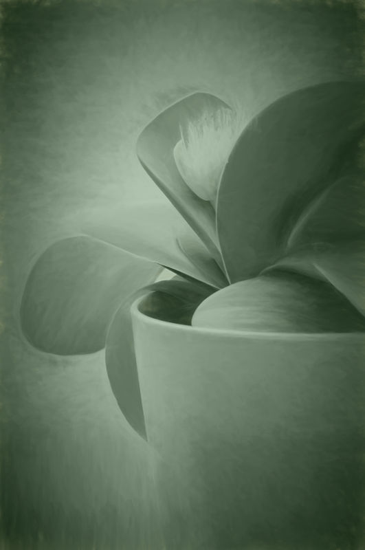
Thank you very much Donna, It did not get anywhere, there were a lot of good pictures and it is what the club members vote for. I myself am very pleased with the way it turned out so I am happy and there have been great comments about it. As it was in a pinkish pot and the flower was white and yellow I thought the green overlay as you say gave it the softer look. Think this one will go on my wall.... :D :D
Sep 25, 2014 17:01:29 #
veralisa296 wrote:
Lovely! It has an abstract feel to it which is very appealing.
Thank you veralisa296 for your nice comment.
Sep 25, 2014 17:00:11 #
rlaugh wrote:
Beauty,beauty,beauty!!!...good work!
Thank you very much Bob, I must admit I like this one myself. :D :D
Sep 24, 2014 13:07:09 #
pgl wrote:
Worked nicely. :)
Thank you pgl for the comment and for looking....
Sep 24, 2014 12:06:09 #
Linda From Maine wrote:
Compelling image; I like it a lot!
Thank you Linda Always appreciate your comments, I think I will get this one printed larger and hang it on my wall as I really like it. :D
Sep 24, 2014 12:03:47 #
SonyA580 wrote:
Very interesting effect! By varying the contrast you can get several different pictures out of one.
Thanks SonyA580 for looking and commenting., I did try altering the contrast and found I liked this one the best.
Sep 24, 2014 09:29:26 #
I did this with one of the sketch work 2 I think it was and then in PS I added a layer of green and took down the opacity as I thought it gave a nice overall colour wash look to it...
Sep 24, 2014 08:41:22 #
GTinSoCal wrote:
I'm going to head out for some night shots tomorrow, Tuesday, September 23rd (okay, technically later today...)
to EITHER
Red Rock OR Trona Pinnacles,
if anyone would like to join me I can guarantee a thermos of hot chocolate and a dark night :-)
GT
to EITHER
Red Rock OR Trona Pinnacles,
if anyone would like to join me I can guarantee a thermos of hot chocolate and a dark night :-)
GT
Good shot, I too would love to join you but live in the Uk... :( PS like hot chocolate too....
Sep 24, 2014 08:35:17 #
Ronbo wrote:
Really starting to like topaz impression. This so so shot was saved by impression, I think.
HI Ronbo Impressed with your impression pictures. I look at the second one you posted. Thought the first was great but I love the second. Turned a simple picture into something great. I really like trying this plug in out.. :thumbup: :thumbup:
Sep 23, 2014 18:39:30 #
FramerMCB wrote:
I like all of the Topaz modified ones...but in my opinion, I definitely prefer picture labelled "#1" the best. Looks like a very fun program.
Thanks FramerMCB for looking, I think no 1 is my favorite one too. It is nice seeing all the different ways to alter a picture. Worth playing with...
Sep 23, 2014 16:56:30 #
RichieC wrote:
I snoped it and it isn't true... they were just pretending to be french.
Ah so thats why they sounded funny.. :D
Sep 23, 2014 16:56:01 #
richosob wrote:
That's a great way to start the day.
Makes for a laugh.. :lol: :lol:
Sep 23, 2014 16:55:20 #
dljen wrote:
Funny! I didn't anticipate that, thanks for sharing. :D
:thumbup: