Posts for: R.G.
Apr 14, 2016 14:04:13 #
This might be old hat to some, but I've just found out how to shrink a file as a DNG export in Lightroom.
My merge of bracketed shots was producing DNG files of 83MB or thereabouts and I needed something smaller (for uploading to UHH for fellow Hoggers to edit). Using lossy compression didn't seem to be working on the merged file (size stayed at 83MB), and previously my answer was to export as jpg, but to avoid the resulting loss of quality I wanted to keep the export as a DNG and shrink it down to something more uploadable.
In the Image Sizing section of the exporter in Lightroom I checked the Resize to Fit box and after experimenting I specified a value of 2300 pixels for the long edge. The resulting file size was 19.5MB - perfect for uploading to UHH.
This might seem obvious to some but it wasn't immediately obvious to me, and it'll be a common problem due to the widespread use of upload limits.
Apr 14, 2016 13:39:21 #
Apr 14, 2016 13:34:57 #
TheeGambler wrote:
I agree with what R.G. has said........
Yes, he does look terrible in shorts, doesn't he :lol: .
Apr 14, 2016 13:18:16 #
Corolyn wrote:
NO I have too many and not enough time or tools with which to do them! :lol:
Better that than having the muses desert you....
Apr 14, 2016 13:14:43 #
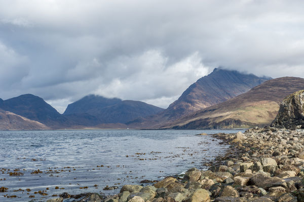
This is a merge of bracketed shots of Loch Scavaig with the Cuillins in the background. Feel free to edit to your liking. There is a link to a DNG version under the JPG.
-
-
Apr 14, 2016 13:09:33 #
Frank2013 wrote:
I agree R.G. I was wondering if you had any different perspectives to show off just the gable, possibly lower with sky behind. I have no clue, but with what the background looks like, that's all I could think of. It's actually a lovely landscape shot. I'm sure you looked it over well.
When I saw this with the naked eye I didn't foresee the problem because the gable was easily distinguishable. I deliberately avoided having the gable partly backdropped by the shore and partly by the sky. I wanted a consistent background for it, and to get the shot as shown I ended up perching precariously on a steep slippery slope. It might be worth pushing the PP a bit more because I have a natural restraint that needs to be shelved sometimes.
Apr 14, 2016 13:04:09 #
Corolyn wrote:
There are so many potentially great photos. I just can't choose which ones! :lol:
It sounds like you're not in danger of running out of ideas :thumbup: .
Apr 14, 2016 12:57:19 #
Frank2013 wrote:
Love the processing you have going on with these R.G. It's a splendid shot. For me the gable is just lost in the back ground.
Thank you Frank. I think the problem is the gable's too similar to the background, and anything that I did to differentiate it would make it look unnatural.
Apr 14, 2016 12:29:26 #
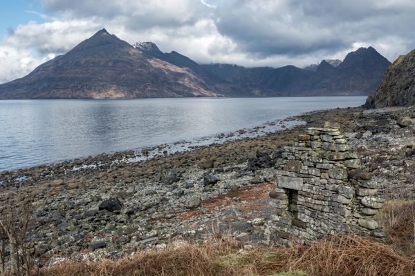
In my quest for foreground elements I came across this gable end.
-
-
Apr 14, 2016 12:26:32 #
Apr 14, 2016 12:07:15 #
jenny wrote:
It's nice to enjoy a beautiful picture R.G. that doesn't need re-making, and I learned after looking up the history that that "Eilean" is not merely a given name but means "island". Hm, never too old to learn, huh?
Thank you Jenny. A lot of Scottish place names are Anglicised versions of Gaelic names, but occasionally the original Gaelic survives intact. There are still places in the Hebrides where Gaelic is learned first, then English.
Apr 14, 2016 12:03:44 #
I think the patterns need something to make them more noticeable. And Nightski's suggestion for the leaf shape sounds like a good idea.
Apr 14, 2016 11:57:37 #
Apr 14, 2016 11:37:17 #
Billyspad wrote:
......insult me and be prepared to take a verbal battering.......
OK. You look terrible in shorts :lol: .
Now about the picture...... It's an interesting effect, but the tint is a bit on the pink side. That might suit some subjects, but only some, and I'd say it's not the best for this particular subject. It would probably be OK if you were after a faded antique look though. But having said that, I don't think "faded antique" and motorbikes are compatible. If you can get the tint and the subject to line up better you'd be on to a winner.
Apr 14, 2016 11:28:16 #
Rathyatra wrote:
Another great capture.
Thank you Rathyatra, and thanks for looking.