Posts for: R.G.
Jul 28, 2016 04:20:08 #
I think this type of still life is reminiscent of the more abstract lyrics of Bob Dylan and others. It can be frustrating trying to make sense of lyrics like that until you realise that the purpose of the lyrics is to evoke mental imagery and the feelings associated with the mental imagery. With a still life such as this we already have the imagery, so it comes down to the feelings that the still life evokes, and the viewer is also left to speculate about the history and possible connections between the placed objects.
In your previous still life stuff you used a deeper box, which gave the option of giving much-needed depth to the arrangement of the bits and pieces. This box is shallower, which results in a more restrictive environment for the still life. The only option seems to be to line up the items along the back of the box. I think depth is an essential ingredient in this type of still life, and this composition is diminished because of the lack of depth. Diminished but not ineffective, because it still has the ability to be evocative, but visually less engaging.
In your previous still life stuff you used a deeper box, which gave the option of giving much-needed depth to the arrangement of the bits and pieces. This box is shallower, which results in a more restrictive environment for the still life. The only option seems to be to line up the items along the back of the box. I think depth is an essential ingredient in this type of still life, and this composition is diminished because of the lack of depth. Diminished but not ineffective, because it still has the ability to be evocative, but visually less engaging.
Jul 26, 2016 16:26:08 #
mcveed wrote:
Grimsey Island, Iceland.
A good, detailed shot of almost the whole family, and I'm left wondering how you managed to get it, since cliff faces are the usual nesting place. I'm also surprised that the parent wasn't being more defensive. Most gulls get aggressive when they have chicks on the nest.
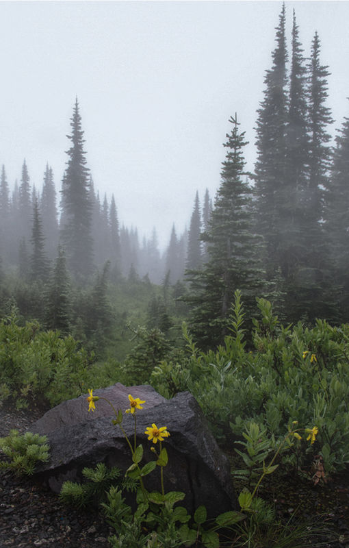
Jul 26, 2016 16:09:28 #
You definitely achieved your objective with the receding treetops and visibility diminishing with distance. I was curious to see what could enhance the sense of depth and tried various things. One of them was the transform tool, and it probably would have worked better if the vanishing point had been closer to the centre of the frame, but I decided to include it in the mix anyway (using the Vertical slider to raise the viewpoint). I know you said no cropping, but the transform tool makes it difficult to stick to the original framing (I did my best  ).
).
I also used a radial filter plus some additional brush work to keep the vanishing point soft and bright and low on contrast/clarity while giving the shot an overall reduction in brightness and an overall increase in contrast/clarity - the purpose being to keep the distance misty while de-hazing the foreground, and using distant brightness to draw the eye in to the mist. I also used the WB and Tint sliders to introduce an overall blue (and slightly green) tint, and used split toning to add more blue to the brightest bits (i.e. the mist). I might have overdone the cold, wet look, but switching back and fore between my edit and the original, I decided I preferred the edit.
I hope there's something there to give you ideas to try .
-
).I also used a radial filter plus some additional brush work to keep the vanishing point soft and bright and low on contrast/clarity while giving the shot an overall reduction in brightness and an overall increase in contrast/clarity - the purpose being to keep the distance misty while de-hazing the foreground, and using distant brightness to draw the eye in to the mist. I also used the WB and Tint sliders to introduce an overall blue (and slightly green) tint, and used split toning to add more blue to the brightest bits (i.e. the mist). I might have overdone the cold, wet look, but switching back and fore between my edit and the original, I decided I preferred the edit.
I hope there's something there to give you ideas to try
.-
Jul 26, 2016 15:16:49 #
magnetoman wrote:
.....I'll post a result of my efforts in due course....

Jul 26, 2016 10:31:33 #
PS - Your failure to upload with storing the original may be because the original is too big. Officially the maximum file size is 20MB, but I've successfully uploaded up to 22MB.
Jul 26, 2016 10:17:29 #
magnetoman wrote:
.....I've had two attempts at loading with download, but both failed for some reason.....
I'm not sure which bit you're missing out, so here's the whole procedure -
Once you have the text of your response sorted out, click PREVIEW then click CHOOSE FILE. Select the image that you want, check the (Store original) box then click ADD ATTACHMENT. If you want to add a comment to the image, add it in the box underneath the thumbnail image at the bottom of the page, then click UPDATE under the box. If the text of your main response is ready, click SEND.
Clicking PREVIEW first and clicking ADD ATTACHMENT are both necessary and not optional.
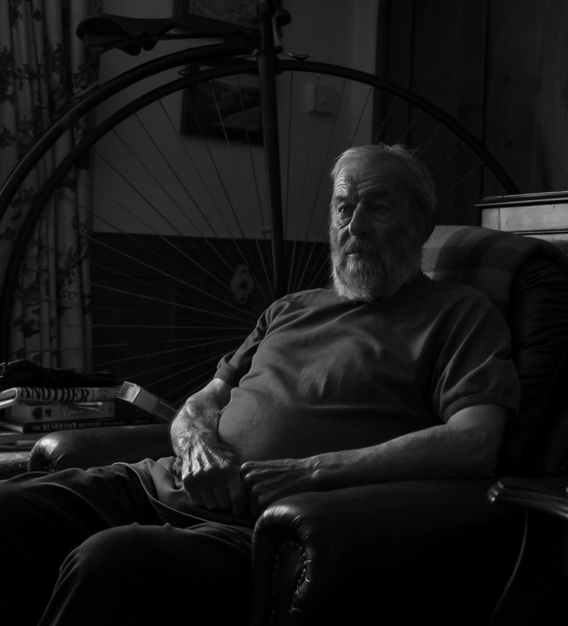
My suggestion regarding the portrait is to not have the shadow side of the face too impenetrable, especially around the eye. The download shows that there is detail visible in the left side of his face, but it's only just visible, and as soon as you go to anything smaller than full screen, that detail is all but lost. I'd recommend lifting the shadows on the left side of the front of his face to bring out just a touch more detail, especially if you're going for a print.
The way it is just now I'd be hard pushed to recognise him from your picture, which suggests to me that it's not showing enough of him. My non-professional opinion is that there should be enough of him visible to actually show something of what he's like. Perhaps for the people that already know him the portrait's fine the way it is.
I also think that there's too much dark along the bottom of the frame. As well as fixing that problem, the crop below puts his left eye on the upper right intersection of thirds (I'm not suggesting that that placement of the eye is essential, but it's an interesting point and might be worth considering as an option).
-
Jul 25, 2016 13:31:58 #
via the lens wrote:
......you would decrease the luminance in blue if you wanted a deeper blue sky......
Doing that can be very effective in bringing out details in a cloudy sky (as can a general darkening of the sky or reducing Highlights for the sky). Darkening can be so effective at strengthening the blue that sometimes you need to throw in a bit of desaturation as well.
Jul 25, 2016 12:58:53 #
GoofyNewfie wrote:
.....Nikon's 17-55 DX is the a "Trinity"-level zoom for DX cameras......
Just checked it out. Unfortunately the price is Trinity-level too (£1,100)
 .
.Jul 25, 2016 12:50:55 #
UKnomad wrote:
R.G. Understood and thank you again :)
You're welcome.
Jul 25, 2016 12:44:10 #
UKnomad wrote:
Many thanks R.G. - will have play with the yellow!
Can you explain the 'tint-shift' please?
Can you explain the 'tint-shift' please?
You're welcome. It's not going to make a miraculous difference, but yellow is the usual culprit when an over-saturated picture looks off-puttingly garish. Personally I give all of the colours a going over in HSL, and you can saturate or desaturate each as required.
By tint-shift I simply meant using the Hue slider to shift a colour in the desired direction. Using yellow again as an example, you might find that, say, a sunset was looking a bit too harsh for your liking, and tint-shifting yellow a bit towards orange might soften it and enhance the sunset look. Or if your vegetation was looking a bit washed out, you might find that shifting green towards blue just a touch gives the vegetation a slightly stronger colour. People that process portraits have all sorts of tricks and preferences for improving skin tones.
Jul 25, 2016 12:13:17 #
If you're open to a wild guess, perhaps it was the yellow saturation slider. When you turn up the saturation in the main edit, yellow is the first colour to look over-pushed. If you desaturated yellow in the HSL section you'd get away with more saturation in the main edit and it would reduce the picture's tendency to appear too garish as you turn up the saturation.
On the other hand, the tip might have been about using a tint-shift that the person giving the tip has gotten fond of.
On the other hand, the tip might have been about using a tint-shift that the person giving the tip has gotten fond of.
Jul 25, 2016 10:39:41 #
WayneT wrote:
.......The 18-140 is on my camera most of the time......
This lens has performed well in sharpness tests. The trouble with having a bigger zoom range than that is that all superzooms are a compromise, and the bigger the zoom range, the bigger the compromise. Fringing is something else that might become an issue with superzooms.
Jul 25, 2016 10:30:42 #
The mottled lighting meant lots of brush work..... or alternatively lots of cropping .
-
.-
Jul 25, 2016 09:08:00 #
I stuck close to the original but with softer colouring and lighting.
-
-
Jul 25, 2016 04:45:15 #
This composition seems a lot simpler than your usual still life shots. I get the impression that "simple" is a good starting point for experimenting, but I also get the impression that you have the skills to go beyond that, so I conclude that the simplicity is done with specific intent.
I'm not sure what to make of the 3. It looks totally incongruous, but perhaps incongruous was the intended look. I'm not sure if that style of still life provides the right sort of format for including incongruous elements. I'm not referring to the unrelated aspect of different elements as Dave was doing, because that's what I (and no doubt most others) would be expecting from randomly gathered junk. In that context almost anything could be included and it would tend to naturally blend in, but the 3 looks like it was purposefully placed in such a way as to have it deliberately not blend in, and I'm not sure what the intended effect is supposed to be.
I'm not sure what to make of the 3. It looks totally incongruous, but perhaps incongruous was the intended look. I'm not sure if that style of still life provides the right sort of format for including incongruous elements. I'm not referring to the unrelated aspect of different elements as Dave was doing, because that's what I (and no doubt most others) would be expecting from randomly gathered junk. In that context almost anything could be included and it would tend to naturally blend in, but the 3 looks like it was purposefully placed in such a way as to have it deliberately not blend in, and I'm not sure what the intended effect is supposed to be.